
The first time I walked into my 1958 ranch after we moved in, the “big room” felt equal parts exciting and baffling. I loved the light, the long sightlines, and the way the space begged for a walnut credenza and a proper conversation area. But open concept comes with a sneaky downside: if you do not intentionally zone it, everything reads like one big furniture showroom, or worse, a waiting room.
Today I’m walking you through how I zone an open-plan mid-century modern living and dining area so it feels true to the era: airy, practical, and quietly organized. No room dividers needed. Just a few smart boundaries using area rugs, lighting, and low-profile pieces that keep the horizontal lines flowing.
Before you move anything: pick your “spine” and your walkways
Every successful open-plan room has an invisible path that stays clear. In mid-century homes, that path is often parallel to the longest wall of windows or the main entry line. I call it the spine.
Stand at the main entry to the space and ask two questions:
- Where do people naturally walk through? Protect that route first.
- What view do you want to keep open? MCM rooms love a long, uninterrupted look across the space.
Once you have the spine, the living zone typically hugs one side of it and the dining zone takes the other. If you are fighting traffic weaving between sofa and table legs, your zoning will always feel “off” no matter how pretty the furniture is.
Zone 1: The living area (low, grounded, conversation-forward)
Start with a rug that is big enough to anchor the seating
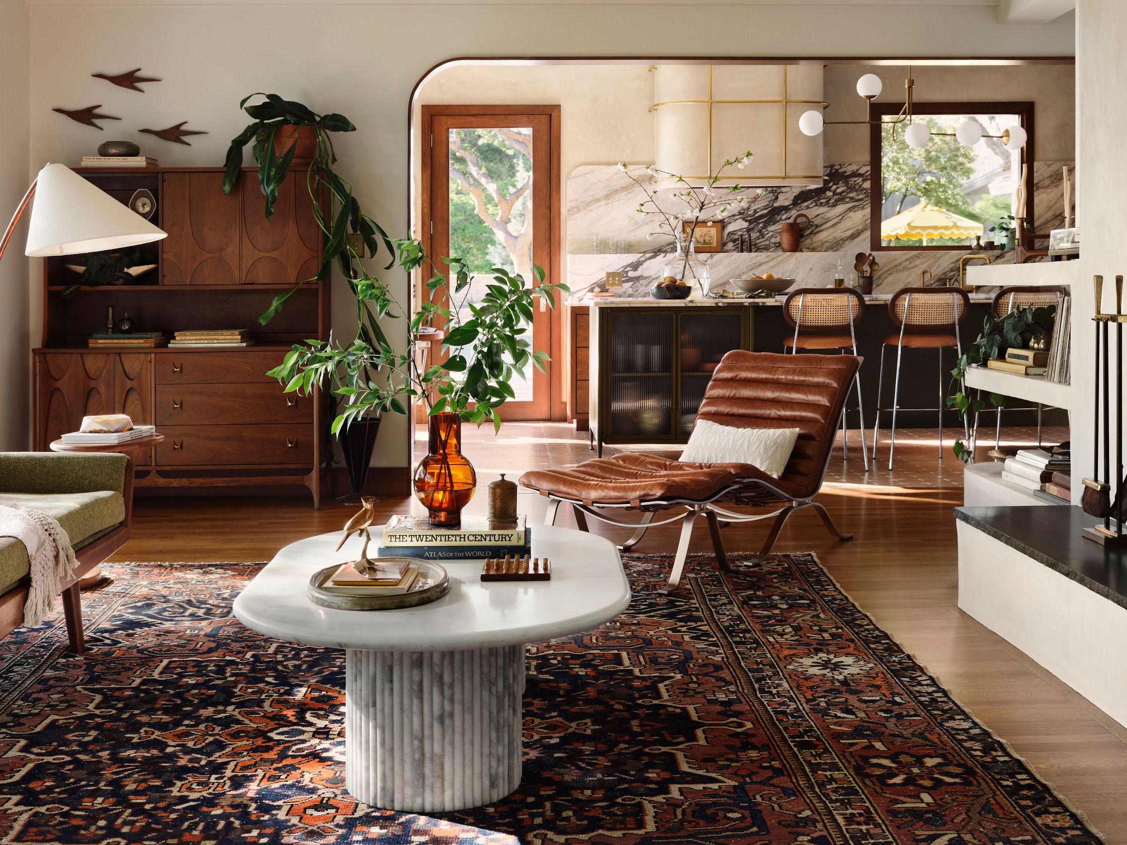
If there is one zoning move that instantly makes an open concept feel intentional, it is the living room rug. In a mid-century space, I like a rug that reads calm from a distance, then gets interesting up close: a subtle geometric, a tweedy texture, or a tone-on-tone pattern that plays nicely with walnut and teak.
- Rule I use: at least the front legs of your sofa and chairs should sit on the rug.
- What to avoid: a rug that only fits under the coffee table. That makes the living zone feel like it is floating.
Keep the main seating low-profile
Mid-century modern is basically a love letter to low silhouettes. In an open plan, that is not just a style choice, it is a zoning tool. A low sofa creates a clear “room” without blocking sightlines to the dining area.
Look for:
- Exposed legs (tapered wood legs are perfect)
- Arms that do not climb too high
- Chairs with open sides (think sling, bentwood, or a more airy frame)
If you are shopping vintage, do a quick check for condition before you fall hard for a pretty frame. I keep my own checklist close, especially for cushions and webbing. If you want a deep dive, I’ve shared what I look for in Buying Vintage Mid-Century Upholstered Furniture: What to Check.
Use a “ceiling cue” to define the zone with light
Lighting is one of the most underused zoning tricks, and it is so authentically mid-century. Instead of relying on one central overhead fixture for the whole open area, give each zone its own light identity.
- Living zone: a floor lamp with a drum shade or a splayed-leg lamp that pools warm light over the seating.
- Bonus: a table lamp on a credenza behind the sofa adds depth and makes the living area feel finished at night.
The goal is to create a circle of light that says, “this is where you land.”
One long, low storage piece makes the living area feel architectural
In my house, a credenza does more than hold records. It acts like a low “wall” that signals the living room boundary without closing anything in.
If you are styling one, keep it simple and intentional. I like to think in threes: one tall element, one medium, one small. I walk through specific styling setups in How to Style a Mid-Century Credenza With Vintage Decor.
Zone 2: The dining area (crisp edges, easy access, no pinched corners)
Give dining its own “island” with a second rug (optional but powerful)
Yes, you can absolutely rug a dining area. In an open concept, it helps the dining set feel placed, not parked. The trick is choosing the right texture and size so chairs slide easily and crumbs do not become a lifestyle.
- Best picks: low-pile, flatweave, or tight loop rugs
- Sizing test: pull a chair out as if someone is standing up. The chair should still sit on the rug.
If you would rather skip a dining rug, you can still zone the space with lighting and furniture arrangement. But I will be honest: the “two rugs, two rooms” approach is the fastest route to clarity.
Center the dining zone with a statement pendant
Mid-century dining areas love a centerpiece overhead. A pendant or a small chandelier creates a visual anchor, especially in rooms where the dining table is not against a wall.
- Hang it so it feels intimate over the tabletop, not lost up in the ceiling.
- Choose a shade shape that echoes your furniture lines: globe for soft, saucer for classic, cone for a sharper 60s vibe.
This is also where you can play with metals. If you have brass in the dining light and chrome elsewhere, that is not a problem. It is a look. I share my personal “mixing without clashing” rules in Mixing Brass, Copper, and Chrome in Mid-Century Modern Style.
Keep the dining furniture visually light
A chunky farmhouse table can overpower an open-plan MCM room. What reads more period-correct is a table with tapered legs and chairs that show negative space.
My favorite combinations for open concept:
- Round or oval table to soften the transition between zones
- Wishbone-inspired or spindle-back chairs for airiness
- Bench seating on the “traffic side” to keep walkways smooth
The “bridge” between zones: how to transition without a divider
The secret to seamless zoning is what happens in the in-between. I like a bridge piece that belongs to the architecture of the room more than either zone.
Try one of these bridge moves
- A low bookcase or record cabinet: placed behind the sofa or near the dining edge, it signals a boundary without blocking light.
- A plant with height: a tall floor plant near the corner of a rug creates a soft visual stop.
- A narrow console: along the spine walkway, it gives you a landing pad for keys and makes the space feel planned.
In true mid-century fashion, keep the bridge pieces slimmer and leggy. Heavy blocky storage tends to fight the open, floating look that makes MCM so calming.
My favorite layout formulas for open-plan MCM
If you are staring at a blank room and need a starting point, these are the arrangements I return to again and again.
Formula A: Parallel zones (cleanest for rectangles)
- Living rug and sofa aligned with the longest wall
- Dining table parallel to the sofa
- Clear walkway down the middle or along the windows
Formula B: Perpendicular zones (great when the kitchen opens into dining)
- Dining table oriented toward the kitchen opening
- Living seating turned 90 degrees to face a focal point (fireplace, media console, or window view)
- A bridge piece at the corner where the rugs nearly meet
Formula C: Floating dining (for rooms with windows on two sides)
- Dining table centered under a pendant, not pushed to a wall
- Living area anchored with a larger rug and low seating
- Extra breathing room around the table so chairs never scrape a wall
Small details that make it feel intentionally mid-century
Once the zones are set, the room shifts from “open plan” to “mid-century.” These finishing touches do the heavy lifting.
- Repeat wood tones: walnut in the living zone and walnut in the dining zone makes the whole space read cohesive. If you are mixing teak and walnut, keep the undertones friendly by repeating each wood at least twice.
- Keep accessories low and sculptural: a ceramic bowl, a shallow planter, a stacked pair of design books. Mid-century styling is more object-focused than clutter-focused.
- Echo shapes across zones: if your dining light is a globe, sneak in one globe element in the living area, like a lamp or a vase. It feels subtle, but it works.
Common zoning mistakes (and quick fixes)
The room feels like one big “furniture blob”
Fix: add at least one large rug, then pull furniture legs onto it. If budget is tight, start with the living rug first.
The dining set looks like it is drifting
Fix: hang a pendant centered over the table, even if the table is not centered in the whole room.
The sofa cuts the room in half
Fix: swap to a lower-back sofa if possible, or move the sofa so its back aligns with the edge of the living rug, not in the middle of a walkway.
Everything feels too matchy
Fix: keep silhouettes consistent (low, leggy), but vary textures: a nubby rug, smooth wood, matte ceramic, a little brass.
If you want the thrifted version of this look
I built a lot of my open-concept zones one weekend find at a time, and that is honestly part of the fun. If you are hunting for the right low-profile pieces without paying showroom prices, start here:
- Estate Sales for Mid-Century Modern Decor
- 7 Overlooked Local Spots to Score Authentic Mid-Century Modern Furniture
- Secret Search Terms for Mid-Century Modern on Facebook Marketplace
And if you are bringing home larger pieces like a dining table or credenza, take a minute to plan the move. It is the difference between a happy haul and a gouged doorway. I wrote out my best precautions in How to Safely Move Thrifted Mid-Century Modern Furniture.
The takeaway: zones should feel like they were always there
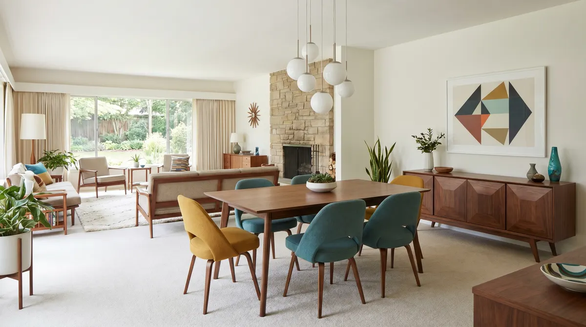
The most satisfying open-concept mid-century spaces do not feel “designed” in a fussy way. They feel inevitable. A rug says where you sit. A pendant says where you gather. Low furniture keeps the long, calm lines of the room intact.
If you set your walkways first, anchor each zone with its own rug and light, and keep silhouettes low and leggy, you end up with two rooms that share air and light, but still feel distinct. That, to me, is the magic of mid-century modern: simple moves, big atmosphere.