
I used to think mixing metals was the fast track to a cluttered, try-hard room. Then I moved into my 1958 ranch and realized something: mid-century homes often have a little eclectic energy baked in. My grandparents’ place had warm brass lamp parts, chrome chair legs, and the occasional copper bowl that somehow made everything feel richer, not messier. The trick is not matching. It is editing.
If you love the glow of brass, the rosy warmth of copper, and the crisp snap of chrome, you can absolutely use all three in one space. You just need a plan that gives your eye a clear path to follow.
Why mixed metals work in MCM
Mid-century modern styling is already a mix of materials: walnut, teak, glass, vinyl, ceramic, lacquer, terrazzo. Metals were part of that optimistic, futuristic moment too, especially in lighting and hardware. When you mix finishes thoughtfully, you get the best of both worlds:
- Warmth from brass and copper, which plays beautifully with wood tones.
- Contrast from chrome, which feels clean and architectural.
- Depth from having more than one reflective surface, so the room looks layered instead of flat.
The goal is not to prove you can use three metals. The goal is to make the mix feel inevitable, like it has always been there.
Pick a lead metal
When people tell me mixed metals look “busy,” it is usually because everything is shouting at the same volume. The easiest fix is choosing one finish to be the lead and letting the others be supporting players.
A ratio that keeps you honest
- 60% lead metal (your most repeated finish)
- 30% secondary metal (shows up a few times)
- 10% accent metal (a pop, not a theme park)
This isn’t math you measure with a ruler. It is a gut-check when you are tempted to buy “one more” shiny thing at the flea market.
How to choose your lead
- Go brass-forward if your room has lots of walnut, warm white walls, earthy textiles, or amber glass.
- Go chrome-forward if your room leans black-and-white, has a lot of glass, or you love a crisp, gallery-clean look.
- Let copper be the lead only if you truly love warmth and patina and you can repeat it enough to look intentional (most homes use copper best as a secondary or accent).
Make the metals connect
If you only take one idea from this article, make it this: repeat shapes and repeat zones. That is what makes different finishes feel coordinated.
Repeat a silhouette
- Arc lamp in brass plus a chrome-framed mirror with a similar curve.
- Brass picture light plus copper candlesticks that echo the same slim cylinder.
- Chrome table legs plus a brass tray that repeats the same thin profile.
Repeat the finish across levels
Try to spread each finish across the room at different heights.
- High: chandelier, curtain rod, wall sconce arms.
- Mid: frames, cabinet pulls, mirror edges, fireplace tools.
- Low: table legs, planter stands, bowls, bar cart wheels.
When brass lives only in one corner and copper lives only on one shelf, the finishes look like separate decisions. When they show up across the whole room, they look like a system.
What each metal does best
Brass: the unifier
Brass is my favorite “glue” metal in mid-century rooms. It is warm enough to pair with wood, but neutral enough to sit beside chrome without fighting.
- Best uses: lamps, cabinet pulls, switch plates, picture lights, hardware on casegoods.
- Watch for: too many different brass tones at once. Some are yellow, some are brown, some are almost green. Pick a lane.
Copper: the spice
Copper is gorgeous, but it has a strong personality. A little goes a long way, especially once it starts to patina.
- Best uses: bowls, vases, tea kettles, planters, barware, small sculptural decor.
- Watch for: copper overload near orange or red walls. It can turn the whole room into a sunset if you are not careful.
Chrome: the crisp line
Chrome is one of the fastest ways to give a room that “atomic” edge instead of a softer, cottagey feel. It adds a clean, space-age line.
- Best uses: chair legs, table bases, floor lamp stems, towel bars, bathroom and kitchen fixtures, frames with thin profiles.
- Watch for: pairing high-shine chrome with too many high-shine surfaces. Break it up with matte textiles and wood grain.
Finish families and sheen
You can mix metals, but try not to mix every sheen. Think in finish families so your mix feels collected, not chaotic:
- Polished: mirror-like chrome, glossy brass.
- Brushed or satin: softer, more modern, and easier to live with.
- Antiqued or patinated: aged, darker, and moodier.
A few combos that tend to behave nicely together:
- Polished chrome + satin brass + patinated copper (crisp, warm, and grounded).
- Brushed stainless + aged brass + warm copper (easygoing, less sparkly).
Room-by-room strategies
Living room
The living room is the easiest place to mix because you typically have multiple “metal zones” already: lighting, furniture legs, frames, and small objects.
- Start with lighting: make your main lamp or ceiling fixture the lead metal.
- Match the quiet stuff: curtain rods, lamp finials, and picture hangers can repeat the lead finish without adding clutter.
- Use copper as a tabletop accent: one copper bowl or vase reads intentional and collectible.
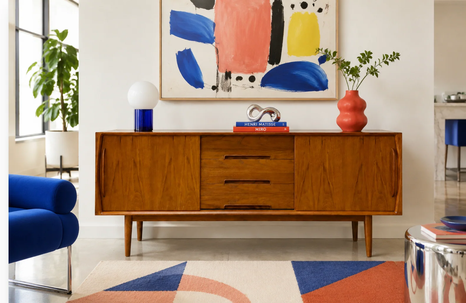
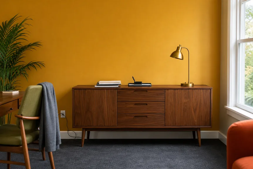
If you need help keeping decor from getting fussy, my favorite approach is styling one strong surface and letting it breathe. This is especially true on credenzas. See how to style a mid-century credenza with vintage decor for a step-by-step rhythm that works with mixed metals.
Kitchen
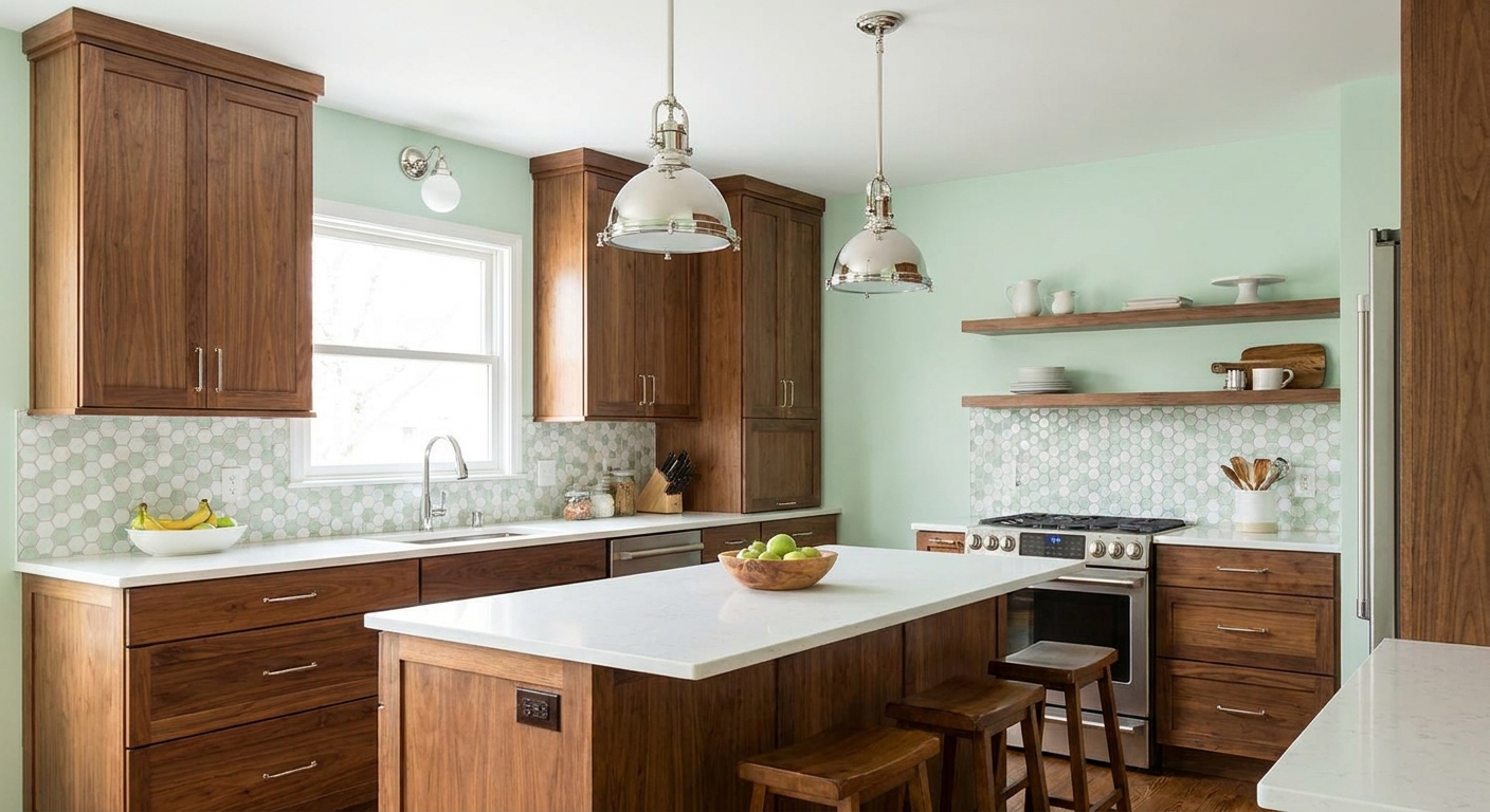
Kitchens can get chaotic fast because metals show up everywhere: faucet, pulls, appliances, lighting, cookware. The fix is choosing what you will not fight.
- Let appliances be their own lane: stainless usually reads as part of the same cool, silvery family as chrome, even if it is more brushed than mirror-shiny. Treat it like a baseline, not a mismatch to “fix.”
- Pick one finish for plumbing: faucet and sink accessories look best when they match.
- Use brass or copper for warmth: pendants, knobs, or one copper rail of cookware can soften a cool-heavy kitchen.
Color matters here too. A bold retro wall color changes how metals read. If you are building a palette, you will like retro color palettes for a mid-century modern kitchen.
Bathroom
Bathrooms are metal-dense, so keep the mix tight.
- Make chrome the baseline if you have chrome shower trim you cannot change.
- Add brass in one controlled place: mirror frame or vanity light.
- Keep copper small: a canister, a tray, or a lidded jar.
Bedroom
Bedrooms love warmth. Brass and copper glow against linen, boucle, and wood nightstands.
- Brass works beautifully for lamps and keeps the vibe soft.
- Chrome is great in frames or a minimal bedside table if the room needs crispness.
- Copper shines in small vintage finds like a trinket dish or bud vase.
Fixed metals you did not choose
In a real mid-century house, the most annoying metals are often the ones you inherited: HVAC registers, door hinges, fireplace screens, even old outlet covers. You do not have to replace everything to make it feel cohesive.
- Group the “background” metals: vents, hinges, and strike plates usually look best when they fade. Let them live in a quiet, cool lane (often they are already nickel, chrome, or brushed steel).
- Make your upgrades do the heavy lifting: if you can only change a few things, make it lighting and the most visible hardware. That is where the room reads “intentional.”
- Handle outlet covers thoughtfully: if they are old and yellowed, a simple, clean plate in a finish that matches your baseline metal can make the whole wall feel less noisy.
- Fireplace screens get one vote: if the screen is black, treat black as your buffer. If it is brass, let brass be your lead nearby and keep the rest simpler.
Avoid a finish war
Use black as a buffer
Matte black is the peacekeeper in a mixed-metal room. A black picture frame, black planter, or black lamp shade can separate competing finishes so the room feels calm.
Anchor shine with texture
Shiny metals look best when they are not surrounded by more shine. Pair them with:
- nubby upholstery
- wool rugs
- ceramic lamps
- woven baskets
- walnut or teak grain
Do not scatter tiny metal objects everywhere
This is the #1 clutter culprit. A handful of small brass trinkets on every surface reads like leftovers from a garage sale. Group small metal pieces on a tray, or commit to one statement object per surface.
Thrifter tricks
Because I thrift constantly, I rarely bring home a “matching set.” Here is how I make it work anyway.
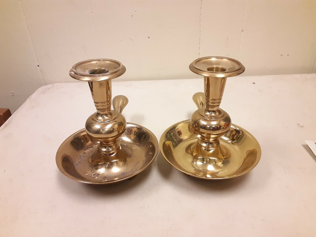
- Shop for shape first, finish second. Mid-century silhouettes are what read authentic, even if the finish varies.
- Buy pairs when you can. Two matching brass candlesticks instantly look more deliberate than one.
- Look for bridge pieces. Items that combine metals, like a lamp with a brass socket and chrome stem, help everything feel connected.
- Decide your patina policy. Either you love age and let it show, or you prefer polished and you maintain it. Mixing “high polish” and “heavy tarnish” is where rooms start to look accidental.
If you want more of my estate sale and flea market approach, including what to check before you buy, head to Vintage Hunting & Thrifting.
Maintenance and patina
Patina is part of the charm, but it helps to know what you are signing up for.
- Lacquered brass or copper: stays brighter longer, but shows fingerprints. When the lacquer finally wears, it can look spotty until you either clean and re-lacquer or embrace the change.
- Unlacquered brass or copper: darkens and softens with time. It is forgiving and looks more “collected,” but it will not stay uniform unless you polish it regularly.
- Chrome and stainless: generally easy care, but they love to show water spots. A quick buff keeps them looking crisp.
Quick fixes
Problem: the room looks sparkly and chaotic
- Remove the smallest shiny items first.
- Swap one high-shine piece for a matte or textured version (hammered copper, brushed brass, ceramic base).
- Add one black or wood element near the noisiest cluster.
Problem: one metal feels like it does not belong
- Repeat it one more time somewhere else, ideally on the opposite side of the room.
- Move it so it sits near a bridge material like glass, walnut, or black.
Problem: your hardware is a mix you cannot change (yet)
- Choose one lead finish for the items you can control, like lighting and frames.
- Use textiles and wood to soften the transition between finishes.
- Stop adding new metals until the room feels settled.
Three formulas I use
1) Walnut + brass + chrome
- Brass lamp and hardware
- Chrome chair legs or table base
- Walnut or teak furniture to warm it up
2) Cream + copper + brass
- Copper bowl or vase as the accent
- Brass lighting as the lead
- Cream textiles to keep it calm
3) Black + chrome + brass
- Chrome as the baseline, especially if you have stainless nearby
- Brass in one or two standout pieces
- Black frames or a black lamp shade to sharpen the whole look
If you are still debating warm versus cool overall, earth tones vs. jewel tones in mid-century style can help you decide the direction before you add more shine.
FAQ
Can I mix brass and chrome in the same light fixture?
Yes, and it often looks very period-correct. Mixed-metal fixtures act like bridge pieces, which makes the rest of your choices easier. Keep the fixture’s silhouette mid-century (clean lines, globe shades, sputnik forms) so it reads intentional.
Does copper clash with chrome?
Not inherently. Copper is warm and chrome is cool, so the key is giving them breathing room and connecting them with a neutral like wood, black, or white. Copper usually works best as an accent when chrome is prominent.
Should door hardware match cabinet hardware?
In open-plan areas, I like door hardware and the most visible cabinet hardware to relate, but they do not need to match perfectly. If you mix, keep one finish dominant and repeat it in at least two locations so it feels planned.