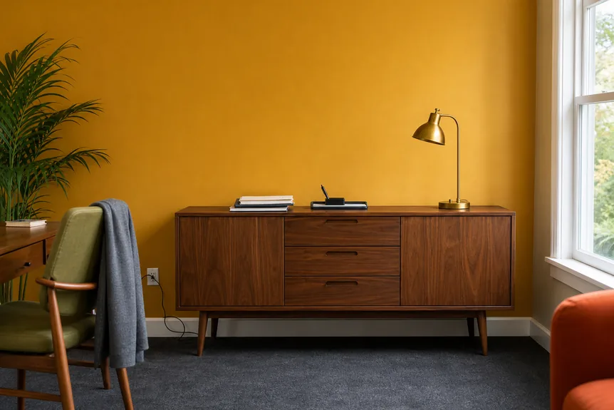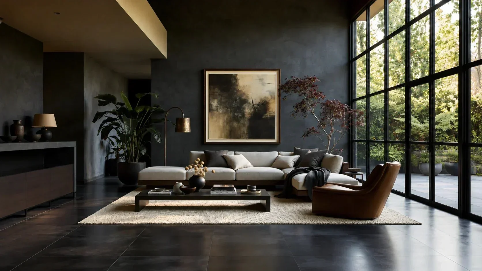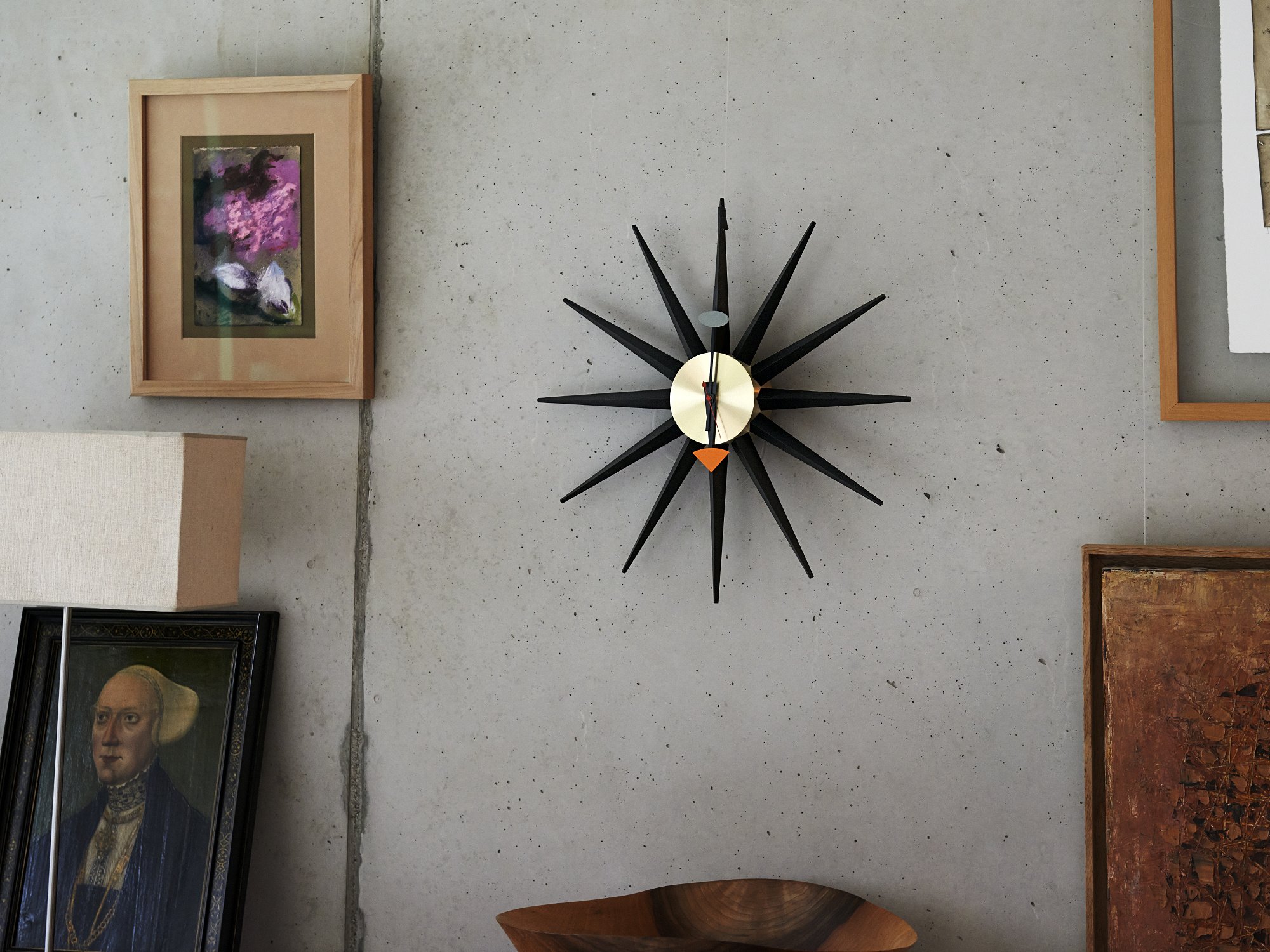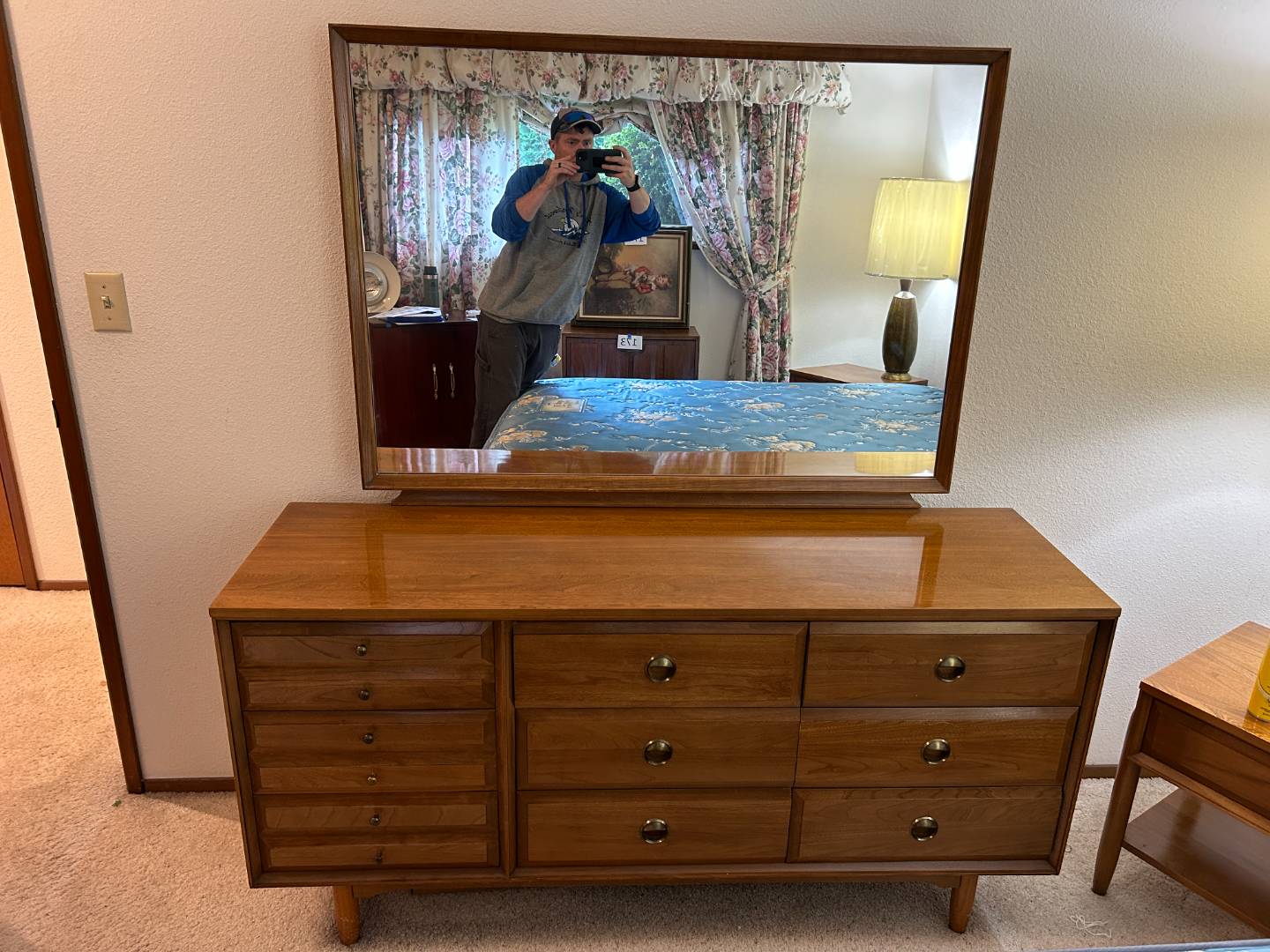

The first credenza I ever styled was a low walnut beauty from a Saturday estate sale, still smelling faintly like lemon oil and old books. I dragged it into my 1958 ranch house, stepped back, and immediately did what most of us do: I lined everything up like soldiers. Two matching vases. A centered frame. Symmetry everywhere. It looked neat, but it also looked flat, like a showroom display that forgot to feel lived-in.
Mid-century rooms, the ones that make your shoulders drop the second you walk in, often follow a different rhythm. Many lean into asymmetry, purposeful negative space, and bold color moments that feel intentional instead of cluttered. If you have a credenza or sideboard that deserves to be the anchor of a room, here is how I style mine with vintage decor in a way that feels collected, not crowded.
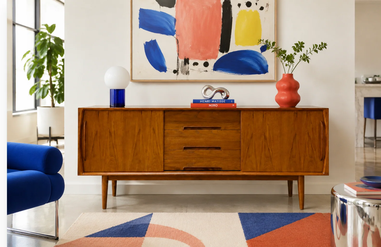
Start with the credenza
Before you style the top surface, take 3 minutes to set the stage. A credenza is basically a long, low runway, and tiny changes make a big difference.
- Clear the surface completely. You want to see the full shape and wood tone.
- Check the backdrop. Is it on a blank wall, under a window, or below a gallery moment? Your styling will be lighter if the wall is busy.
- Decide its job. Is it a bar, a media piece, or a dining room sideboard? Function should guide what you leave accessible.
If the finish is showing dust or fingerprints, I do a quick dry wipe with a soft cloth so the wood tone reads clean. If you are tempted to oil or condition it, follow the maker or restorer’s guidance. Some vintage finishes do not love surprise products.
Pick a simple palette
This is the step that keeps “vintage collection” from becoming “yard sale on a table.” Mid-century styling loves color, but it loves editing more.
My easy credenza palette formula
- Wood tone stays the base. Walnut, teak, rosewood, whatever you have, let it be the calm.
- One main color. Avocado, ochre, rust, peacock blue, tomato red.
- One quiet neutral. Cream, off-white, smoky gray, matte black.
- One metal accent. Brass, chrome, or blackened iron, choose one and echo it once.
Color blocking in a mid-century mood is not about using every bright shade at once. It is about making one color feel like it belongs, then pulling it in again in small ways so your eye moves across the credenza instead of stopping at a single loud object.
If you want more help building a palette, I keep my go-to combinations in mind from Color Palettes & Styling whenever I am working with strong vintage ceramics.
Use the three-zone layout
Here is the styling trick I come back to again and again: divide the top into three invisible zones. Not three equal piles, but three areas with different heights and visual weight. This sets you up for asymmetry without chaos.
Zone 1: The tall anchor
Pick one taller piece to establish height on one side. Good anchors:
- A table lamp with a drum or cone shade
- A tall ceramic vase
- A sculptural object like a teak horse or abstract brass form
- A large framed print leaning against the wall
Place it slightly in from the edge, not hugging the corner. Corners read stiff.
Quick scale cue: If you are choosing a lamp, I like one that lands somewhere around 1.25 to 1.75 times the credenza height when it is sitting on top. It is not a rule, just a reliable proportion.
Zone 2: The medium cluster
On the opposite side, build a cluster that lands around mid-height. Think “group,” not “line.” This is where pottery, a small stack of books, and a bowl can play together.
Zone 3: The low breather
The middle (or the area between the two bigger moments) is where you let the credenza breathe. That negative space is a common mid-century move, and it makes the wood feel like part of the composition. You can place one low item here, like a shallow dish, but keep it restrained.
If your credenza is extra long, you can still use three zones, just stretch the breathing room.
Pottery without clutter
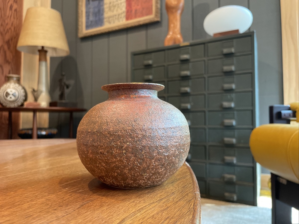
Vintage pottery is my weakness. The glaze, the weight, the tiny fingerprints in handmade pieces. But ceramics can get crowded fast on a credenza because every piece has visual mass.
Step 1: Pick one hero pot
Choose the most sculptural piece or the one with the best glaze. This becomes your focal point in the medium cluster or your tall anchor if it has height.
Step 2: Add one supporting shape
Look for contrast. If your hero is round, add something more angular. If your hero is glossy, add something matte. Mid-century styling loves shape variety.
Step 3: Repeat the glaze color once
This is where color blocking comes in. If your hero pot is turquoise, bring that turquoise in again in a smaller way: a tiny bud vase, a book spine, or even artwork with a similar hue.
Step 4: Leave air around ceramics
Give pottery a little perimeter of space so the silhouette reads. When pieces touch, they visually merge into one lumpy shape. I like at least a few inches between objects, more if the forms are bold.
Books the mid-century way
Books are the secret weapon for credenza styling because they create platforms and structure. Vintage or vintage-looking art and design books are perfect, but any hardback with a solid spine can work.
Step 1: Use books as risers
Stack 2 to 4 books horizontally to lift a small object, like a dish, a candleholder, or a petite vase. This keeps your cluster from being one height.
Step 2: Add one vertical book moment
Add a few books standing upright with simple bookends. The vertical line adds a clean architectural note that can feel especially at home in 1960s-leaning spaces.
Step 3: Keep spines calm
If the book spines are loud and modern, turn them pages-out for a softer look. If you have beautiful vintage spines, show them off, but stick to your palette. Too many competing colors can overpower the wood tone.
Step 4: Top with one small object
One, not three. A single small object on the stack reads intentional. Three tiny objects read like you ran out of room.
Art that feels collected
Credenzas love art because they give your styling a why. Even a simple print can make the objects feel curated.
Option A: Lean a large frame
- Scale: Aim for art that is roughly two-thirds the width of your tallest cluster, or larger if the wall is blank. As a practical starting point, I often reach for frames in the 18x24 to 24x36 neighborhood for a standard living room credenza.
- Placement: Lean it behind your medium cluster or near your tall anchor.
- Frame finishes: Walnut, black, or brushed metal all play nicely with MCM furniture. Pick one and echo it once on the credenza.
Option B: Hang art slightly off-center
Mid-century rooms do not always insist everything be centered. If the credenza sits under a larger wall space, try hanging one piece slightly off-center and then answering it with a taller object on the credenza top.
Option C: Use a small art stack
Two frames leaning, one larger behind one smaller, is a classic layered look. Keep the color palette tight so it does not read busy.
Asymmetry made easy
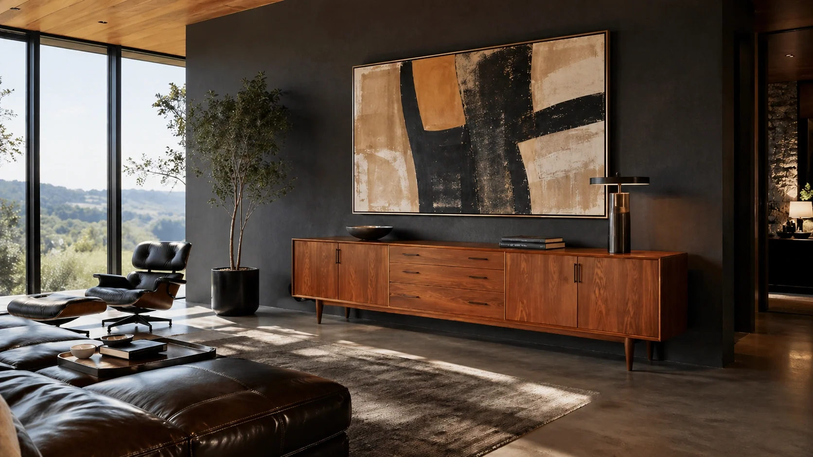
Asymmetry can sound intimidating, but it is really just “balanced without matching.” Here are my checks for an asymmetrical credenza that still feels calm.
- Match visual weight, not objects. A lamp on one side can be balanced by a framed print plus pottery cluster on the other.
- Keep one side taller. Two equal peaks feel formal. One tall, one medium feels relaxed.
- Repeat one material. If you have brass in a candleholder, pull brass in again in a small bowl or lamp detail so it feels intentional.
- Let negative space do work. Empty surface is part of the styling. It highlights the wood and makes the chosen objects feel special.
Color blocking: 3 moves
1) Group similar colors together
If you have three ceramics in the same family, place them in one cluster rather than scattering them. This creates a block of color that reads strong and mid-century.
2) Use one bold color as a dot
A single pop, like an orange vase against walnut, is very MCM. The key is bringing that color back once, even subtly, so it feels planned.
3) Anchor brights with matte black or cream
Brights look sharper when grounded. A matte black bowl, a cream vase, or a black frame can calm a colorful grouping instantly.
When there is a TV or turntable
Real homes have screens and gear, and you can still keep the mid-century vibe.
If there is a TV
- Go lower with decor. Use a shallow bowl, a low pottery piece, or a small stack of books.
- Keep the tallest objects to the side. Flank the TV area with a lamp or tall vase so nothing competes with the screen.
- Limit shiny items. Reflections get messy around TVs. Choose matte ceramics and textured pieces.
- Tame the cords. I run cables straight down behind the credenza and hide the power strip inside, so the surface styling does not have to fight a spaghetti situation.
If there is a turntable
- Leave operating space. Do not crowd the lid or the record path.
- Style with records as the books. A neat stack of sleeves can become your horizontal element.
- Add one small sculptural piece. Let the turntable be the star.
- Keep vibrations in mind. If your speakers are on the credenza, avoid wobbly stacks that will rattle every time the bass hits.
Quick styling recipes
Recipe 1: Warm walnut, desert tones
- One tall ochre or sand-colored vase
- Two matte black pieces (bowl and small vase)
- Stack of art books with warm spines
- One abstract print with rust or terracotta
Recipe 2: Teak, cool contrast
- Brass lamp with white shade
- Turquoise or teal pottery hero piece
- One white ceramic bud vase
- Black frame leaning print
Recipe 3: Minimal and graphic
- Large black-and-cream print leaning
- Two neutral ceramics with strong shapes
- Three books turned pages-out
- One small brass object
Troubleshooting
“It looks cluttered.”
Remove one item from each cluster. Then add space between what remains.
“Everything feels too small.”
Add one oversized element: a larger frame, a taller lamp, or a bigger ceramic piece.
“It looks like a store display.”
Add one personal item with texture, like a small vintage box, a thrifted ashtray style dish (used for keys), or a quirky figurine. Mid-century homes had personality.
“The colors fight.”
Limit yourself to one main color plus one neutral. Put the extras inside the credenza behind doors.
“It feels too symmetrical.”
Shift the tallest item off to one side, then rebuild the opposite side as a medium cluster.
“The wall above feels empty.”
Lean a large frame first, then style the objects in front of it. It is the fastest fix.
Kid, pet, and earthquake proofing
If you have little kids, curious cats, or even just an enthusiastic dog tail, styling has to survive real life.
- Keep heavy, breakable pieces back. I push pottery and leaning frames toward the wall, not the front edge.
- Use museum putty or gel. A little under ceramics can keep a bump from becoming a crash.
- Skip the big lean in high-traffic spots. If a hallway runs right past the credenza, hanging art is often calmer than a large frame perched on the surface.
Where I find vintage pieces
My best credenza decor almost never comes from one place. I mix estate sale pottery with thrift store frames and a few modern basics so the whole scene feels layered.
- Thrift stores: matte pottery, book stacks, small brass pieces
- Estate sales: lamps, higher quality ceramics, framed art
- Flea markets: sculptural objects and odd little conversation starters
If you love the hunt too, you will feel right at home in Vintage Hunting & Thrifting.
Final pass
After you style, walk out of the room and come back in. That first glance tells you what is too loud. Then do this quick polish:
- Lower one thing. Credenzas look best when at least one zone stays low.
- Echo one material. Brass, black, or ceramic, pull it in again once.
- Clean the negative space. Wipe the wood. Tuck cords. Let the credenza glow.
If you want to see how styling choices change the feel of a whole room, I share more of my before-and-after approach in Room Makeovers & Tours.