
I fell in love with mid-century color before I knew what to call it. My grandparents’ 1960s living room had walnut casework that practically glowed at sunset, plus a quiet little punch of color here and there: a rust throw pillow, a teal glass bowl, a mustard accent chair that somehow worked with everything.
Years later, while renovating my own 1958 ranch, I realized a lot of mid-century rooms I’m drawn to land in one of two easy-to-decode camps: earth tones (warm, grounded, nature-forward) or jewel tones (saturated, dramatic, cocktail-hour glamour). That is not the whole story of the era, of course. You also see plenty of pastels, crisp black-and-white graphics, and those classic atomic pops of primary color. But if you are stuck between “cozy and collected” versus “moody and bold,” earth versus jewel is a surprisingly useful starting point.
Neither palette is “more authentic” than the other. Both showed up in the era, often side by side. The real question is: which one loves your light, your architecture, and the way you actually live?
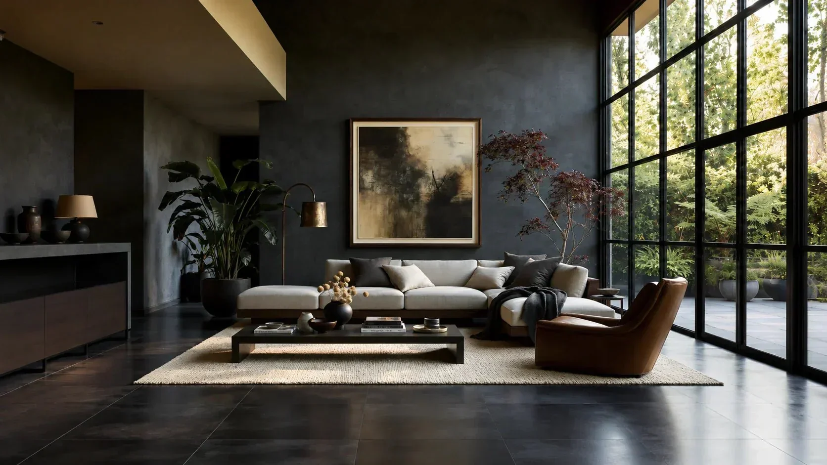
Quick definitions
Earth tones
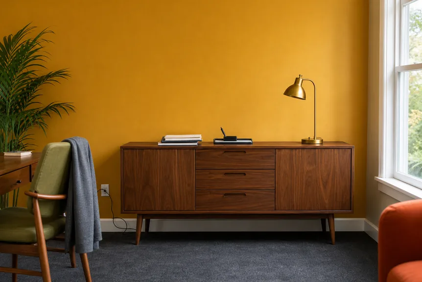
Earth tones are colors pulled from soil, bark, clay, sand, and sun-warmed plants. In a mid-century home, they read as cozy and architectural, especially next to wood.
- Core colors: camel, tan, tobacco, cinnamon, terracotta, rust, ochre, mustard, olive, moss, warm gray
- Common neutrals: cream, bone, greige, warm white
- Signature vibe: grounded, organic, collected over time
Jewel tones
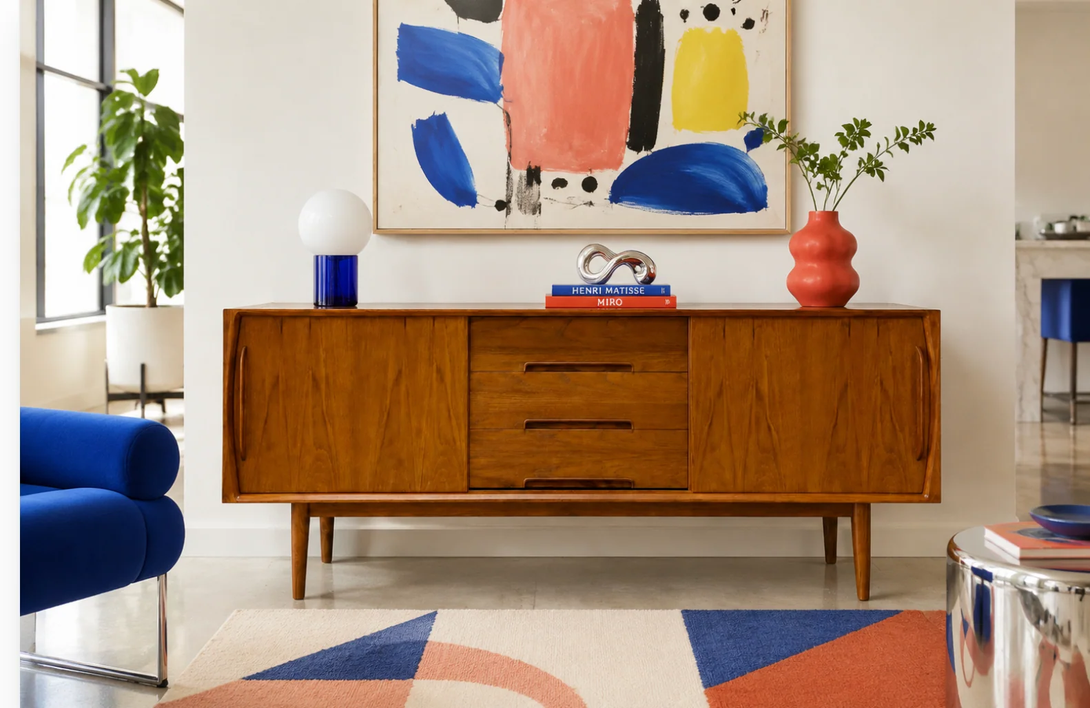
Jewel tones are saturated, high-impact colors inspired by gemstones and lacquered finishes. They bring the “party” energy that shows up in so much vintage barware and upholstery.
- Core colors: emerald, peacock teal, sapphire, cobalt, amethyst, garnet, ruby, deep plum
- Common neutrals: crisp white, charcoal, black, navy, warm brass
- Signature vibe: moody, glamorous, confident
How light changes color
If you take nothing else from this article, take this: color is a light-and-context trick. The same “perfect” swatch can feel welcoming in one house and heavy in another. Latitude, window size, glass coatings, trees outside, and even your wall finish can change what you see, so treat these as reliable tendencies, not laws.
North-facing rooms
- Earth tones: Choose the warmer side (camel, terracotta, ochre). They counteract that cool cast and keep wood from looking flat.
- Jewel tones: Go rich and slightly warm (deep teal, aubergine, garnet). Blue-heavy jewels can skew chilly in north light unless you balance with brass and warm woods.
South-facing rooms
- Earth tones: Can look sun-baked in the best way. Watch anything too yellow; it can turn brassy at peak afternoon.
- Jewel tones: Absolutely sing. Strong light lets you use saturated color without it feeling like a cave.
East-facing rooms
- Earth tones: Softer clays and olives feel gentle and fresh in the morning.
- Jewel tones: Consider a jewel as an accent here (pillows, art, a chair). Full walls can feel intense at sunrise.
West-facing rooms
- Earth tones: West light makes them extra cozy. Terracotta and rust look incredible late-day.
- Jewel tones: West light can make jewel walls feel theatrical. If you want moody lounge energy, this is your room.
Let the architecture lead
Mid-century homes were designed with color in mind, but not always loud color. Materials, planes, and sightlines matter.
Lots of original wood
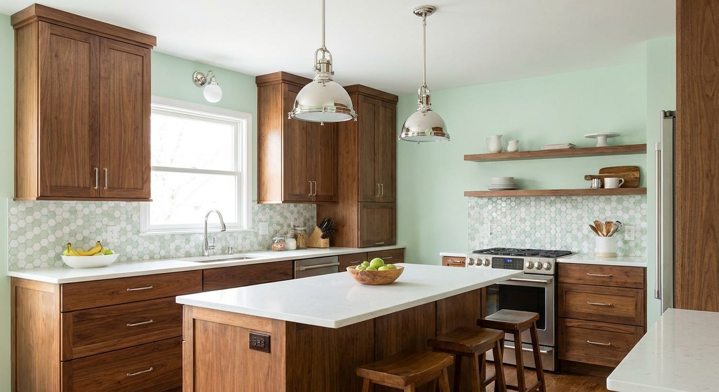
- Earth tones are the easiest yes because they harmonize with walnut, teak, and oak.
- Jewel tones work best in smaller doses unless the wood is darker and the room is well-lit. Think emerald velvet chair, cobalt ceramics, or a plum rug instead of four jewel-tone walls.
Painted trim and cleaner lines
- Jewel tones pop beautifully against crisp trim and simple silhouettes.
- Earth tones still fit, but they shine when you layer texture: bouclé, woven shades, cork, leather, wool.
Low-ceiling ranch life
Deep color can feel intimate or oppressive depending on sheen and contrast. In my house, I treat jewel tones like espresso: incredible, but not in every cup.
- Earth-tone approach: keep walls lighter (warm white or pale clay) and put the depth in textiles and vintage pieces.
- Jewel-tone approach: choose one saturated anchor (a wall, a sofa, or a rug) and keep the rest calm.
Wood tones matter
In mid-century rooms, wood is practically a color family of its own. Here’s the cheat sheet I use when I’m trying to avoid that “why does this feel off?” moment.
| Wood you have | Earth tones that flatter | Jewel tones that flatter |
|---|---|---|
| Walnut (deep, chocolate) | Camel, rust, olive, warm cream | Emerald, sapphire, amethyst, garnet |
| Teak (golden, mid-tone) | Terracotta, ochre, moss, warm gray | Peacock teal, cobalt, deep plum |
| Oak (honey to orange, especially red oak) | Olive, clay, tobacco, bone | Teal, forest green, burgundy |
| Painted or laminate pieces | Use earth tones to add warmth and authenticity | Use jewel tones to add richness and intention |
If you want more help balancing vintage woods with modern pieces, I keep a lot of my practical color thinking in Color Palettes & Styling.
Where to use the color
If you freeze up at “pick a palette,” this is how I simplify it. Decide where you want the drama, then assign your boldest color there.
- Walls: Best for a steady mood. Earth-tone walls are forgiving and airy. Jewel-tone walls are stunning, but they are a commitment, and they look very different day to night.
- Sofa: The biggest “wear-and-tear” decision. Earthy upholstery tends to feel relaxed. Jewel upholstery is the statement piece, especially in velvet or mohair.
- Rug: My favorite way to try jewel tones without painting. A sapphire or peacock rug can carry a whole room while your walls stay neutral.
- Small accents: The easiest place to experiment. Ceramics, pillows, art, and vintage glass let you test a strong color without living with it on every surface.
Pattern and print
Mid-century color really comes alive once you add pattern. The trick is scale and restraint.
- Earth-tone rooms: You can go bigger and more organic with prints. Think oversized botanicals, woven stripes, and nubby textures. Earth palettes also love subtle geometric patterns that read almost like architecture.
- Jewel-tone rooms: Keep the pattern more graphic, or more controlled. A few high-contrast geometrics, a classic stripe, or one bold abstract tends to feel sharper than lots of small competing prints.
- My rule: If the color is loud, keep the pattern quieter. If the pattern is loud, keep the color count low.
Paint finish tips
Sheen can make or break a darker mid-century color.
- Jewel walls: Matte or low-sheen tends to look richer and hides wall texture better. Higher sheen can bounce light in a way that feels a little theatrical, which you might love in a lounge-y room and hate in a bedroom.
- Earth walls: Eggshell is usually a sweet spot for lived-in spaces because it wipes down easier without looking glossy.
- Trim: A slightly higher sheen on trim can give you that clean mid-century line work without needing bright, stark white everywhere.
Earth tones: best uses
Earth tones are the palette for people who want their home to feel like it has always been there. They are forgiving, wearable, and wildly compatible with thrifted finds.
Why you might love them
- They handle real life. Depending on the fabric and weave, earthy mid-tones can be easier to live with than bright, saturated upholstery when you have pets, kids, or clumsy coffee moments.
- They make vintage wood look richer. Especially walnut and teak.
- They welcome mixed eras. A 1970s ceramic lamp and a modern sofa can look intentional when the palette stays earthy.
Common pitfalls
- Pitfall: Everything turns brown and flat.
Fix: Add contrast with creamy whites, black accents, and one clear color note (avocado, teal, or mustard). - Pitfall: Feels “too Southwest” when you did not mean it that way.
Fix: Keep terracotta to accents and bring in classic MCM shapes: tulip bases, tapered legs, simple geometric art. - Pitfall: Looks dingy in cool light.
Fix: Choose warmer versions of your neutrals, and use bulbs around 2700K to 3000K (2700K reads warm white, 3000K reads soft white in most homes).
Jewel tones: best uses
Jewel tones are for the part of mid-century that feels like a jazz record and a perfectly mixed drink. They look incredible with brass, smoky glass, and sculptural lighting.
Why you might love them
- They create instant focus. One emerald chair can do the work of ten small accessories.
- They elevate simple basics. A plain, modern sofa looks more mid-century when you add jewel pillows and a bold rug.
- They shine at night. If you entertain, jewel tones look especially rich under lamp light.
Common pitfalls
- Pitfall: The room feels smaller and heavier.
Fix: Keep the ceiling and at least one major surface lighter, and add reflective moments like brass, glass, and glossy ceramics. - Pitfall: The palette starts to feel theme-y.
Fix: Limit yourself to one or two jewel colors, then use wood and warm neutrals as the bridge. - Pitfall: It clashes with warm wood.
Fix: Choose jewels with warmth (peacock, emerald, aubergine) and repeat warm metals.
Starter formulas
If you want “tell me what goes where,” these are my low-regret setups. Adjust the exact shades to your wood and light.
Earth base, easy everyday
- Walls: warm white or pale clay
- Big furniture: walnut or teak, plus a camel or oatmeal sofa
- Textiles: olive or rust pillows, a warm neutral rug
- Contrast: black accents (frames, lamp base, cabinet pulls)
Jewel accent, not a cave
- Walls: warm neutral
- Anchor: sapphire or peacock rug
- Support: walnut pieces, brass lighting
- Accents: a matching vase or artwork so the jewel color repeats twice
Jewel base, lounge mode
- Walls: one jewel feature wall (emerald, aubergine, or deep teal)
- Big furniture: a simpler sofa in cream, camel leather, or charcoal
- Lighting: multiple lamps, warm bulbs, and at least one reflective surface
- Keep it tight: one jewel color plus wood and one metal finish
Pick in 10 minutes
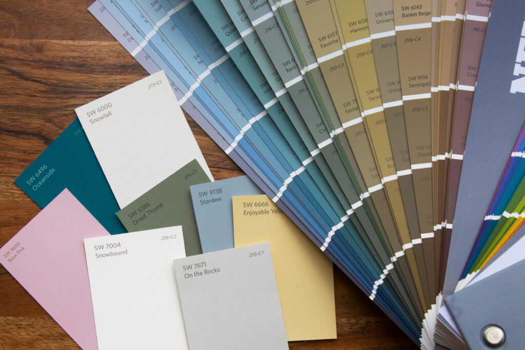
I do this before I paint anything or commit to a rug. It saves money and second-guessing.
- Choose one constant in the room you are not changing (wood tone, flooring, or a sofa).
- Gather 6 to 10 small items from around your house or thrift store candidates: a throw, pillow cover, vase, art book, small tray, a ceramic piece. Aim for either mostly earth tones or mostly jewel tones.
- Place them together near your constant in daylight and then again at night with your usual lamps on.
- Notice your reaction: do you exhale and relax (earth tones) or feel energized and delighted (jewel tones)? Both are valid. You are building a home, not a showroom.
- Take one photo and view it in black-and-white. If everything blends into the same gray, you need more contrast.
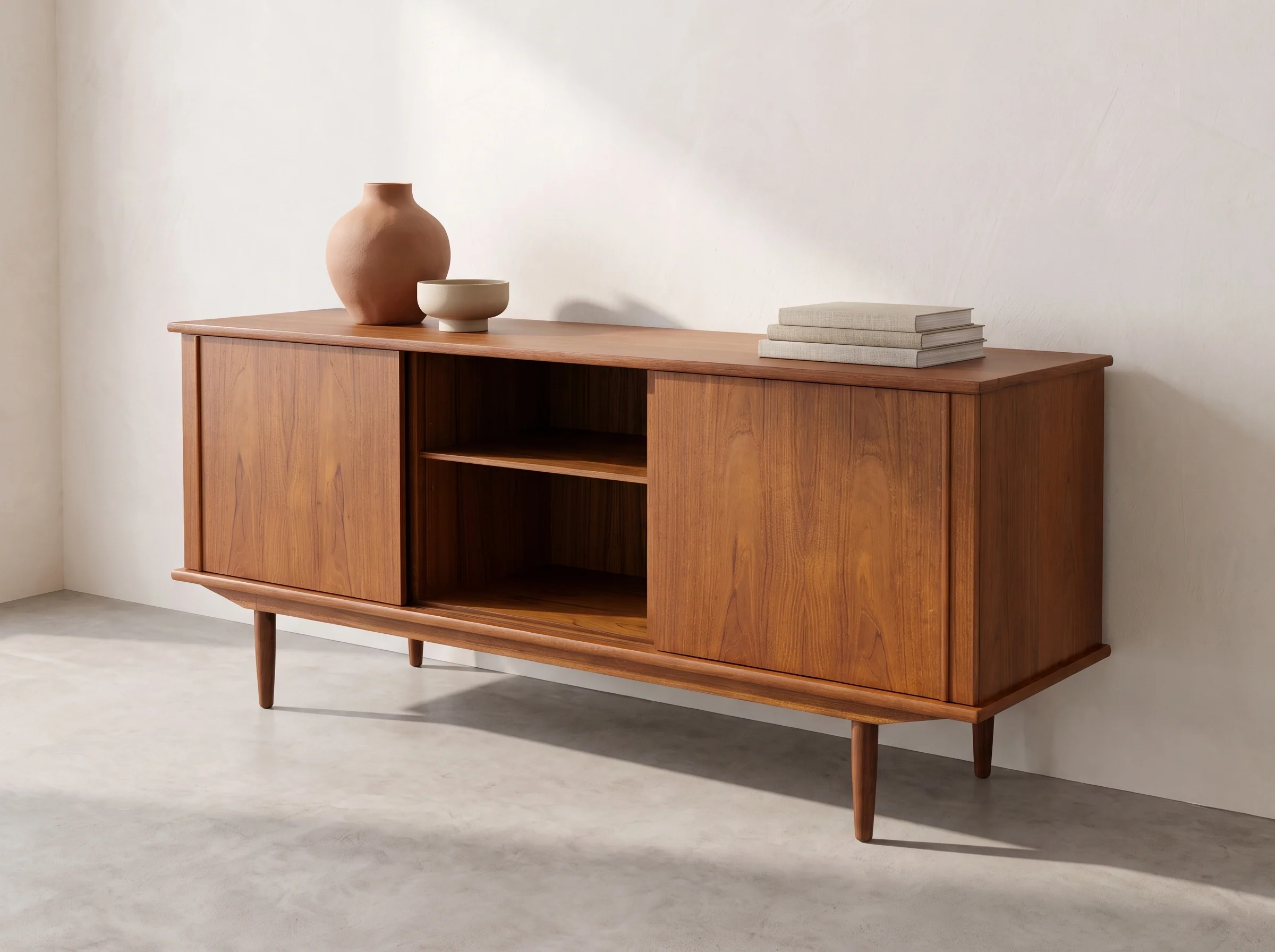
If you want a simple styling anchor while you test color, start with a credenza or console. I walk through my favorite approach here: How to Style a Mid-Century Credenza with Vintage Decor.
Ready-to-use pairings
Here are combinations I return to again and again, especially when I’m mixing thrifted pieces with modern basics.
Earth-tone pairings
- Warm white + olive + walnut (calm, classic, very 1960s)
- Clay + mustard + black accents (cozy with a graphic edge)
- Camel + teal accents (earthy base with a little atomic sparkle)
- Rust + cream + brass (soft and sunset-warm)
Jewel-tone pairings
- Emerald + warm walnut + brass (a guaranteed stunner)
- Peacock teal + crisp white + black (clean but bold)
- Amethyst + camel leather (unexpected and very vintage-luxe)
- Sapphire + warm gray + wood (cool jewel with a grounded buffer)
My decision rules
- If your room is dim or north-facing: start with earth tones, add jewel accents.
- If your room gets strong sun: jewel tones are easier to pull off in bigger doses.
- If you have a lot of original wood: earth tones will look seamless, jewel tones will look like intentional punctuation.
- If you love a moody, lounge feeling: jewel tones plus layered lighting.
- If you want relaxed, everyday comfort: earth tones plus texture.
You can also blend them, which is honestly where many of the best mid-century rooms land: an earthy foundation with one unapologetic jewel moment.
FAQ
Can I mix earth tones and jewel tones?
Yes, and it often looks more authentic than committing to one extreme. Keep one family as the base (walls, rug, sofa) and use the other as accents (pillows, art, ceramics). Wood is usually the easiest bridge, and warm metals help, too.
Which palette makes a room look bigger?
Typically, lighter earth tones expand a room because they keep contrast low and bounce light. Jewel tones can still work in small rooms, but they read intentionally intimate. If you go jewel, use reflective surfaces and layered lighting.
What if my partner and I disagree?
Pick the base you both tolerate and save the strong-opinion color for one swap-friendly piece like a chair, pillows, or art. Thrift stores are perfect for this. If it does not feel right, you can re-donate without heartbreak. For more on shopping with intention, browse Vintage Hunting & Thrifting.
Do earth tones always look dated?
They can if everything is the same value (all mid-browns) or if the room lacks contrast. Add crisp black, warm white, and one cleaner color note. Suddenly it reads mid-century again instead of old.
My favorite compromise
If you’re stuck, this is my default: keep the big-ticket surfaces friendly and earthy, then add one jewel-tone moment that makes you smile every time you walk in. In my house, it was a thrifted peacock-blue vase that led to a matching pillow, then a small abstract print, then eventually a rug. That is the fun of mid-century style. You build it the way the era did: piece by piece, with personality.
If you want more room-by-room examples, you can explore Room Makeovers & Tours for real-life palettes in action.