
One of the fastest ways to make a room feel “right” in a mid-century home is to get the windows right. I learned this the hard way in my 1958 ranch. I had the furniture, the warm walnut, even a little atomic sparkle, but my windows were wearing heavy, puddled drapes that belonged to a different decade. The day I swapped them for tailored panels on a streamlined rod, the whole room snapped into focus.
Mid-century modern (MCM) window treatments are all about clean lines, intentional texture, and practical light control. You do not need museum-authentic replicas. You just need the right proportions, the right materials, and a color or pattern that plays nicely with your wood tones and upholstery.
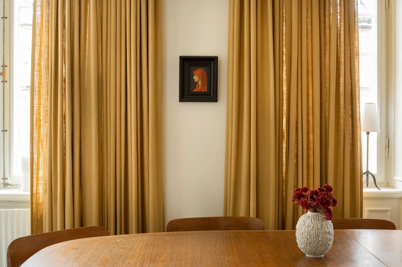
What feels mid-century
Before we get into specific options, here are the design cues I look for when I am trying to keep things period-friendly without sacrificing comfort.
- Tailored silhouettes: Panels that hang straight, not overly gathered, not puddling on the floor.
- Visible hardware: Streamlined rods, rings, and brackets in brass, black, or brushed metal. Nothing too ornate.
- Natural texture: Linen, cotton, wool blends, woven wood, and other materials that look good next to teak, walnut, and oak.
- Graphic pattern used strategically: Geometrics, stripes, or abstract prints that echo the era, used in moderation so the room still feels calm.
- Function first: Privacy and glare control matter. MCM interiors were designed for real life, not just for photos.
Curtains vs drapes
People use “curtains” and “drapes” interchangeably, but the difference is helpful when you are styling an MCM space.
Curtains (lighter, airier)
Think cotton, linen, and simple weaves. Curtains are perfect when you want daylight, softness, and a relaxed but still tailored look. In MCM rooms with lots of wood and angular furniture, a lightly textured curtain adds warmth without getting fussy.
Drapes (heavier, more light control)
Drapes are often lined and made from thicker fabric. They make sense in bedrooms, TV rooms, or any space where you want serious light blocking. The key for MCM style is keeping them structured. Avoid overly ornate pleats, swoopy valances, and anything that feels Victorian.
My rule: If the fabric is heavy, keep the details clean. If the fabric is quiet, you can let color or pattern do a bit more talking.
Best options (and when to use them)
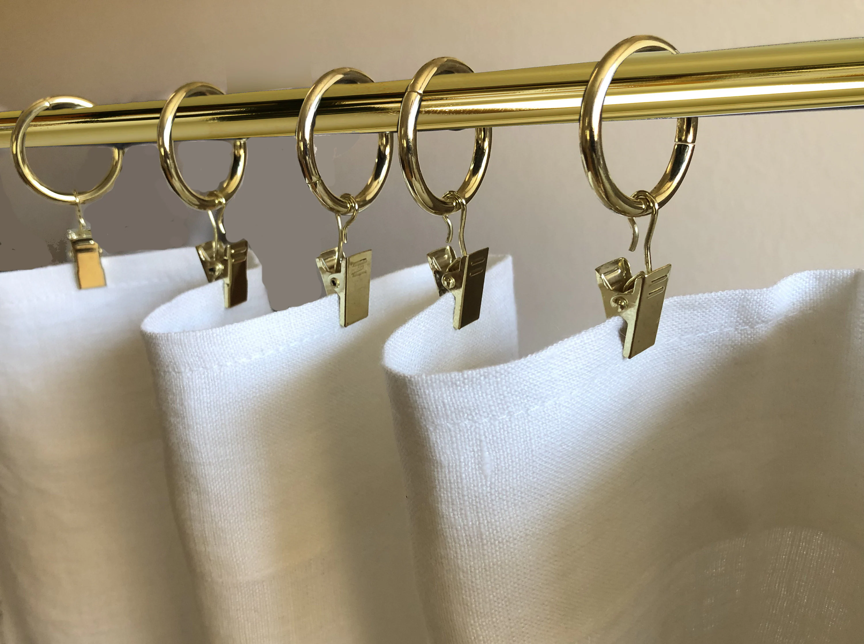
1) Tailored curtain panels on rings
This is the easiest way to get an authentic vibe quickly. Rings create neat, even folds and make panels easy to open and close. A straight, uninterrupted hang looks especially good with low-slung sofas and long credenzas.
- Best for: Living rooms, dining rooms, offices
- Style tip: Choose a rod that is slim and unfussy. Brass warms up walnut beautifully, while black feels crisp and architectural.
2) Ripple fold or simple pinch pleat drapes
If you want a more polished look, ripple fold and simple pinch pleat headings read clean and modern. They also stack back neatly so you do not lose a lot of glass when they are open.
- Best for: Large picture windows, sliding doors
- Style tip: Keep the top treatment minimal. No swags, no scallops, no elaborate headers.
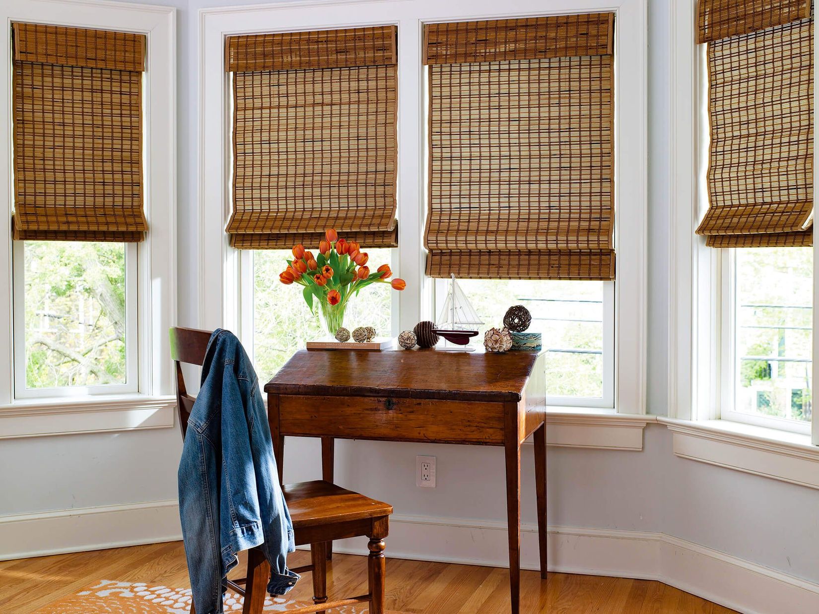
3) Woven wood shades (a texture hero)
Woven wood shades are one of my favorite ways to bridge vintage warmth and modern simplicity. They pair beautifully with teak and walnut, and they make a room feel grounded.
- Best for: Kitchens, bedrooms, sunrooms
- Style tip: Add a privacy liner if the room needs it, especially at night. You keep the texture but gain function.
4) Roller shades (clean, quiet, MCM-friendly)
Roller shades are a sleeper hit for mid-century homes. The silhouette is crisp, and they disappear when open. They are also great if you have statement furniture and you want the windows to stay visually calm.
- Best for: TV rooms, nurseries, minimalist spaces
- Style tip: Choose a slightly textured weave instead of a shiny vinyl look unless you are intentionally leaning atomic and playful.
5) Vertical blinds (the controversial classic)
Vertical blinds can look very period-correct in ranch homes and condos from the 60s and 70s, especially on sliders. The problem is cheap materials and bent slats. If you go this route, pick a higher-quality version with a softer, matte finish.
- Best for: Sliding glass doors
- Style tip: Keep the color warm and subtle so it does not look like an office.
6) Venetian blinds (aluminum or wood)
Venetian blinds can feel wonderfully retro, especially in kitchens and studies. Wood versions add warmth. Aluminum versions can lean more atomic, especially in white or champagne tones.
- Best for: Kitchens, bathrooms, offices
- Style tip: Make sure the slat size fits the scale of the window. Very narrow slats can read busy in a room full of clean lines.
Shade opacity terms
Shopping gets easier once you decode the labels. These terms are not always used perfectly by brands, but they are a helpful baseline.
- Sheer: Softens daylight and reduces harsh glare, but offers limited privacy at night.
- Light-filtering: Lets in glow while obscuring details. A good everyday choice for living spaces.
- Room-darkening: Cuts a lot of light, but typically not total darkness.
- Blackout: Designed to block most light, best for bedrooms and media rooms.
In older ranch homes with big glass, I usually start with a light-filtering shade for daytime comfort, then add panels if the room needs warmth and softness.
Fabrics that work with walnut and teak
MCM rooms love honest materials. When I am shopping, I focus on texture first, then color. Here are the fabrics that consistently feel appropriate.
- Linen and linen blends: Casual, breathable, and perfect for that sun-washed California ranch mood.
- Cotton canvas or twill: Holds its shape well for tailored panels, especially in solids.
- Wool blends: Cozy and structured for drapes, great in cooler climates or north-facing rooms.
- Sheers with a slubby weave: Better than shiny voiles. They filter light without looking formal.
- Woven natural fibers: Bamboo, grasses, and reeds in shades that echo your wood tones.
What I avoid: super glossy satin, overly ornate jacquards, and anything with a frilly or ruffled edge. Those details fight the architecture.
Color and pattern
Windows are big surfaces, which means curtain color can swing the whole room. In MCM styling, I like a “supporting actor” approach unless I am intentionally making the window treatment the statement.
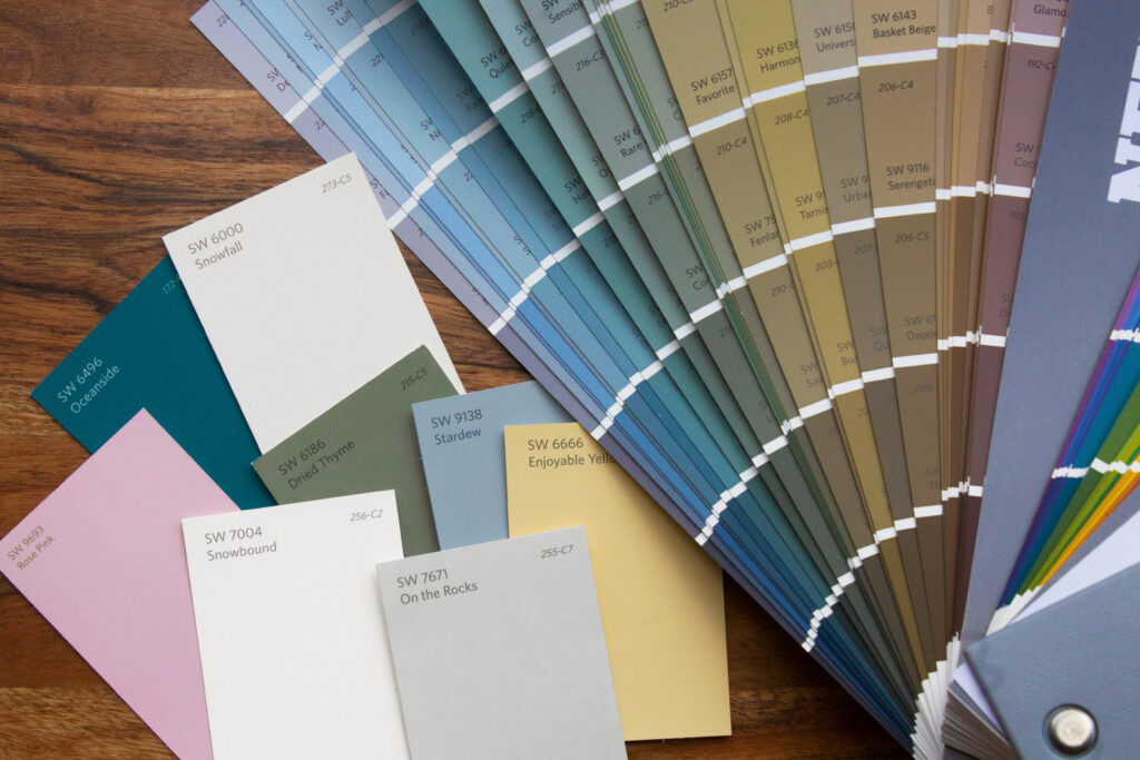
Go-to color families
- Warm neutrals: oatmeal, sand, cream, camel, mushroom, putty
- Earthy greens: olive, moss, avocado (use avocado thoughtfully and balance it with neutrals)
- Sunset tones: rust, terracotta, burnt orange, paprika
- Golden yellows: marigold, mustard, saffron
- Deep accents: teal, peacock, inky navy, espresso brown
Patterns that feel true to the era
- Geometrics: simple repeats, bold shapes, not too many colors at once
- Stripes: especially vertical stripes to emphasize height
- Abstract botanicals: stylized leaves and organic shapes, more “graphic” than “floral bouquet”
Easy pattern rule for real homes
If you already have a busy sofa fabric, a bold rug, or statement wallpaper, keep window treatments solid or subtly textured. If the room is mostly solids, let the curtains bring a little life.
Light control that still looks right
Modern life comes with modern needs. Glare on screens, neighbors close by, and bedrooms that need to go dark. You can handle all of that without losing the retro vibe.
Layering: my favorite trick
Layer a functional shade with panels for softness.
- Daytime: woven wood or a light-filtering roller shade down, panels open
- Night: shade down for privacy, panels closed for a finished look
Liners and interlining
- Privacy lining: can block silhouettes at night and helps protect fabric from sun damage.
- Blackout lining: ideal for bedrooms and media rooms.
- Thermal lining: can help with comfort near older windows, especially in ranch houses where large glass is a feature and a challenge.
Clara note from my own house: in my west-facing living room, a light-filtering roller shade under linen panels was the difference between “glowy and inviting” and “squinting through dinner.”
Kid and pet safety
If you have kids or pets, cordless shades are worth prioritizing. They look cleaner, too, which is a nice bonus in an MCM room where visual clutter shows up fast.
Hardware and hanging
You can choose the perfect fabric and still end up with window treatments that feel off if the placement and hardware are wrong. Mid-century windows often sit in simple trim, so hardware becomes part of the design.
Rod placement
- Go wider than the window: extend the rod so panels can stack mostly off the glass when open.
- Hang higher than the frame: as a starting point, I like the rod a few inches above the window trim, or closer to the ceiling if the room needs a little lift. Keep it consistent across the wall for a calmer look.
Rod style
- Streamlined metal rods: brass, bronze, black, or brushed nickel
- Minimal finials: cylinder, ball, or no finial at all
Length
For an MCM look, I like panels that either kiss the floor or hover just above it. Avoid dramatic puddling. It reads too romantic for the era.
Room-by-room picks
Living room
- Tailored linen or cotton panels plus a light-filtering shade
- Woven wood shades if you want extra warmth and texture
Bedroom
- Blackout roller shade with simple drapery panels for softness
- Solid colors or very calm patterns so the room stays restful
Kitchen
- Wood or aluminum blinds for easy wipe-down
- Simple roller shades in a washable fabric
Dining room
- Structured panels on rings in a solid or a subtle geometric
- Consider a slightly richer color to frame evening light
Sliding glass doors
- Ripple fold drapery that stacks neatly
- Higher-quality vertical blinds if you want an era-appropriate nod
Thrifting vintage treatments
I love a thrifted find, but windows are a fit-and-function situation. Here is how I approach vintage curtains, rods, and shades so I am not stuck with something that looks cool but lives in a closet.
- Look for fabric first: heavy cotton, linen, and textured weaves age better than thin synthetics.
- Check sun damage: hold fabric up to the light and look for brittle areas or fading stripes along fold lines.
- Buy longer than you need: you can hem up, but you cannot magically add length.
- Washability matters: if you cannot clean it, think twice, especially for kitchens and kid spaces.
- Vintage hardware is gold: rods, rings, and brackets often have better proportions than modern big-box sets. Just make sure you can mount them securely.
If thrifting is your happy place too, you will find more vintage shopping tips around the site in Vintage Hunting & Thrifting.
Quick cheat sheet
| Your priority | Best option | Styling note |
|---|---|---|
| Soft, airy daylight | Linen or cotton curtains | Tailored panels, streamlined rod |
| Maximum blackout | Blackout roller shade plus panels | Let the shade do the work, keep panels clean |
| Warm texture | Woven wood shades | Match tone to your wood furniture |
| Cleanest silhouette | Roller shades | Pick a subtle weave, avoid high shine |
| Easy tilt light control | Venetian blinds | Choose a slat size that fits the window scale |
| Sliding door solution | Ripple fold drapery or quality vertical blinds | Prioritize smooth stack and matte finishes |
Common mistakes
Too much fabric and fuss
Fix: swap to fewer panels, a simpler header, or a lighter fabric. Let the architecture and furniture shine.
Rods mounted too low and too narrow
Fix: widen the rod so the glass is not covered when curtains are open, and consider mounting higher to visually lift the room.
Competing patterns
Fix: choose one “hero” pattern in the room. If your rug is bold, keep curtains solid. If your furniture is neutral, let curtains bring the graphic punch.
Blinds that feel office-like
Fix: go matte, go warm, and pay attention to proportion. Many times the issue is not blinds, it is cheap sheen and the wrong scale.
Where to go next
If you are building an MCM palette that plays nicely with your window treatments, browse more ideas in Color Palettes & Styling. And if you want to see how these choices come together in a real home, I share more before-and-after thinking in Room Makeovers & Tours.
Windows are not just the backdrop. In MCM spaces, they are part of the architecture. Get the fabric, color, and proportions right, and your whole room will feel like it has been there all along.