
The first thing I fell in love with at my grandparents’ 1960s place was the entry. Not the landscaping, not the roofline. It was that confident front door, set against warm brick and a big pane of glass, like it had somewhere fabulous to be. Decades later, while fixing up my own 1958 ranch, I learned the secret: mid-century curb appeal is really just a few strong moves done on purpose, and door color is one of the biggest.
If your exterior leans classic MCM with brick, stucco, vertical siding, breeze blocks, or a low-slung silhouette, these colors can make the whole façade feel sharper, friendlier, and more authentically retro.
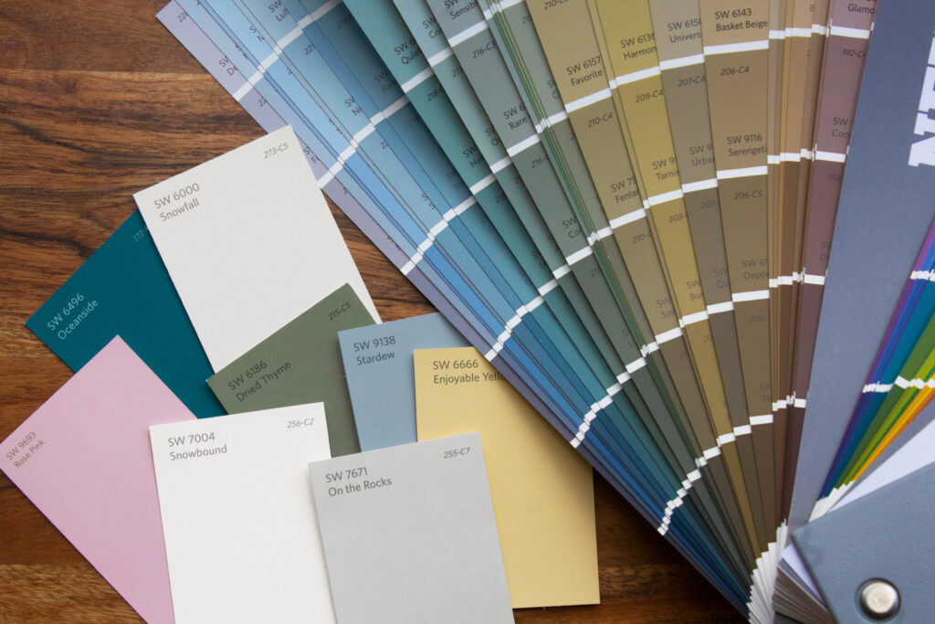
How to pick the right MCM door color
Before you fall hard for a color chip (I always do), take 5 minutes to match the door to what is already doing the heavy lifting outside.
- Brick and stone: These are busy textures, so a clean, saturated color reads crisp. Think teal, tangerine, chartreuse, or deep navy.
- Stucco: Almost anything works, but the most mid-century look comes from contrast. A pale stucco loves a bold door.
- Wood siding or strong wood tones: Either echo the warmth with ochre and nutty browns, or go opposite with cool colors like seafoam or cobalt.
- Trim color matters: White trim makes bright colors pop. Dark trim makes them moodier and more sophisticated.
- Work with the “unpaintables”: Roof shingles, driveway concrete, brick undertones, and window frame colors set the rules whether we like it or not. If those lean warm (tan brick, brown roof), warm-leaning colors like mustard, coral, or olive usually look more natural. If they lean cool (gray roof, charcoal frames), teal, cobalt, and matte black tend to look sharper.
- Sun exposure: South- and west-facing doors can fade faster, especially with bright pigments. Darker colors also tend to heat up more, which can be harder on paint films over time on some door materials. Latitude, sheen, paint quality, and even how much your eaves shade the entry all matter, so plan for a refresh if you choose a high-energy hue.
For more palette thinking, I keep a running guide to the “why” behind retro color choices in Color Palettes & Styling.
Best mid-century modern front door colors
These shades are the ones I return to again and again in my own mood boards, estate-sale fantasies, and real-life makeovers. Each one has that unmistakable mid-century confidence without feeling costume-y.
1) Bright tangerine
This is the classic “Palm Springs postcard” move. Tangerine brings energy to brick, creamy stucco, or pale gray siding. If your house has a deep eave shadow, orange keeps the entry from disappearing.
- Pairs well with: matte black hardware, simple house numbers, and a natural fiber doormat
- Best exteriors: tan brick, off-white stucco, warm gray paint
2) Seafoam green
Seafoam is sweet, airy, and very period-friendly. It reads playful but still grown up, especially when the rest of the exterior is calm and simple. If you have a lot of wood on the façade, seafoam is a gorgeous cool counterbalance.
- Pairs well with: brushed nickel or black hardware, globe porch light, a simple planter in white or charcoal
- Best exteriors: white stucco, light gray siding, honey-toned wood accents
3) Atomic teal
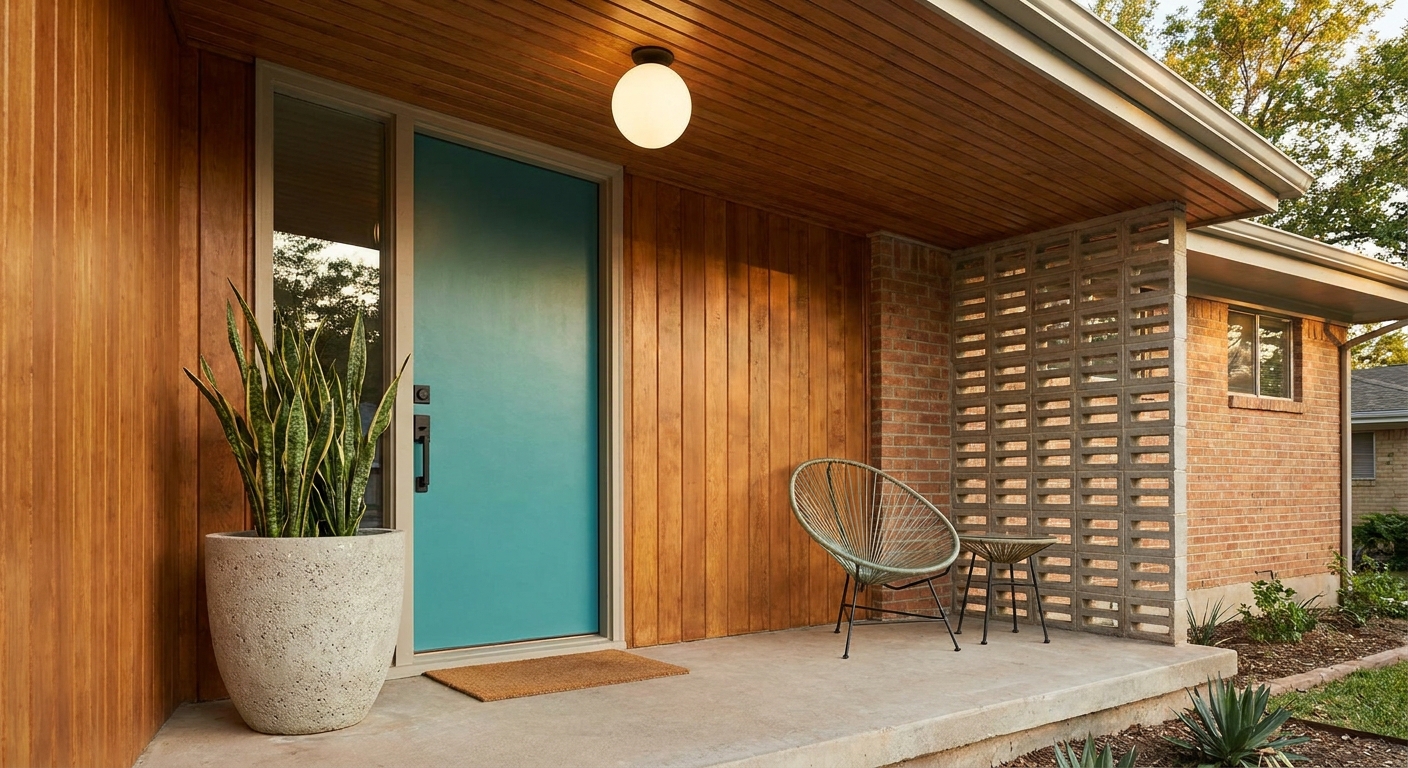
Teal is one of the most flattering “mid-century” colors because it lands between blue and green, which means it plays nicely with both warm and cool materials. It also looks fantastic next to natural stone and blond wood.
- Pairs well with: warm brass hardware, a vintage-style sconce, minimal landscaping lines
- Best exteriors: cream paint, sandy stone, blond or medium wood
4) Mustard yellow
Mustard is sunshine with some swagger. It feels right at home on a ranch house, especially if you have earthy brick or a deep overhang. The trick is to keep it more ochre than lemon.
- Pairs well with: dark bronze hardware, walnut tones, terra cotta pots
- Best exteriors: red brick, beige stucco, olive landscaping
5) Chartreuse (yellow-green)
If you want a door that looks original to the house and slightly fearless, chartreuse is it. It is bright, but it still feels organic, like it belongs alongside stone, wood, and big glass.
- Pairs well with: black hardware, crisp white trim, simple geometric welcome mat
- Best exteriors: charcoal paint, white stucco, tan brick
6) Turquoise (pool-water blue)
Turquoise is retro joy, especially on houses with a little bit of playful architecture like a breeze block wall, angled posts, or an asymmetrical entry. If you love color but want it to feel happy instead of loud, turquoise is a solid bet.
- Pairs well with: chrome or brushed metal hardware, white trim, a clean-lined bench
- Best exteriors: warm white paint, light brick, pale gray siding
7) Coral pink
Coral can be surprisingly sophisticated on an MCM exterior, especially when the rest of the palette is restrained. Think more “sun-faded desert motel” than bubblegum. It flatters tan and red brick beautifully.
- Pairs well with: black hardware, brass house numbers, warm exterior lighting
- Best exteriors: tan brick, creamy stucco, natural stone
8) Cobalt or ultramarine blue
A strong blue door feels graphic, clean, and modern while still nodding to mid-century color blocking. It is a great option if you want bold curb appeal without going neon.
- Pairs well with: brushed nickel hardware, white trim, concrete steps
- Best exteriors: white and gray exteriors, mixed stone, cooler-toned brick
9) Deep olive green
Olive is my go-to when someone wants mid-century style that feels grounded and a little quieter. It looks original on ranch houses and plays beautifully with landscaping, especially if you have mature shrubs or desert plants.
- Pairs well with: brass hardware, wood accents, warm porch light bulbs
- Best exteriors: red brick, tan stone, off-white paint
10) Espresso or walnut brown
If your house has lots of glass, beams, or wood soffits, a dark brown door can look authentic. It also lets your landscaping and hardware do the talking. I love this look with simple, sculptural handles.
- Pairs well with: long vertical pulls, warm brass, minimalist porch decor
- Best exteriors: brick, cedar siding, homes with strong wood details
11) Warm red (tomato or barn-red, not burgundy)
Mid-century red reads cheerful and welcoming, especially on houses with pale paint or tan brick. Keep it warm and clean. A wine red can skew traditional fast.
- Pairs well with: black hardware, simple planters, clean-lined light fixtures
- Best exteriors: light gray siding, tan brick, white stucco
12) Matte black
Matte black is the modernist option, but it still works in true mid-century contexts because it makes the door feel like a graphic shape. It can be forgiving about glare and minor surface texture, but it can also show dusty fingerprints or burnish where hands touch most. If you like a crisp, architectural look and do not mind a quick wipe-down now and then, it is hard to beat.
- Pairs well with: brass or brushed nickel, oversized numbers, a simple wreath alternative like a single stem arrangement
- Best exteriors: anything, especially homes with bold lines and big windows
Easy upgrades that make it look intentional
A great door color can fall flat if the surrounding details are tired. You do not need a full exterior remodel. These small changes do the most for the least effort.
- Swap the hardware: A new handle set in matte black or warm brass instantly reads more designed.
- Update your house numbers: Choose simple, mid-century-friendly shapes and give them breathing room.
- Paint the trim thoughtfully: Crisp white is classic, but matching the trim to the body color can look period-correct and lets the door take center stage.
- Add one sculptural planter: One larger, clean-lined planter often looks better than several small mismatched ones.
- Choose the right porch light: A globe or streamlined cylinder shape complements MCM architecture. If you are already thinking about lighting, browse ideas in Furniture & Lighting.
- Do not forget the screen or storm door: If you have one, it can either disappear (match it to trim or body color) or quietly frame the statement (go neutral in black, bronze, or a dark brown). Matching a screen door to a bold door color can look busy fast unless the lines are very minimal.
Quick paint tips for a durable finish
I have painted more exterior doors than I care to admit, and the difference between “fresh” and “flawless” is almost always prep.
- Clean first: Exterior doors collect invisible grime. Wash, rinse, and let it dry fully.
- Scuff sand: You want a lightly dulled surface so primer and paint can grip.
- Prime smart: If you are making a big color change, primer helps the new shade look true and last longer. If the existing finish is glossy (or it is a previously varnished wood door), a bonding primer is your best friend. You can sometimes skip primer when the existing paint is sound, deglossed, and you are staying in a similar color family.
- Use thin coats: Two to three thin coats beat one thick coat every time.
- Let it cure: Dry is not the same as cured. Be gentle with the surface for the first few days.
- Mind the weather: Avoid painting in direct hot sun, and do not paint when rain, fog, or heavy dew is expected within the dry and recoat windows on the label. Temperature and humidity change how paint levels out and how quickly it cures.
- Know your door material: Wood doors usually benefit from careful sanding, spot repairs, and sealing any bare areas. Steel doors are all about rust prevention and good adhesion. Fiberglass doors can be picky about prep and products, so it is worth checking the manufacturer guidance and using a compatible primer and exterior paint system.
Quick sheen note: Semi-gloss is a common choice for exterior doors because it is wipeable and holds up well, especially on steel and fiberglass. Satin can look a little more architectural and is great when you want color without too much shine. In harsh sun, sheen can play a role, but paint quality and UV-resistant pigments tend to matter more than chasing a specific finish.
Color pairings
| If your exterior is... | Try this door color | The effect |
|---|---|---|
| Red or tan brick | Teal, mustard, coral, matte black | High contrast that feels crisp and classic |
| White or cream stucco | Tangerine, turquoise, cobalt, chartreuse | That sunny mid-century punch |
| Gray siding or paint | Seafoam, warm red, mustard | Softens cool tones and adds warmth |
| Lots of wood details | Seafoam, teal, espresso brown | Balances warmth with cool color or leans fully organic |
| Dark exterior paint | Chartreuse, coral, turquoise | Graphic, playful, and statement-making |
FAQ
Should a mid-century modern front door be glossy or matte?
Either can work. Semi-gloss is practical and commonly used for exterior doors because it wipes clean easily. Matte or satin can look more modern and architectural, especially in black or deep colors, but it may show scuffs or burnish sooner in high-touch spots.
Do bright colors look too much on a small house?
Not if the rest of the exterior stays simple. A small façade often benefits from one bold focal point. Keep the trim clean and limit competing decor around the entry.
What if my HOA limits bold colors?
Go for mid-century mood instead of mid-century volume. Deep olive, walnut brown, navy, and a softened mustard often pass as “classic” while still feeling period-friendly.
How do I keep the look from feeling too trendy?
Pair your door color with timeless materials and shapes: simple hardware, clean-lined planters, and a porch light with a classic globe or streamlined silhouette. The architecture should do most of the talking.
One last thrift-lover tip
If you are choosing between two colors, look at your entry like it is a vignette, the same way you would style a credenza. The door is your statement piece. Everything else supports it. When I am second-guessing myself, I step back to the sidewalk and ask, “Which one looks like it could have been here in 1962?” The right color usually answers fast.
If you love adding that curated, lived-in feeling beyond the paint, my favorite ways to source era-friendly details are in Vintage Hunting & Thrifting.