
My soft spot for mid-century kitchens started in my grandparents’ 1960s place, where the cabinets were walnut, the counters were laminate, and everything somehow felt cheerful even on a gray day. Now that I’ve spent years rescuing credenzas, refinishing teak, and nudging my own 1958 ranch house closer to its roots, I’ve learned one reliable truth: the most convincing mid-century kitchen makeovers come from color choices that respect the era’s balance.
Mid-century kitchens were playful, yes, but they were not chaotic. Pastels had breathing room. Bolder colors showed up in smaller, high-impact doses. And warm wood did the heavy lifting of grounding the whole room. Let’s talk palette ideas and the practical steps that keep the look cohesive.
How mid-century kitchen color works
When people say “retro kitchen,” they often picture one loud color everywhere. But in the 1950s and 60s, kitchen color more commonly followed a simple structure, especially in homes with warm wood, laminate (including boomerang and metal-edged looks), linoleum-style floors, and the occasional pastel appliance:
- Base: warm wood cabinetry or a quiet neutral (cream, soft white, pale greige).
- Main color: one dominant hue, often a pastel or a muted midtone.
- Accent: one punchier color used sparingly (backsplash, stools, runner, small appliances).
- Metals: chrome, polished nickel, and painted or enameled metals tend to read most period-typical. Stainless can work as a practical modern update, especially when you keep the shapes simple.
Also, a quick reality check that makes this easier: mid-century kitchens varied a lot by region, builder, and budget. Not every house had pastel appliances or a colorful tile moment. Plenty were neutral and wood-forward, which is great news if you want the vibe without the theme-park energy.
If your kitchen already has warm wood cabinets, you are halfway to “retro” before you buy a single tile.
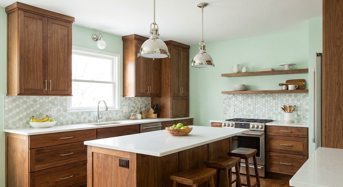
Palette 1: Mint + Cream + Walnut
If you want a kitchen that feels like it could have stepped out of a 1960s magazine spread but still lives well in 2026, this is the one. Mint is cheerful and clean, cream keeps it soft, and walnut brings that cozy mid-century warmth.
Where to use each color
- Mint: paint, a vintage-style fridge, or even just bar stools if you want a smaller commitment.
- Cream: walls, upper cabinets (if you are painting), counters, or backsplash grout color.
- Walnut: cabinetry, open shelving, or a wood range hood surround.
My cohesion trick: keep mint on one “plane” of the room. For example, mint on walls and cream on backsplash. If mint shows up on walls, backsplash, and accessories all at once, it can start to read like a nursery rather than a kitchen.
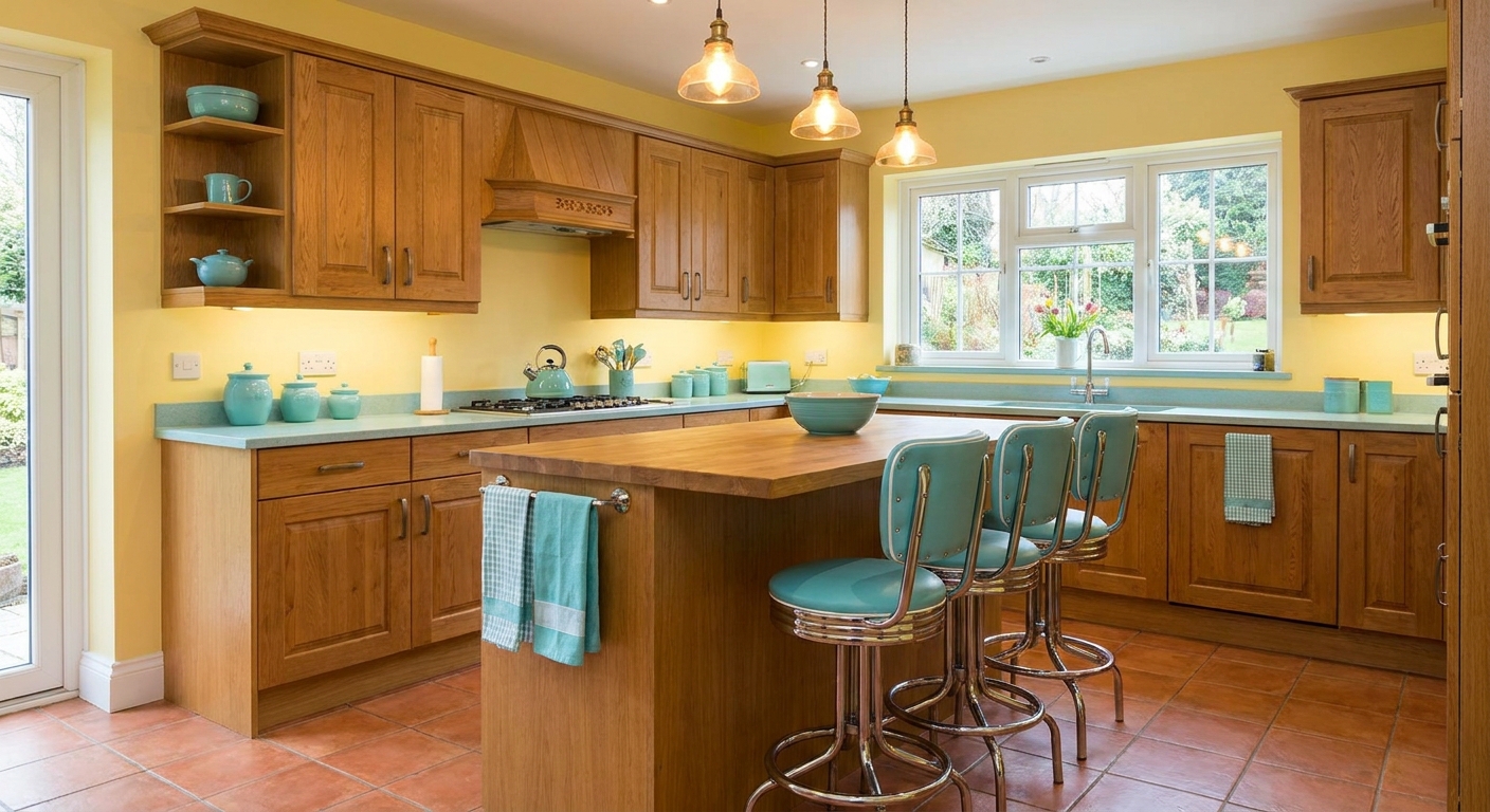
Palette 2: Butter Yellow + Aqua + Medium Oak
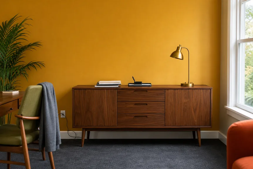
Butter yellow feels like weekend pancakes. Paired with aqua, it leans unmistakably mid-century, especially when the wood tone is medium and a little honeyed.
Actionable ways to pull it off
- Choose butter yellow as the wall color if your cabinets are staying wood. It warms everything up without making the space feel smaller.
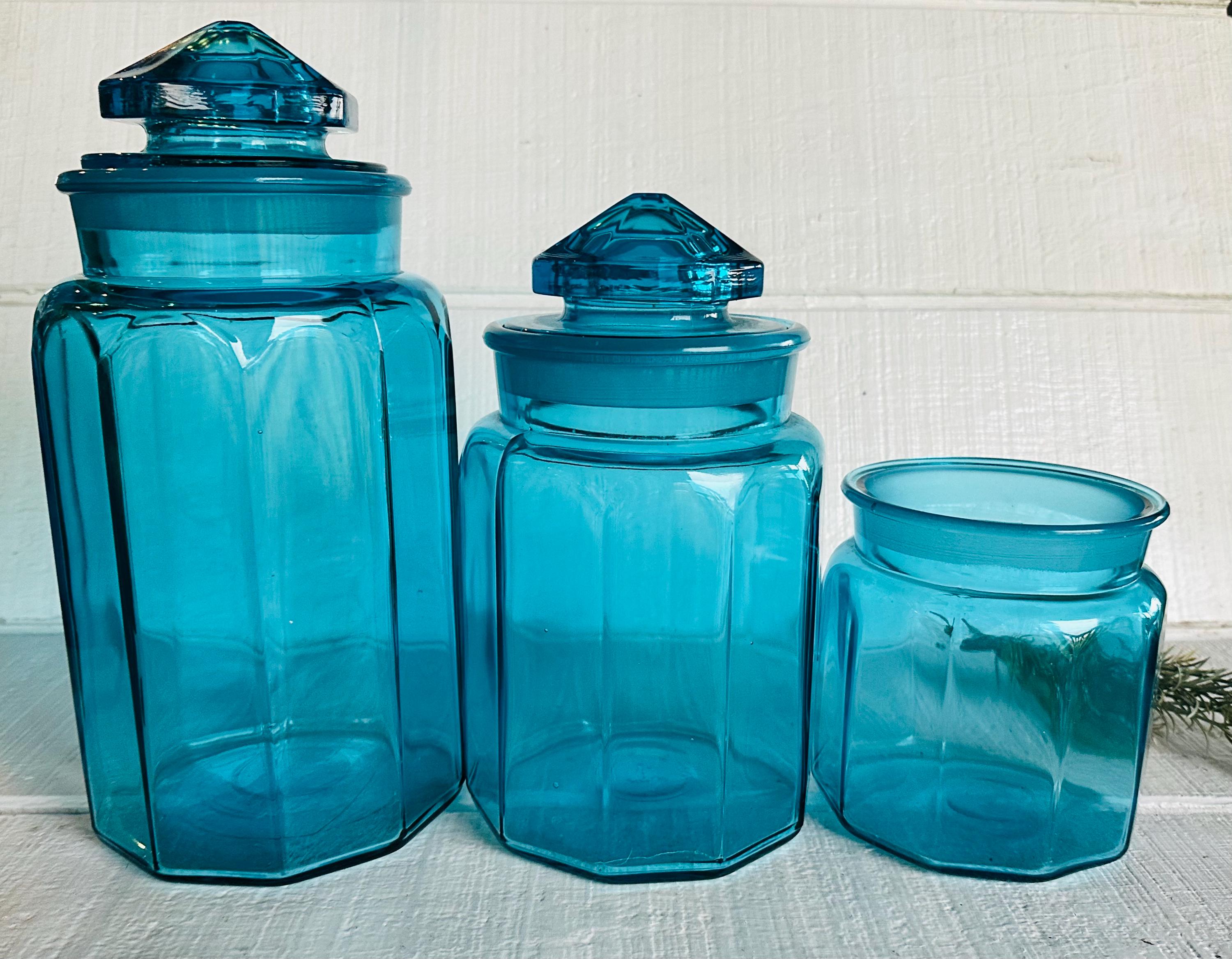
- Use aqua on a backsplash strip, vintage glassware on open shelves, or a small appliance lineup on the counter.
- Repeat the wood tone at least twice: cabinets plus a cutting board collection, floating shelves, or a dining table nearby.
Palette 3: Salmon Pink + Warm White + Brass
Salmon and blush tones were a real thing in mid-century interiors, and kitchens can wear them beautifully when you keep the supporting cast warm and simple.
Best placements
- Salmon pink: backsplash tile or a painted island, rather than every wall.
- Warm white: perimeter walls and ceilings to keep the room from feeling too sweet.
- Brass: cabinet hardware and a pendant light to add grown-up polish.
Finish note: in kitchens, satin or eggshell is my go-to because it reads classic and it wipes down easily. Ultra-matte can look beautiful too, but it is less forgiving around splatters and scuffs.
Palette 4: Avocado + Terracotta + Teak
If your taste leans more “California ranch house” than “space-age diner,” go earthy. Avocado green and terracotta feel grounded, especially next to teak or walnut.
Make it feel intentional
- Choose one of the two colors to dominate. I like avocado as cabinetry or walls, terracotta as the accent.
- Keep counters calm: warm off-white, cream, or a subtle speckle that does not compete.
- Add black in tiny doses (faucet, pulls, or a single light fixture) to sharpen the palette.
This palette is a natural fit if your home already has mid-century window lines and warm trim. If you need ideas for keeping the whole house cohesive, I keep a running list of styling approaches in Color Palettes & Styling.
Palette 5: Turquoise + Tomato Red + Maple
This combo is pure retro pep. The key is scale. If you want a bold backsplash, keep the rest of the room quieter so the tile gets to be the “jukebox” in the corner.
A simple ratio that works
- 70%: maple or light-to-medium wood and a soft neutral.
- 25%: turquoise (backsplash or painted island).
- 5%: tomato red (counter stools, canisters, a single vintage print).
Note: think of 70/25/5 as a sanity check, not a strict math assignment. If it feels balanced to your eye, you are doing it right.
My favorite move: use tomato red on items you can swap easily. If you fall out of love with red in a year, you do not want to be chiseling out tile.
Bold backsplash tips
A backsplash is where a kitchen makeover can tip from “authentic retro charm” into “busy trend wall.” Here are the guidelines I use in my own projects:
- Pick one visual story: either a strong color or a strong pattern. Both together can feel visually noisy.
- Watch undertones: warm wood wants warm-leaning whites and creams. Cooler whites can make walnut look dull or gray.
- Repeat the backsplash color elsewhere: one small echo is enough. A dish towel, a rug stripe, or a single piece of art keeps it cohesive.
- Mind the grout: grout color is the quiet co-star. A softer grout often reads more period-leaning than a bright, high-contrast grid, but it depends on the tile and the look you want.
If you love that crisp graphic look, focus on simple shapes like rectangles, squares, or a clean geometric that nods to the era without turning into a visual circus.
Wood cabinets and color
Wood is your anchor, but wood has an undertone that matters. Here’s how I “read” cabinets before committing to paint or tile:
- Walnut and teak: look best with creamy whites, muted greens, dusty blues, and warm pinks.
- Orange-leaning oak: loves butter yellow, warm aqua, terracotta, and softer warm whites.
- Maple: plays nicely with brighter pastels, turquoise, and tomato red accents.
Quick reality check: if your wood is staying, avoid icy gray paint. Gray can flatten mid-century warmth fast. If you want a neutral, choose a warmer off-white or a barely-there beige.
Counters and floors
This is the part people forget until the samples are spread all over the kitchen. Counters and floors set the “noise level” of the room.
- If you have busy granite or strong stone movement, keep wall color quieter and let your retro color show up in smaller accents.
- If your counters are calm and solid (laminate, butcher block, simple quartz), you can push color harder on the walls or backsplash.
- If your floor is high-contrast (checkerboard, strong pattern, dark grout grid), keep the backsplash simpler so they are not competing.
My low-risk color test
I have made enough “bold choice” mistakes to respect testing. Here’s the order that saves money and heartbreak:
- Start with what cannot change easily: cabinets, floors, counters.
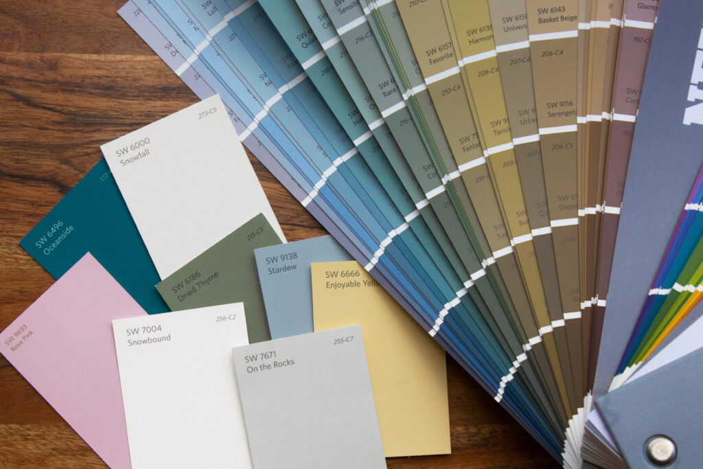
- Test paint in at least two spots: one near a window, one in a shadowy corner.
- Bring the backsplash sample vertical: prop it against the wall, because the angle changes how gloss and color read.
- Check it morning and night: mid-century palettes can shift dramatically under warm bulbs.
Lighting tip: if you want your kitchen to stay warm and flattering, aim for bulbs around 2700K to 3000K, and try to keep the temperature consistent across fixtures. Mixing very cool and very warm light is where good paint choices go sideways.
When I’m working through a palette, I also pull fabrics and window treatments early. A curtain with the wrong undertone can throw off a whole kitchen. If you’re updating windows too, Mid-Century Modern Window Treatments can help you keep the era vibe without blocking light.
Retro color without remodeling
You do not need to gut your kitchen to get that mid-century feeling. Some of the best retro cues are small and reversible.
- Paint just the island in a pastel or avocado tone.
- Swap hardware to warm brass or simple chrome pulls.
- Add a color-block runner that repeats your accent hue.
- Style open shelves with a tight palette of glassware, stoneware, and wood.
- Thrift your accent color through canisters, Pyrex-style bowls, and vintage linens.
My happiest kitchens are the ones that feel collected, not purchased all at once. If you’re building your palette through secondhand finds, I share my best tactics in Vintage Hunting & Thrifting.
Quick palette cheat sheet
| Vibe | Best base | Main color | Accent idea |
|---|---|---|---|
| Classic cheerful | Walnut + cream | Mint | Chrome stools or mint small appliances |
| Sunny family kitchen | Medium oak + warm white | Butter yellow | Aqua backsplash strip or textiles |
| Soft glam 60s | Warm white + wood | Salmon pink | Brass hardware and a simple pendant |
| Earthy organic modern | Teak + cream | Avocado | Terracotta pottery and warm lighting |
| Playful statement | Maple + neutral | Turquoise | Tomato red accessories |
When it feels off
1) The wood looks too orange
Lean into it with warm whites and buttery tones, and avoid cool grays. Add texture like woven shades or a warm runner so the orange does not feel lonely.
2) The pastel feels too sweet
Add contrast with black or deep walnut in small doses, and choose more grounded textiles (think oat, cocoa, or charcoal) rather than bright white everything.
3) The backsplash dominates the room
Quiet the surrounding choices. Keep wall color simple, reduce counter clutter, and repeat the backsplash color only once elsewhere.
Closing thoughts
A mid-century modern kitchen is not about recreating a showroom. It’s about that particular brand of optimism the era did so well: warm wood, clean lines, and color that makes you want to put on a record while the coffee brews.
If you choose a base that feels calm, let one color take the lead, and use your boldest choices where they’re easiest to edit later, you’ll end up with a retro palette that feels authentic and livable.