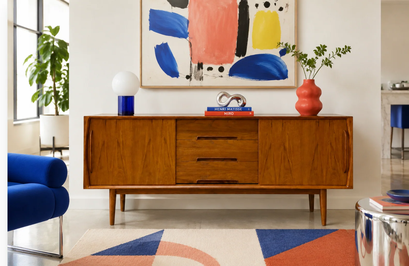

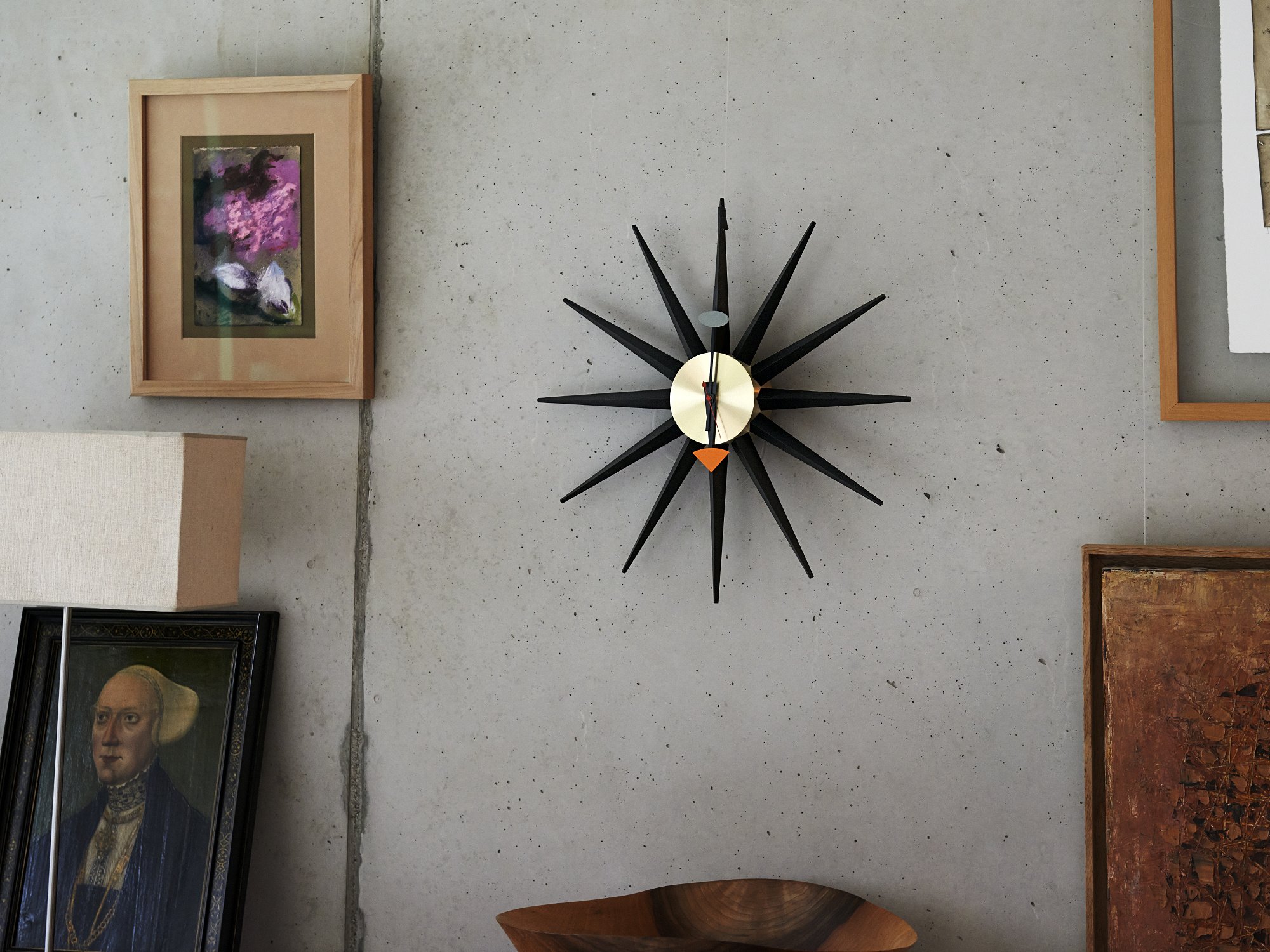
The first thing I ever “collected” for a wall was a sunburst clock, the kind that looks like it should be ticking away above a walnut console while a record spins somewhere nearby. Mine came from an estate sale, wrapped in yesterday’s newspaper and optimism. I got it home, held it up, and immediately realized the hard truth about a good wall moment: one great piece is gorgeous, but a group of great pieces is where the magic happens.
A mid-century modern gallery wall is not just “frames in a cluster.” It is a little design time capsule where warm woods, confident negative space, and punchy graphic art can all coexist. Here is how I curate and hang one that feels intentional, balanced, and very MCM, without needing a museum budget.
Start with the ingredients
Mid-century gallery walls look best when they combine a few distinct object types, not just art. I think of it like building an outfit: one statement piece, a couple classics, and a little sparkle.
My favorite mix for a true mid-century vibe
- One sunburst clock (or one starburst style object) as the sculptural anchor
- Two to four abstract and geometric prints for color and movement
- One to two typography pieces like retro travel posters, exhibition-style type, or simple block lettering
- One “object” piece such as a small brass wall sculpture, a ceramic tile, a shadowbox, or a shallow vintage tray
If you want this to read as mid-century rather than generic eclectic, keep the shapes clean and the lines confident. Curves are welcome, but I usually skip overly ornate details that steer it toward Victorian or farmhouse territory.
For more general styling ideas that pair well with wall moments, I keep a running inspiration list in Color Palettes & Styling.
Pick a color story first
This is the part that makes a gallery wall feel “curated” instead of “everything I own is on this wall.” Many mid-century palettes work especially well with a warm base and a controlled pop, but consider that a helpful starting point, not a law.
Easy palette formulas I lean on
- Walnut and cream (base) + teal (pop) + brass (accent)
- Teak and white (base) + rust or burnt orange (pop) + black (anchor)
- Black and natural wood (base) + mustard (pop) + olive (support)
- Warm neutrals (base) + cobalt (pop) + gold (accent)
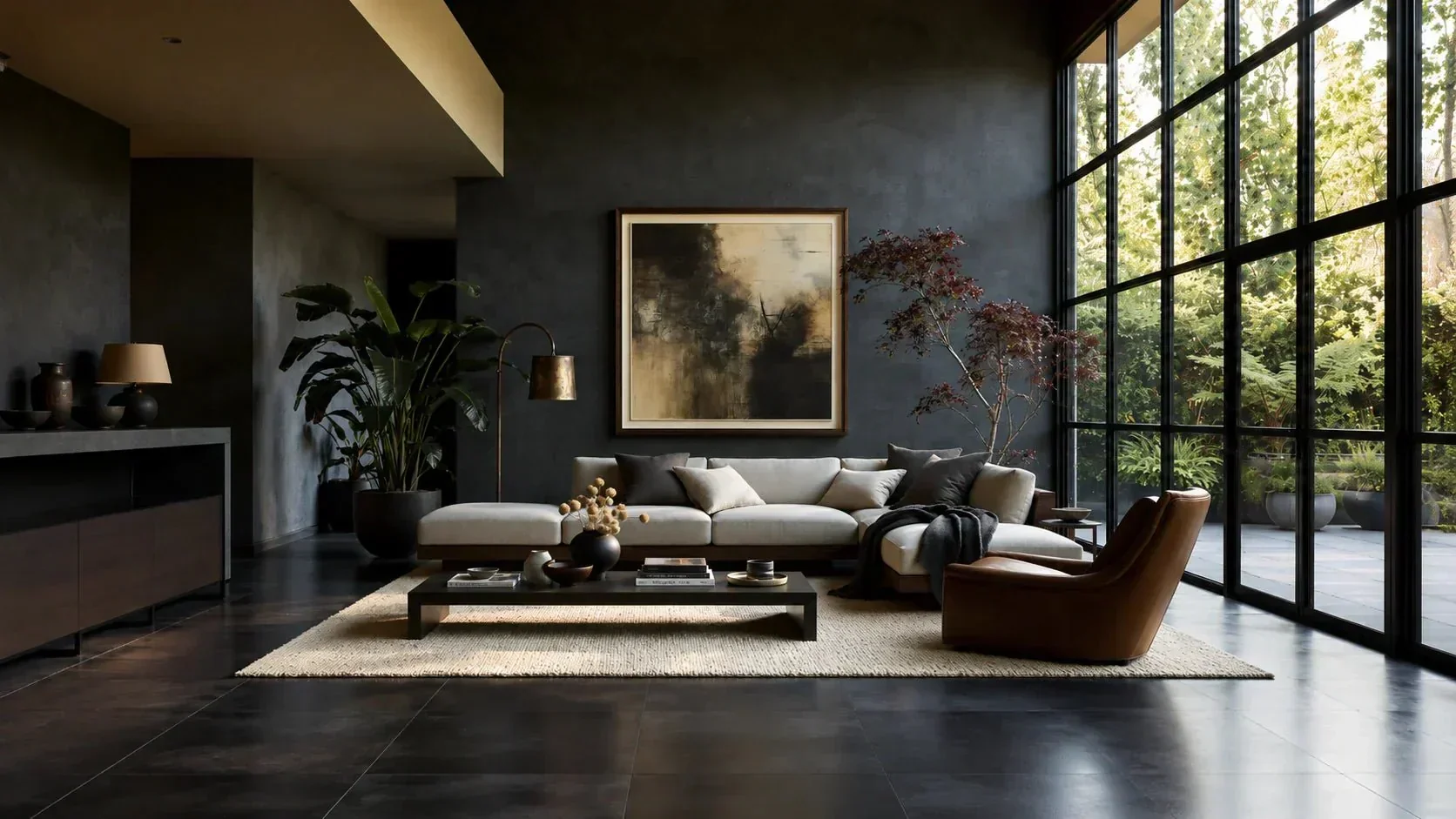
If you are deciding between a moodier earth-tone wall and a punchier jewel-tone wall, I broke down the tradeoffs and where each tends to look best in Earth Tones vs. Jewel Tones in Mid-Century Style.
A tip I use constantly
Pick two main colors you want to see repeated across the wall. Then let everything else be supporting neutrals. Repetition is what makes a mixed wall feel cohesive.
Thrift with a plan
I thrift constantly, which means I am always flirting with the “too much good stuff” problem. The secret is not to stop bringing pieces home. It is to bring home pieces that play well together, and to edit ruthlessly once you are back in your own space. If it helps, decide on a rough “wall plan” first, then rotate extras in and out seasonally instead of crowding the wall.
What I look for at estate sales and thrift shops
- Frames with honest wood tones: walnut, teak, oak, or even faux bois that reads warm from a few feet away
- Matting opportunities: slightly odd sizes can look elevated with a clean mat
- Prints with bold shape language: arcs, blocks, atomic boomerangs, tapered forms
- Typography that feels period-correct: simple sans serif, condensed type, or playful mid-century display fonts
- Patina that is hard to fake convincingly: small scuffs on a brass piece or slight age toning on a frame reads as charm, not damage
If you love the hunt side of this hobby, you will feel right at home in Vintage Hunting & Thrifting.
Get the scale right
This is the quiet difference between “nice stuff on a wall” and “oh, that looks designed.” Before you obsess over the exact layout, check the overall size of the grouping against the furniture below it.
Two scale guidelines I use
- Over a sofa or credenza: I usually aim for the gallery wall to span about two-thirds to three-quarters of the furniture width. It is a flexible rule of thumb, but it keeps things from looking either tiny and lost or oddly overgrown.
- One strong anchor: include at least one piece that reads as “large” in the arrangement, whether that is a bigger frame, a bold clock, or a chunky object. It gives the eye a place to land.
Plan the layout
Mid-century rooms often feel airy, even when they are full of personality. That is why gallery walls in this style tend to have more breathing room than a maximalist salon wall.
Pick one layout style
- Organic cluster: varied sizes, visually balanced, easiest for mixing clocks and objects
- Grid-ish: still relaxed, but more structure, great for mostly frames
- Linear band: a long horizontal run above a credenza or sofa, very architectural
Spacing starting points
- 2 to 3 inches between frames for a clean, intentional look
- 3 to 5 inches around a chunky object like a sunburst clock so it can “sparkle” without crowding
- 6 to 8 inches above a credenza or console as a common sweet spot
These are starting points, not commandments. Ceiling height, furniture height, and how tall your art is can nudge those numbers up or down.
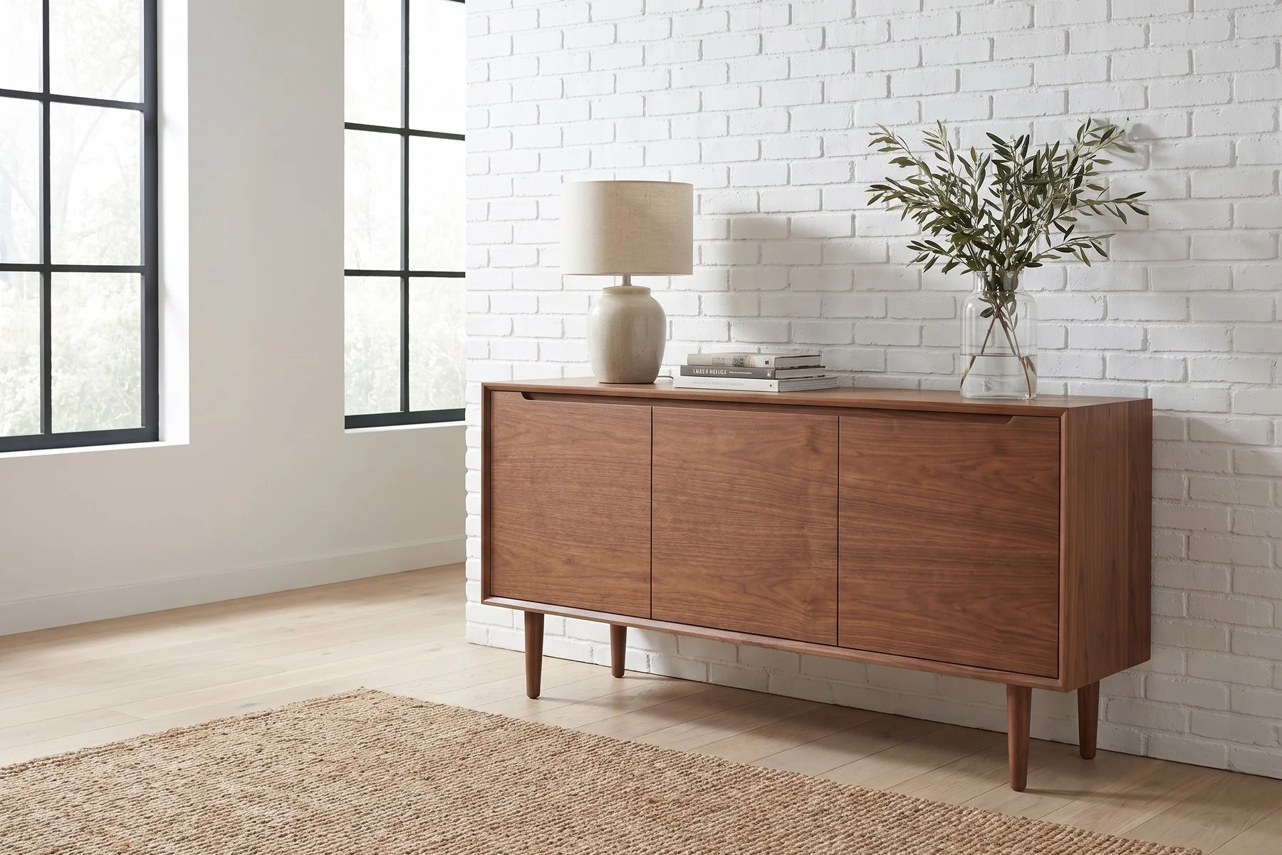
If your gallery wall is going above a credenza, the scale relationship matters. I walk through that whole balancing act in How to Style a Mid-Century Credenza With Vintage Decor.
My paper-planning method
- Trace each frame and object on kraft paper or plain packing paper.
- Cut them out and label the back with the piece name and an arrow for “top.”
- Tape the paper shapes to the wall and adjust until it feels right from across the room.
- Mark hanging points on the paper where hooks will go.
This method is especially helpful for odd pieces like clocks, where the hanging point is rarely at the top.
Hang at the right height
If you have ever walked into a room and thought, “Why does that wall feel tense?” it is often hanging height. A simple place to start is to aim the visual center of the overall grouping around 57 to 60 inches from the floor, which tends to land near average eye level.
Above furniture, I treat that as a reference, not a rule. If the wall is above a credenza or sofa, the better goal is that the art feels connected to the piece below it, not floating halfway to the ceiling. That is where the “6 to 8 inches above” guideline can help.
Place the sunburst clock
A sunburst clock is basically jewelry for your wall. But because it is round and spiky, it can either anchor the arrangement beautifully or make everything else look like it is orbiting awkwardly.
Three placements that usually work
- Off-center anchor: place the clock slightly left or right of the cluster’s center, then balance the opposite side with a larger frame
- Top-corner sparkle: tuck it near the upper left or upper right of the grouping to lift the eye
- Side companion: position it just outside a rectangular frame cluster, like a sculptural punctuation mark
Two things to avoid
- Perfect bullseye center placement unless everything is symmetrical. Otherwise it can feel like a target.
- Crowding the rays with frames placed too close. Give the points room so they read as a shape.
Frames and mats
These walls often shine with a mix of walnut frames, black frames, and a little brass. The trick is to limit the total finishes so your eye can relax.
A simple finish ratio I like
- 60% warm wood frames
- 30% black or dark brown frames
- 10% metal accents (brass, gilt, or brushed aluminum)
Matting tips that elevate thrifted art
- Choose white, warm white, or light oatmeal mats for that clean gallery feel.
- Use the same mat color across multiple pieces to unify mismatched frames.
- Do not be afraid of generous mat borders. Mid-century presentation often looks best with breathing room.
Hardware and safety
I have rehung the same wall more times than I care to admit. What finally made it painless was treating hanging like a system, not a guessing game.
What I use most often
- Picture hooks rated for the weight of the piece
- Wall anchors for anything heavy if a stud is not available
- Bumpers on the bottom corners of frames to keep them from shifting
- Painter’s tape for marking level lines and centers
Two tips that save your sanity
- Use two hooks for wider frames so they do not tilt when you walk by.
- Hang to a shared baseline when possible. Even an organic cluster feels calmer when the bottom edges loosely align.
For heavier clocks and metal pieces, I stick with proper hooks and anchors rather than adhesive strips. Removable strips can be great within their weight limits, but a heavy clock is not the moment to test them.
Finish the look
Once everything is up, step back and look at it the way a guest would: from the doorway, from the sofa, and from the far corner of the room. Gallery walls are about rhythm.
Quick fixes I do before I call it done
- Swap two pieces if one side feels visually heavier. Often it is a single dark frame causing the imbalance.
- Add one small piece if there is an empty pocket that looks like a missing tooth.
- Pull one color through with a small typography print or tiny abstract that repeats a hue already present.
- Check glare by turning on lamps and overhead lights at night. If glare is bad, move that piece or use non-glare glazing when you reframe.
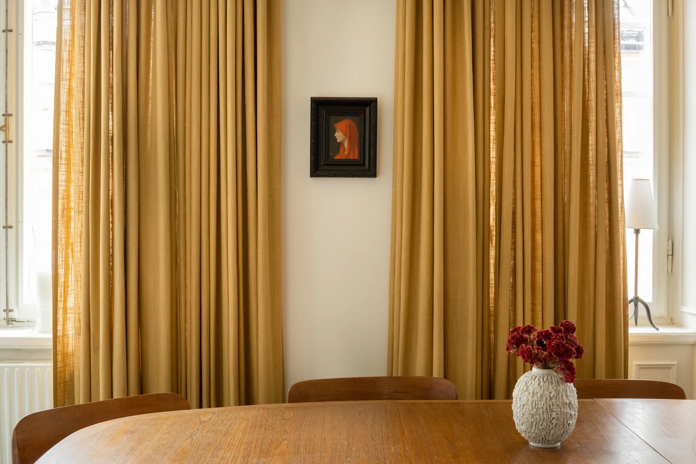
And if your wall is near a window, remember that your window treatments act like a “frame” for the entire scene. I love pairing a gallery wall with simple, structured treatments, especially in a 1950s or 1960s home. More on that in Mid-Century Modern Window Treatments.
Three wall recipes
1) Classic walnut and brass
- 1 sunburst clock in brass or gold tone
- 2 abstract prints with cream backgrounds
- 1 black-and-white typography print
- All frames in walnut or black
2) Playful pop-color
- 1 clock with bold rays or colored face
- 2 geometric prints featuring teal, mustard, or orange
- 1 small sculptural wall piece (brass, ceramic, or wood)
- Mix of black frames and lighter wood frames
3) Quiet and earthy
- 1 warm metal clock, slightly aged
- 3 prints in rust, olive, and tan
- 1 typography piece in dark brown or black
- Mostly teak and oak frames, minimal black
Common issues
It looks cluttered
Spread pieces out by an inch or two, or remove one small item. This style tends to love negative space.
It looks like floating dots
You likely need a stronger anchor. Add a larger frame, or move the largest piece closer to the center of the grouping.
The clock feels random
Give it more breathing room, then repeat its finish once elsewhere with a small brass frame or object.
The colors feel off
Choose one print that matches your intended palette and rebuild around it. Sometimes the fix is simply editing out one “almost right” piece.
My final check
I take a photo of the wall and turn it black-and-white. If the balance of light and dark looks calm, the arrangement will usually feel calm in real life, too. Then I put the phone down, let the clock tick, and enjoy the fact that a handful of thrifted finds can make a room feel like it has a story.
If you want to learn more about why certain pieces read as atomic versus organic, or how to mix eras without losing that vintage soul, you can always browse the rest of the articles on Century Hue or head straight to Color Palettes & Styling.