
The entryway in my 1958 ranch used to be a classic nothing-space. A slice of wall, a too-small rug, and that awkward feeling of walking straight into the living room like you are interrupting your own house. I wanted an arrival moment, the kind my grandparents had in their 1960s home: a hint of separation, warm wood, and just enough structure to make the rest of the room feel intentional.
That is where the slat wood divider came in. A vertical screen does three very mid-century things at once: it defines a zone, adds architectural rhythm, and makes even a simple console table look curated instead of temporary. Here is how I planned, built, and styled a bold first impression that still feels airy and livable.
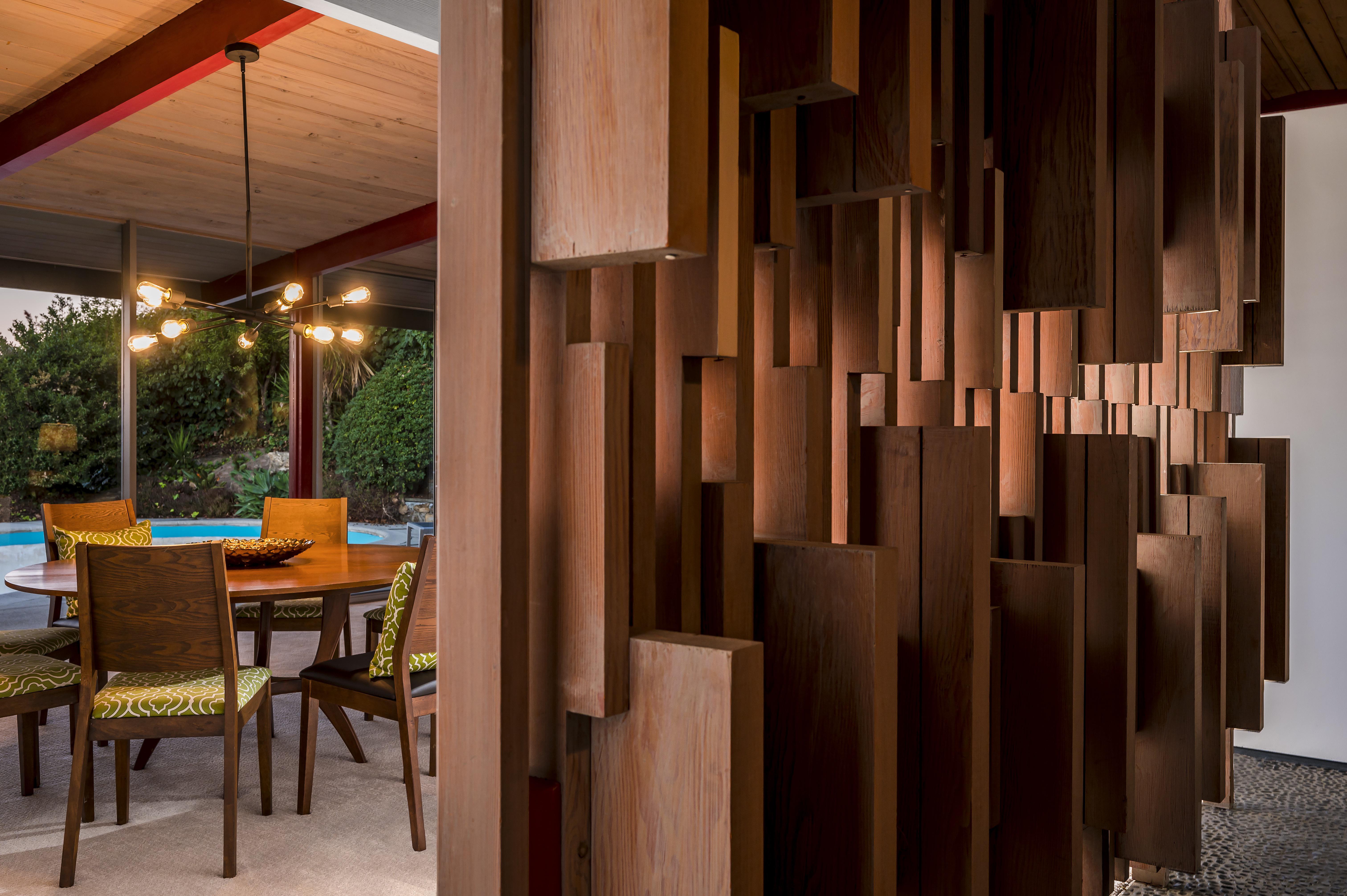
The goal: light separation
Mid-century interiors love a visual boundary. Not a heavy wall, but a suggestion of one. Slat dividers, open screen walls, and airy partitions often show up in 1950s and 1960s layouts, especially between an entry and a living area, because they keep sightlines open while still giving each zone its own purpose.
Before you build anything, decide which problem your entryway needs to solve:
- No defined landing zone: You need a spot for keys, bags, and shoes that looks finished.
- Front door opens straight into the living room: You want a little privacy and a calmer first view.
- Long blank wall feels flat: You need vertical texture and a strong focal point.
- Small space feels cluttered fast: You need restraint in furniture and styling, not more storage bins.
For my house, it was mostly the second and third. The divider created a clean pause between the front door and the seating area, and it turned a plain wall into a feature that reads architectural, not decorative.
Pick your divider type
Before you get attached to a specific look, decide what you are actually building. Slat dividers usually fall into three entry-friendly categories:
- Feature panel: Slats mounted flat against a wall to add texture behind a console. It is the easiest build and does not change traffic flow.
- Perpendicular partition: A slat screen that projects out from a wall to carve out a foyer pocket. This is the classic entry zoning move.
- Freestanding screen: A movable divider (or one anchored only at the floor). I love the flexibility, but it has to be heavy and stable enough to feel safe in a real entryway.
I went with a perpendicular partition because I wanted that little moment of separation without closing anything in.
Planning the divider
Place it for real life
The most convincing slat walls feel like they belong to the floor plan. A few placement options that tend to work well:
- Perpendicular to the wall near the entry: Creates a small foyer pocket while keeping the room open.
- Parallel to the wall as a feature panel: Adds texture behind a console when you do not need true separation.
- Half divider with a console in front: Lets furniture do some of the zoning work without crowding the walkway.
Walk the route from the front door to the next room and make sure you are not forcing a tight turn with groceries in hand. If you cannot comfortably pass with a laundry basket, the divider is too deep into the path.
Clearance rule of thumb: I try to preserve about 36 inches of clear walking path as a starting point. Older homes vary, so treat that as guidance, not gospel. If your space is tighter, go with wider slat spacing and a shallower console so the area still feels breathable.
Mock it up with tape
I am a huge believer in mocking things up full-scale before buying lumber. Use painter’s tape to mark:
- Total divider width (how much visual screen you want)
- Height (more on that below)
- Depth if you are building a perpendicular or freestanding divider
In mid-century-inspired spaces, vertical slats look best when they feel continuous and intentional. If you want an architectural, built-in feel, aim near the ceiling, usually within 2 to 6 inches, or go full-height if your construction method allows. If you have beams, a soffit, or a ceiling detail, stopping just below that line can look original on purpose.
Height and spacing that look right
Spacing is what makes slats look crisp instead of chaotic. These are common DIY ranges, and the best choice depends on slat width and the overall divider width:
- 3/4 inch to 1 1/2 inches between slats: tighter and more refined
- 1 1/2 inches to 3 inches between slats: breezier and more open
When in doubt, slightly wider spacing reads calmer in an entryway, especially if you plan to hang art or a mirror nearby.
DIY build overview
There are a dozen ways to construct a slat divider, but the most stable and least fussy method for an entry is a top and bottom rail system that the slats attach to. Think of it like a minimalist fence panel, refined for indoors.
Materials for the look
- Wood for slats: clear pine, poplar, or oak depending on budget and finish goals
- Top and bottom rails: same species as the slats for a seamless look
- Fasteners: wood glue plus finish nails or trim screws (hidden where possible)
- Finish: stain and clear coat, or paint for a graphic divider
- Optional: felt pads or rubber isolators where the divider meets the floor if you are protecting hardwood
If you are trying to match vintage walnut tones, consider using a stain that leans warm rather than gray. My personal test is simple: if the sample looks like iced coffee instead of cocoa, it is too cool for most mid-century palettes.
Tools that make it smoother
- Measuring and layout: tape measure, pencil, speed square
- Find structure: stud finder (and a way to mark studs and ceiling joists)
- Cutting: miter saw or circular saw with a straightedge guide
- Keeping it straight: 4-foot level (or laser level if you have one)
- Assembly: drill driver, finish nailer or hammer, clamps if you have them
- Finishing: sander or sanding block, tack cloth, good brush or foam roller
Construction steps (high level)
- Plan your anchoring points: Before you cut, confirm where studs and ceiling joists are so your rails land where they can be secured.
- Install the rails first: Establish a dead-straight top and bottom line. If the rails are off, every slat will advertise it.
- Cut all slats at once: Consistent length is what makes the whole thing look like millwork.
- Set spacing with a scrap spacer: Cut a small block of wood to your gap size and use it between each slat.
- Attach slats: Glue plus nails or screws gives strength and reduces squeaks.
- Sand, then finish: It is easier to get a clean finish when edges are smooth and dust is controlled.
Safety and stability note: In a high-traffic entry, treat the divider like a permanent architectural feature. Anchor into studs and, if applicable, ceiling joists. Also, do not place a divider where it narrows or blocks a required path of travel to and from exterior doors. If you are unsure what is required in your home, keep the design lighter, wider-spaced, and out of the direct door swing and main walkway.
Baseboards and trim: the real-life snag
Baseboards can throw off that clean, built-in look fast. You have a few options, and which one feels best depends on how permanent you want the divider to be:
- Scribe around the baseboard: Clean and intentional, especially for a perpendicular partition that meets a wall.
- Remove a small baseboard section and patch later: Best for a true built-in look, but it is more commitment.
- Mount proud of the trim: Works for feature panels where the slats sit slightly off the wall, but it reads more like decor than architecture.
Paint vs stain
Both work, but they signal different vibes:
- Stained wood: warmer, more 1950s den, especially paired with brass and ceramics.
- Painted slats: crisp and graphic, great if you want a Palm Springs feel or a more modern twist.
If you love color but want the wood to stay the star, keep the divider stained and bring color in through a runner, art, or a front door update. If you are choosing a bold exterior color, I rounded up options in Best Mid-Century Modern Front Door Colors.
Finish for durability
An entryway is hard on surfaces. If you stain, I recommend sealing with a clear topcoat that can handle scuffs and frequent wipe-downs. Water-based poly stays clearer and tends to keep warm stains from going too amber. Oil-based poly warms the tone more. Either way, let the finish cure fully before you treat the divider like a coat rack stand-in. Dry is not the same as cured.
Style the entry
Once the divider is up, the styling should feel intentional but not precious. A mid-century entryway works best when it is edited. A few pieces, each with a job.
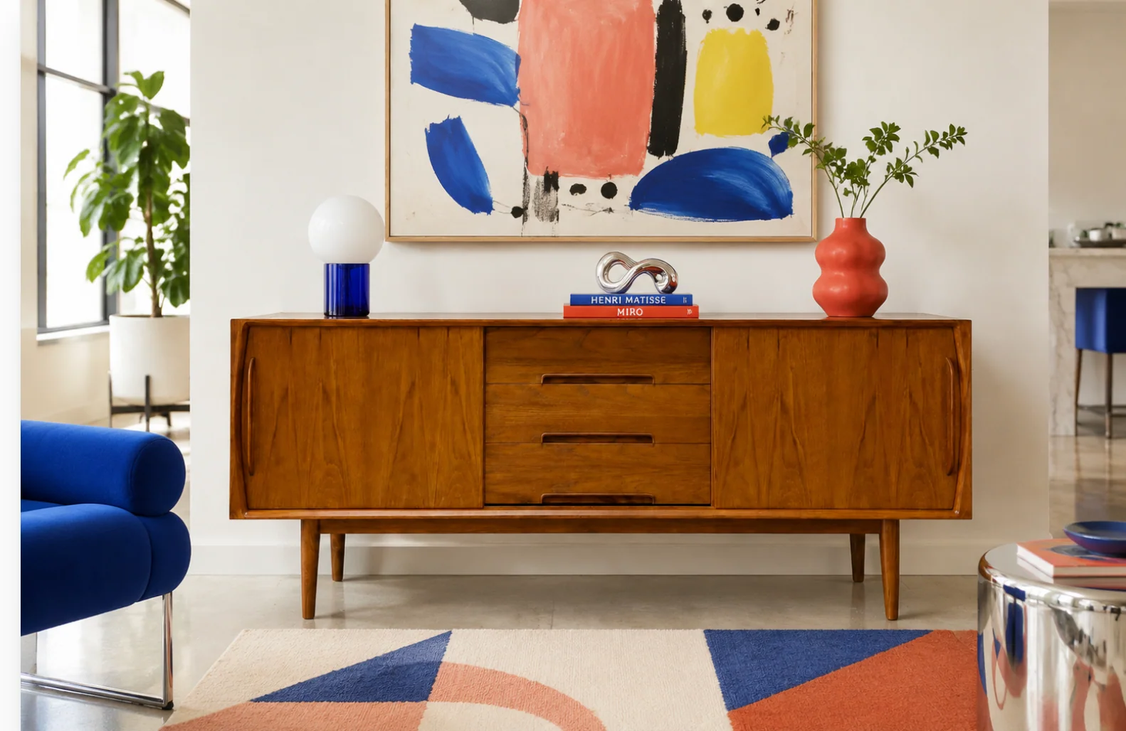
Start with the console shape
I like a console that is:
- Long and slim (so it reads airy)
- Raised on legs (visual lightness is very MCM)
- Simple front (flat drawers or clean doors)
If you are thrifting a vintage piece for the spot, give it a quick structural check before you haul it home. This guide is my go-to: 5 Structural Red Flags to Avoid When Thrifting Mid-Century Wooden Furniture.
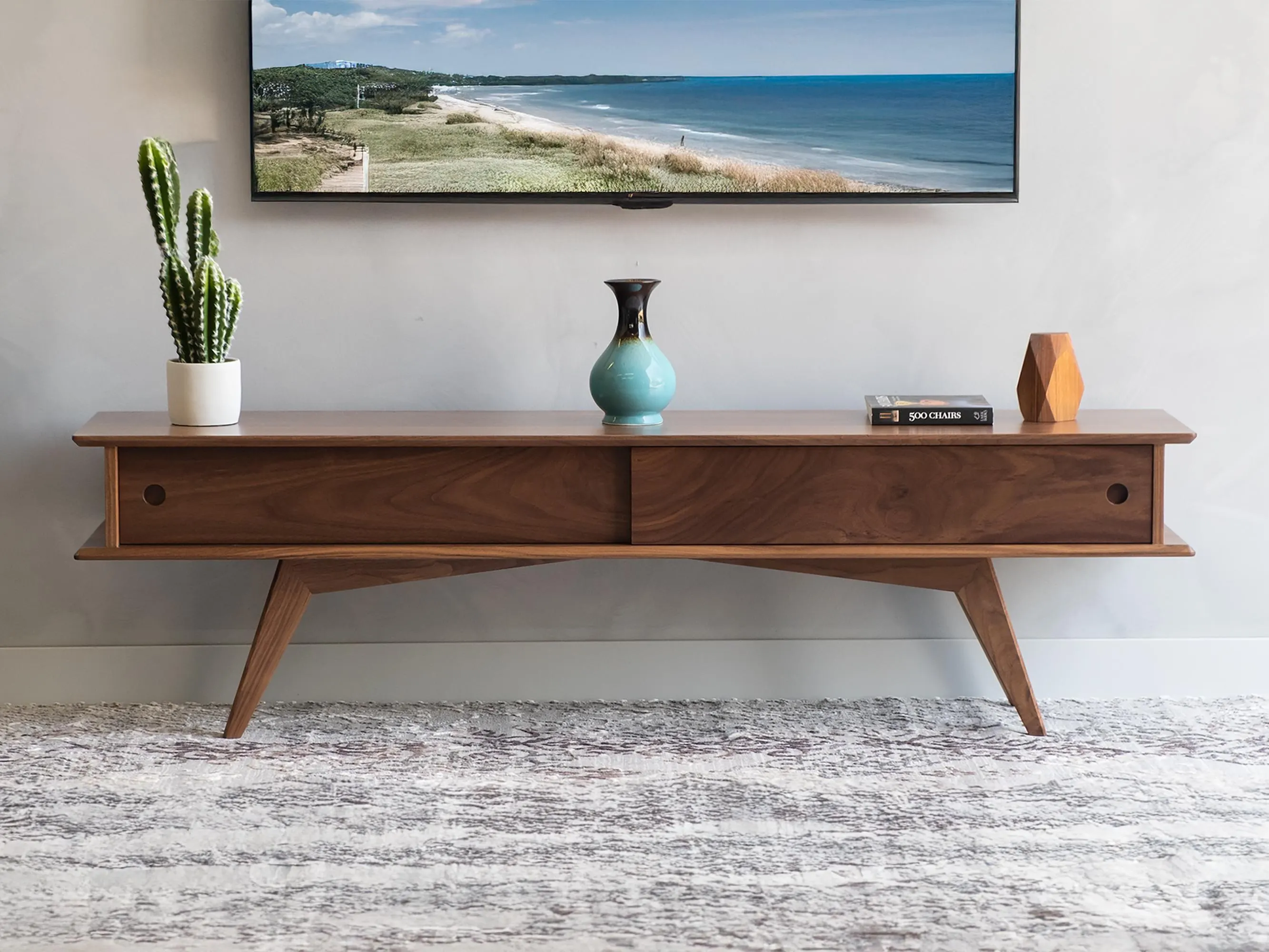
My console styling formula
This keeps the surface useful and calm:
- One anchor: a round mirror or a single larger framed piece
- One light source: a small lamp with a warm bulb
- One catchall: a low bowl or tray for keys and sunglasses
- One vertical element: a vase with branches or a sculptural object
If you love the look of layered objects but end up with clutter fast, make your catchall the only landing zone. If it does not fit in the bowl or tray, it does not live on the console.
Make it one composition
- Repeat wood tones: If the divider is warm, echo that warmth in the console or mirror frame.
- Use negative space: Let parts of the divider show behind the console. Do not cover it with tall stacks.
- Keep decor low: A divider already adds vertical rhythm. The console decor should not compete.
Rug, lighting, and storage
Choose a runner for real life
An entry rug is not just style. It is a job. I prefer:
- Low pile so doors do not catch
- Medium to dark pattern to hide grit
- Warm tones to complement wood slats
If your palette leans earthy or jewel-toned, you can steer the whole mood with the rug alone. For color direction, see Earth Tones vs Jewel Tones in Mid-Century Style.
Entry lighting
Mid-century lighting is a huge part of the mood, but the entryway does not need a chandelier moment to feel finished. Focus on:
- Warm bulbs (soft white, not blue)
- A small lamp on the console for evening glow
- One statement ceiling fixture only if the space can handle it
If you are mixing metals between a door handle, hooks, and a lamp base, keep the overall feel cohesive by repeating one finish at least twice. I walk through it here: Mixing Brass, Copper, and Chrome in Mid-Century Modern Style.
Hooks and storage that stay calm
The trick is to store what you need without turning the entry into a gear closet. A few options that stay MCM-friendly:
- Minimal wall hooks aligned in a straight row
- A lidded basket under the console for scarves and dog leashes
- A single tray for mail with a weekly reset habit
Budget and sourcing
This makeover does not have to be a one-weekend, all-new shopping spree. My favorite approach is: build the divider, then thrift and upgrade slowly around it.
Where I hunt pieces
- Estate sales: great for lamps, mirrors, and small ceramics (Estate Sales for Mid-Century Modern Decor)
- Local spots beyond the obvious: reuse stores, small-town antiques, church thrifts (7 Overlooked Local Spots to Score Authentic Mid-Century Modern Furniture)
- Facebook Marketplace: best for consoles and larger mirrors if you search smart (Secret Search Terms for Mid-Century Modern on Facebook Marketplace)
When I am evaluating a vintage console or cabinet, I also do a quick pricing gut-check so I do not overpay for something that needs major repair. This helps: How to Price-Check Vintage Mid-Century Thrift Finds.
Common mistakes
Mistake: stripy slats
Fix: Widen the spacing slightly, or choose a wider slat. Also make sure the finish is even. Blotchy stain will exaggerate contrast.
Mistake: the entry feels tighter
Fix: Pull the console shallower, switch to a slimmer piece, or reduce the divider width so the walkway breathes. Visual separation should not create a physical obstacle course.
Mistake: too many small objects
Fix: Go bigger and fewer. One substantial bowl, one lamp, one piece of art. Mid-century styling loves confident objects with space around them.
Mistake: the wood tone fights the floors
Fix: Match undertones, not exact color. If your floors are warm, keep the divider warm. If your floors are cooler, consider painting the divider a solid color and letting the floor be the wood element.
Finish checklist
- Divider installed, anchored, and stable
- Console placed with comfortable walking clearance
- Mirror or art centered above console
- Lamp with warm bulb on a timer or easy switch access
- Catchall tray or bowl for daily items
- Runner rug with a grip pad underneath
- One contained storage solution for shoes or bags
When this checklist is done, the entryway stops feeling like leftover space. It becomes a small, designed moment that sets the tone for everything beyond it.
FAQ
Can a slat divider work in a small entryway?
Yes, as long as it is visually light and placed to preserve walking space. Wider slat spacing, a shallower console, and a clear path of travel make the biggest difference.
Should the divider match the console exactly?
Not exactly. Matching undertone matters more than matching color. Warm with warm is usually enough to look intentional.
What if my entry has no natural light?
Use the divider to add texture, then rely on warm layered lighting. A console lamp plus a flattering ceiling fixture will keep the wood from looking flat or muddy.