
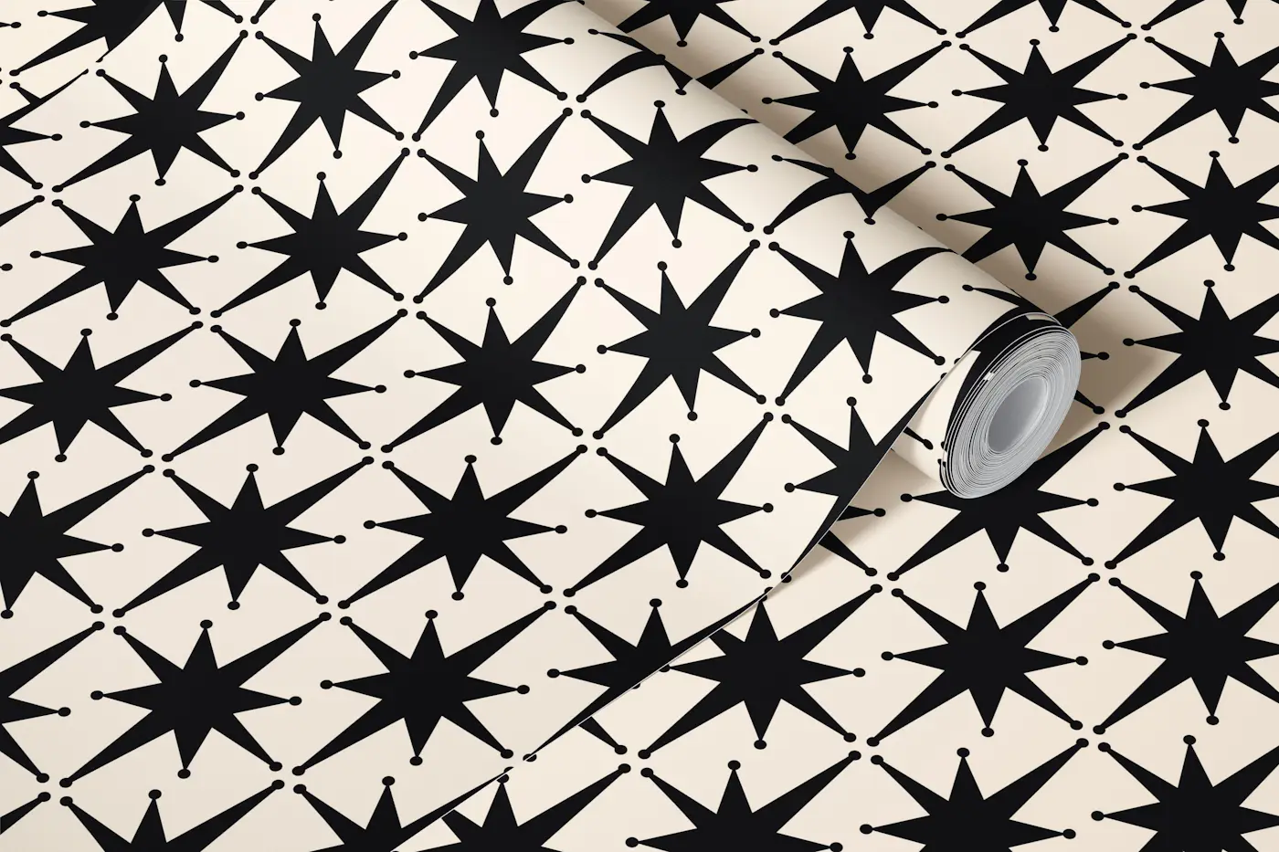
I fell in love with wallpaper the way a lot of mid-century kids did: by staring at it for long stretches of time while the adults talked. My grandparents’ 1960s house had a little powder room with a tiny, busy print that felt like a secret world. Decades later, in my own 1958 ranch, I still get that same thrill when a geometric or atomic pattern catches the light.
The trick in a modern home is letting that pattern feel intentional, not like it swallowed the room. This guide is how I pick the right print, scale it to the space, and style it as an accent wall so you get the retro magic without the visual overload.
Geometric vs atomic
Both families are mid-century, but they behave differently on your walls.
Geometric wallpaper
- Look: repeating shapes like arches, grids, diamonds, hexagons, and stylized leaves.
- Vibe: tailored, architectural, often calmer than atomic prints.
- Best for: open-plan rooms, long sightlines, and spaces where you want structure.
Atomic wallpaper
- Look: starbursts, boomerangs, satellites, amoebas, bursts, and spark-like motifs.
- Vibe: playful, kinetic, more “conversation starter.”
- Best for: small moments where you want impact, like an entry, powder room, nook, or behind a bar cart.
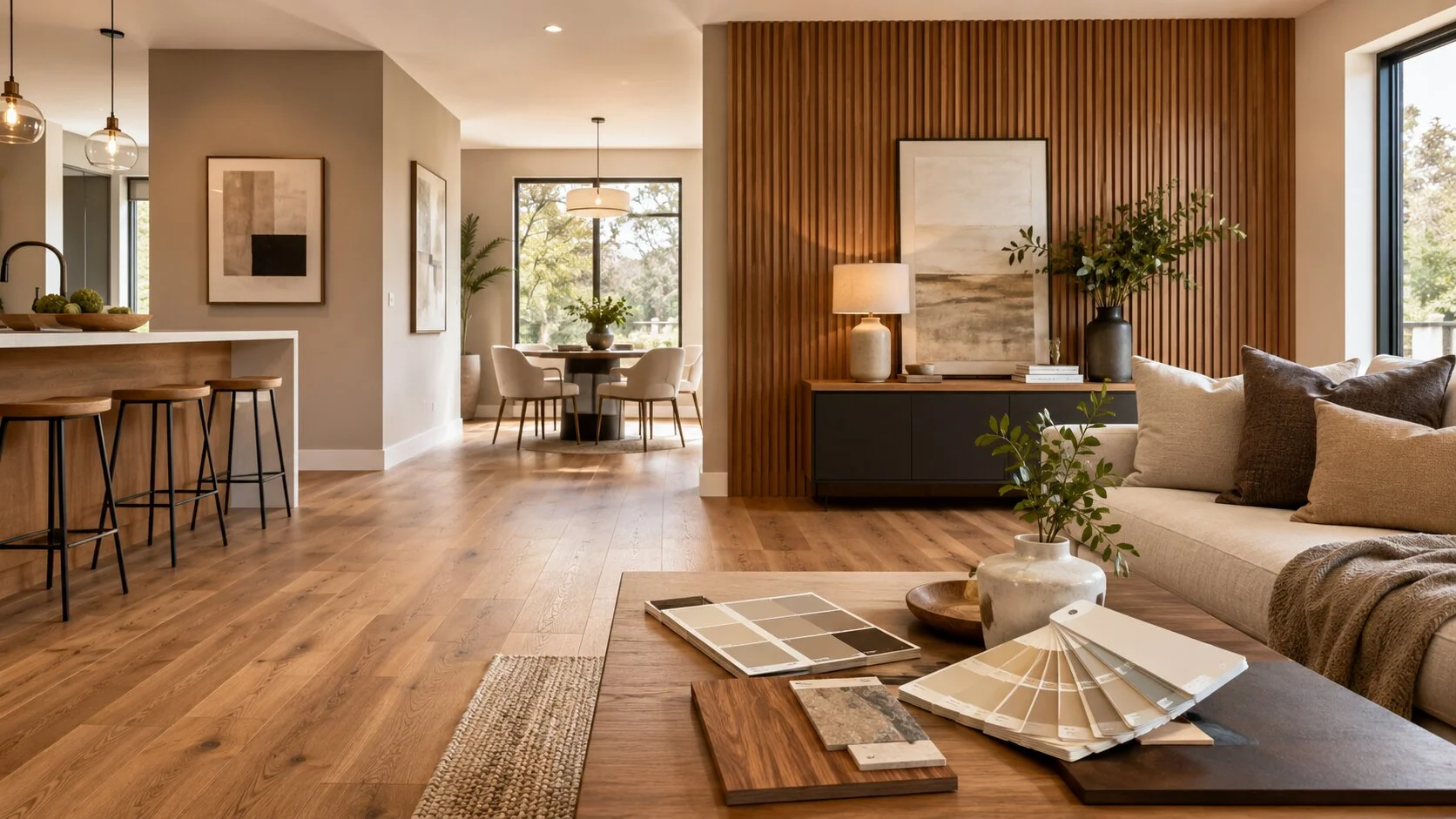
If your room already has strong shapes (slat walls, bold lighting, sculptural chairs), geometric usually layers more easily. If the room is simple and modern, atomic can be the one big personality move that makes it memorable.
Pick the wall first
In my experience, accent wallpaper works best when it reads as a backdrop for a specific “scene,” not a random blast of pattern.
Walls that often work well
- Behind a credenza or media console: Creates a built-in focal point for art and objects. If you love styling vignettes, pair this with the approach in How to Style a Mid-Century Credenza with Vintage Decor.
- Dining room anchor wall: The wall your table visually “sits against,” especially in open concept rooms.
- Bedroom headboard wall: The bed contains the pattern so it feels calmer.
- Entryway wall: A hit of retro as soon as you walk in, then it fades out as you move through the house.
Walls to avoid (or handle carefully)
- Hallways with multiple doorways: Too many breaks can make the repeat feel choppy.
- Walls with heavy window grids: The pattern can fight the mullions and trim lines.
- Anything with lots of open shelving: Your objects already create visual noise.
My personal rule: if you cannot describe what the wall is “for” in one sentence, it is not your accent wall.
Get the scale right
Scale is where, in my experience, a lot of wallpaper regrets happen. A print can be gorgeous on a sample and completely overwhelming at full height, especially with atomic motifs.
Use this quick scale check
- Small rooms (powder room, small office, nook): You can go bigger and bolder. The room ends before your eyes get tired.
- Medium rooms (bedroom, dining room): Choose a medium repeat and give it breathing room with solids and wood tones.
- Large rooms (big living room, open plan): Pick either a larger repeat with lots of background space or a tight geometric that reads like texture from across the room.
My sample test at home
I tape up two or three panels of the sample (not one tiny square) and look at it from three distances: right up close, across the room, and from the doorway. If the pattern “vibrates” or makes my eyes bounce, I either size up the repeat or choose a calmer colorway.
Color strategy
The most modern-looking wallpaper installations are the ones that borrow colors already living in the room.
Choose your anchor color
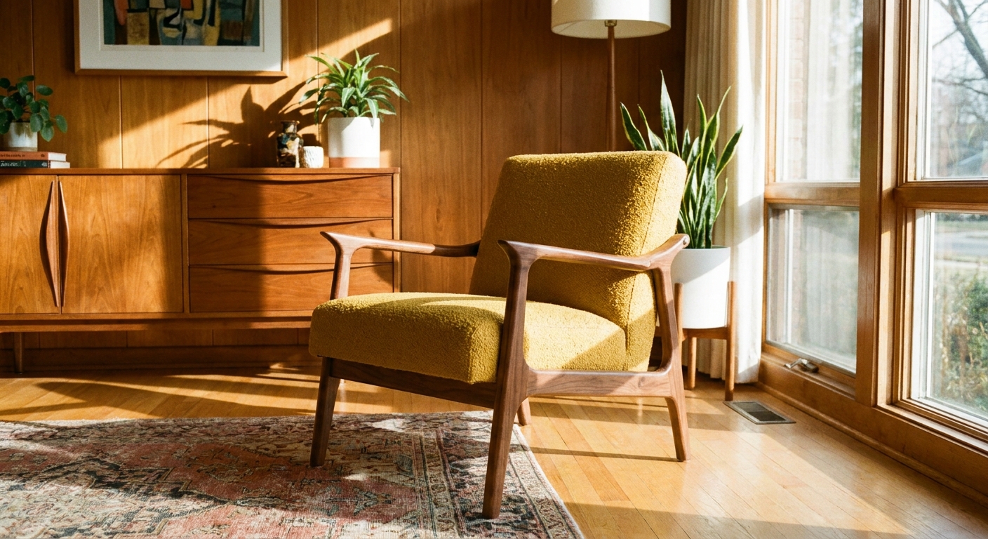
- Wood tone first: Walnut and teak love warm, grounded wallpapers. If your room is heavy on mid-century wood, start with guidance from Wall Colors That Love Walnut and Teak, then pick a wallpaper with a compatible base.
- Upholstery second: If you have a sofa or accent chair you are keeping, match one wallpaper color to it so it looks intentional. For chair color ideas that stay mid-century, see Upholstery Colors for a Mid-Century Accent Chair.
- Metal last: Brass, chrome, and copper can either harmonize or clash with bold prints. If your room mixes metals, I usually keep the wallpaper background a little quieter. Mixing Brass, Copper, and Chrome in Mid-Century Modern Style can help you decide which metal should lead.
Two dependable mid-century wallpaper palettes
- Earthy modern: warm white, camel, olive, tobacco, soft black.
- Optimistic retro: teal, mustard, coral, cream, walnut.
If you are stuck between earth tones and jewel tones, that choice alone can steer the whole room. I break down the mood difference in Earth Tones vs Jewel Tones in Mid-Century Style.
Keep it from overpowering
Wallpaper looks “too much” when there are too many competing focal points. The fix is not always changing the wallpaper. Often it is editing what sits in front of it.
My balancing checklist
- Limit patterns elsewhere: If the wall is busy, keep rugs and curtains simpler. If you are choosing a rug after wallpaper, Choosing the Right Area Rug for a Mid-Century Modern Room is the path I follow.
- Use solids in big blocks: A solid sofa, solid drapes, or a solid duvet gives your eyes a place to rest.
- Pick one hero object: A sculptural lamp, one bold piece of art, or a statement mirror. Not all three.
- Repeat the wallpaper colors twice: Once in textiles (pillows, throw, runner) and once in a hard element (ceramic, frame, book spine). Two repeats look curated. Five repeats look like a theme party.
- Give the print negative space: If your wallpaper has a light background, do not cover every inch with gallery wall frames.
Styling ideas
Behind a credenza
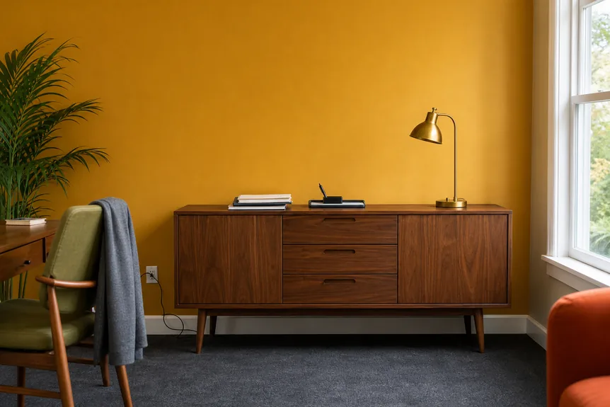
Keep the top of the credenza simple: a tall lamp, a stack of books, one ceramic piece, and one framed print. If you want a fuller look, go vertical, not wide. That leaves the wallpaper to do its job as a field of pattern.
In a bedroom
Let the bed act like a visual buffer. Upholstered headboards and solid bedding calm even a lively atomic print. If your room is small, you can also use wallpaper to zone the sleeping area. I use a similar zoning mindset in Arranging Mid-Century Bedroom Furniture in Small Spaces.
In a dining space
Pair bold wallpaper with dining chairs that are clean-lined and mostly solid. If you are mixing chair styles, keep finishes consistent so the wall remains the star. Mixing and Matching Mid-Century Modern Dining Chairs is my go-to for that balance.
With lighting
Wallpaper loves grazing light. If you can, aim sconces so the light skims across the wallpaper (more sideways than straight-on) to bring out texture and keep the pattern feeling rich at night. If sconces are on your list, see Mid-Century Modern Wall Sconces. For floor lamps that create cozy pools of light that flatter pattern, Top Mid-Century Modern Floor Lamps for Cozy Reading Nooks is a helpful companion read.
Trim and window treatments
This is where modern homes sometimes feel off with mid-century patterns. The wallpaper is doing one era, but the trim and treatments are doing another.
Trim
- Clean and consistent: crisp white trim usually makes wallpaper feel more modern and less heavy.
- Soft contrast works: if the wallpaper has warmth, an off-white trim often looks better than bright white.
- Avoid competing paint colors: if you paint trim a strong color, your wallpaper becomes a second or third focal point instead of the focal point.
Window treatments
If the wallpaper is bold, treat windows like a calm frame. Simple woven shades, solid drapery panels, or minimal roller shades keep things grounded. I walk through options in Mid-Century Modern Window Treatments.
Before you buy
These are the unglamorous steps that save you from the mid-project panic run back to the store.
Measure and calculate rolls
- Measure wall width and height: include the full height you plan to paper, and note any slope or soffit.
- Count full drops: a quick way is wall width divided by wallpaper width, rounded up.
- Plan for repeat: if the pattern has a large repeat, you will lose more to matching, so you often need extra.
Order extra (and keep it consistent)
- Add a buffer: I usually plan for at least one extra roll for an accent wall, more if the pattern repeat is large or the wall has lots of cuts (doors, corners, outlets).
- Buy at the same time: ordering together helps keep color consistent from roll to roll.
Prep the surface
- Clean first: wipe down the wall so dust and oils do not fight adhesion.
- Fill and sand: patch nail holes, smooth ridges, and knock down bumps so hard-edged geometrics do not spotlight every flaw.
- Prime if needed: especially if you have repairs or a very porous wall. Wallpaper looks its best on an even, sealed surface.
Peel-and-stick caveats
- Paint sheen matters: peel-and-stick can struggle on very matte or chalky paint, and it can grab too hard on some fresh paints. I always test a large sample first.
- Let paint cure: if you just painted, give it real cure time before you stick anything to it. “Dry to the touch” is not the same as cured.
- Texture changes everything: removable papers can lift on orange peel or heavy texture, and the bumps can telegraph through the pattern.
Where atomic shines
If you want the atomic look but fear commitment, start with a small, contained wall. These are my favorite gateway locations.
- Powder room: go bold, then keep towels and accessories simple.
- Laundry or mudroom: a little joy in a utilitarian space.
- Home office backdrop: one statement wall behind your desk, balanced with clean storage.
- Inside a closet or pantry: yes, really. A surprise pop of starbursts makes everyday routines feel special.
Quick troubleshooting
The wallpaper feels too loud
- Remove one competing pattern (usually a rug or busy throw pillows).
- Swap bright bulbs for warmer bulbs, or upgrade to higher-CRI LEDs if your colors feel harsh.
- Add a larger solid element in front of the wall (a bigger art piece, a taller plant, or a wider console) to calm the field of pattern.
The wallpaper looks flat
- Add a light source that hits it at an angle (sconce, floor lamp, picture light).
- Bring in texture nearby (woven basket, ceramic, bouclé pillow) while keeping the color simple.
The room feels like a set
- Mix one contemporary piece in, like a modern coffee table or a clean-lined sofa.
- Keep accessories edited and meaningful, not all mid-century everything.
A simple way to start
If you are staring at ten samples and spiraling, here is the formula I use when I want a win:
- One accent wall behind a credenza or bed.
- Two colors pulled from the wallpaper repeated in small doses elsewhere.
- One wood tone that stays consistent across the room.
- One metal finish for lamps and hardware, even if the rest of the home mixes.
- One big solid textile to calm everything down.
When it works, it is almost always the same order of operations: pick the wall, choose the scale, tie in the color, then edit everything around it. Wallpaper is the fun part. The restraint is what makes it look grown-up and modern.