
The first mid-century accent chair I ever fell in love with sat in my grandparents’ 1960s living room, angled toward a low record console like it had somewhere important to be. It was upholstered in a spicy, burnt orange that looked almost coppery in late afternoon light, and the wood arms had that quiet glow only decades of careful living can build.
When I started redoing chairs for my own 1958 ranch house, I learned quickly that color does most of the time-traveling. Change the fabric, and the same silhouette can read 1959 cocktail hour or 1997 waiting room. If you want your makeover to feel truly mid-century, here is how to pick an upholstery color that looks right, lives well, and still makes your heart do that little happy flip when you walk past it.
Start with the decade
Mid-century modern spans a few decades, and upholstery colors shifted along the way. If you decide which era you want to echo, your color choices get much easier. Think of these as common tendencies, not hard rules.
- 1950s to early 1960s: cleaner, lighter palettes. Soft teal, olive that leans gray, warm beige, cocoa, and restrained mustard show up often. Patterns tend to be small-scale geometrics or textured solids.
- Late 1960s to 1970s: richer and bolder. Burnt orange, avocado, goldenrod, chocolate, rust, and saturated teal are more common, along with chunkier textures and bigger prints.
If your chair has delicate, airy lines (tapered legs, slim arms), it often looks most believable in a 1950s to early 1960s palette. If it has chunkier proportions or a loungey “sink in” profile, it can carry deeper 1970s colors beautifully.
Classic colors that work
These are the colors I reach for when I want a chair to look like it could have come home from a 1962 showroom, even if the fabric is brand new.
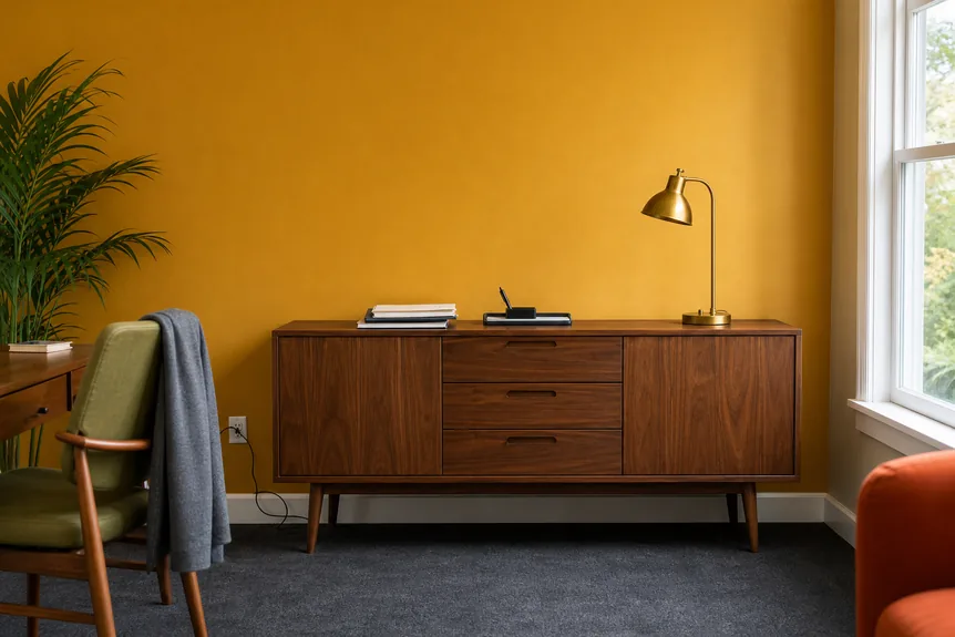
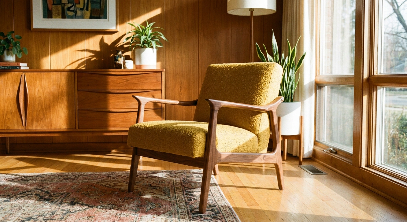
Mustard yellow
Mustard is mid-century magic because it reads warm, sunny, and a little sophisticated all at once. It pairs especially well with walnut, teak, and oak.
- Best for: warming up neutral rooms, balancing cool grays, adding “instant vintage” without going neon.
- Works with: walnut casegoods, white walls, black accents, brass, and woven textures.
- Clara tip: Choose mustard that leans golden or ochre, not lemon. Lemon tends to read more contemporary.
Teal and blue-green
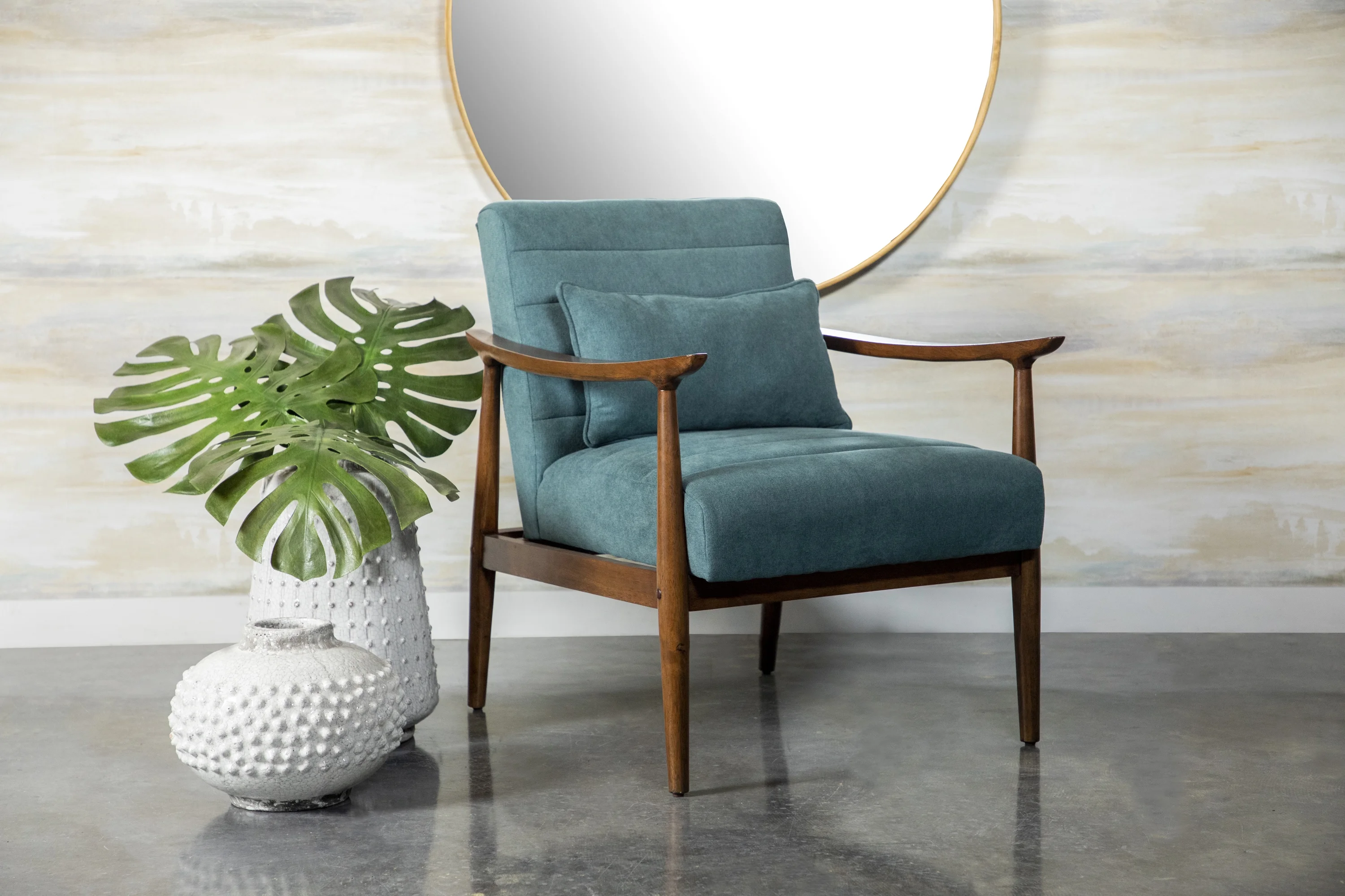
Teal is one of those era-defining hues that still feels fresh. It can be calm (dusty teal) or punchy (saturated peacock). Both can be period-friendly, depending on the piece and the room.
- Best for: adding cool contrast in warm-wood rooms, making small spaces feel crisp.
- Works with: walnut and teak, white, cream, cognac leather, and chrome accents.
- Clara tip: Dustier teals often read more early-1960s to my eye. Deep peacock teals often feel later 1960s into the 1970s, especially in plush textures.
Burnt orange and rust
This is the color of conversation pits, terracotta planters, and the warm glow of vintage lamps at dusk. It is bold, but surprisingly easy to live with because it can play like a neutral in warm palettes.
- Best for: adding instant cozy, anchoring a space with a single statement chair.
- Works with: olive, cream, camel, walnut, and natural linens.
- Clara tip: If you are nervous, look for rust with a touch of brown. It reads more grounded than bright orange.
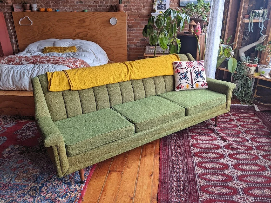
Olive, avocado, and moss
Green is a period-correct choice that can skew refined or very 1970s depending on undertone.
- Best for: making a room feel organic and collected, pairing with plants and wood paneling vibes.
- Works with: walnut, teak, cream, tan, and brass.
- Clara tip: Avocado is iconic but loud. Mossy olive is the easier version if you want authenticity without committing to full 1973.
Chocolate brown and warm neutrals
Not every mid-century chair was a bright color. Textured browns, camel, warm taupe, and oatmeal weaves were common, especially in family rooms and dens.
- Best for: high-traffic homes, letting wood and silhouette shine, pairing with colorful pillows.
- Works with: almost everything, especially if your room already has strong art or a bold rug.
- Clara tip: A nubby weave or subtle slub keeps neutrals from feeling flat.
Match fabric to the wood
Here is the mistake I made early on: I chose fabric to match the room paint, then wondered why the chair looked “off.” The wood is the anchor. Mid-century chairs often show a lot of wood, so your upholstery needs to complement it.
| Wood tone | Colors that often look historically “right” | Colors to use carefully |
|---|---|---|
| Walnut (deep, warm brown) | Mustard, teal, rust, cream, olive | Icy grays, stark white fabrics (can feel too modern) |
| Teak (golden, honey warmth) | Teal, avocado, burnt orange, camel, oatmeal | Very cool blues (can fight the warmth) |
| Oak (lighter, more visible grain) | Olive, mustard, warm neutrals, muted denim blue | Overly yellow fabrics (can look too same-on-same) |
| Rosewood or very dark stains | Mustard, cream, rust, peacock teal | Dark brown upholstery (chair can disappear) |
If you are also refinishing wood, choosing the fabric first can be smart. I have done it both ways, and fabric-first keeps you from chasing undertones later. If you are restoring teak or walnut, my process for getting finish back on tired vintage wood is outlined in Restore a Vintage Teak Sideboard Finish. The same “respect the undertone” idea applies to chair frames.
Quick undertone check: Hold your swatch next to a true white sheet of paper. If the fabric suddenly looks a little yellowed, peachy, or golden, it is a warm-leaning color. If it looks a little steely, minty, or sharp, it is cool-leaning. This tiny test saves a lot of “why does this clash?” drama.
Texture matters
Color gets all the attention, but texture is what makes a newly upholstered chair feel authentic instead of freshly printed.
Textures that read mid-century
- Tight weaves and tweeds: classic, durable, and period-friendly.
- Looped textures: looped, nubby fabrics can read very mid-century, but today’s bouclé trend can skew “now.” Keep it in era colors and simple silhouettes if you want it to feel retro.
- Wool blends: very authentic for a tailored look, especially in solids or subtle heathers.
- Velvet: velvet can work beautifully for a loungey 1960s vibe, especially in deeper tones like rust, olive, or teal. It is more of a mood choice than a requirement.
Finishes to avoid for a vintage look
- High-shine faux leather in bright colors: often reads more diner booth than Danish modern.
- Super crisp, flat cotton in bright white: tends to feel more modern farmhouse than mid-century.
- Huge contemporary prints: fun, but rarely period-correct unless you are intentionally doing a bold 1970s moment.
If you are shopping secondhand upholstery pieces, it also helps to know what to look for beyond just color. I keep a checklist in Buying Vintage Mid-Century Upholstered Furniture: What to Check.
Don’t skip durability
If this chair is going to be a daily sitter (kids, pets, movie nights, real life), pick a fabric that can take it. In practical terms, tighter weaves, heathers, and mid-tone colors tend to hide wear best. If a fabric line lists a rub count (Wyzenbeek or Martindale), higher numbers are generally better for high-traffic use. And if you love velvet, consider how it shows pressure marks and nap changes in certain lighting. That can be part of the charm, but it is good to choose on purpose.
Pick a hero color
When you are staring at fabric swatches, everything starts to look the same. This is the simple order that keeps me sane.
- Pick one hero color for the chair. Mustard, teal, rust, olive, or a warm neutral.
- Confirm it against the wood frame. Do this in daylight and evening light if possible.
- Choose two supporting neutrals in the room. Cream and walnut. Oatmeal and black. Camel and white.
- Add one metal note. Brass warms mustard and rust. Chrome makes teal feel crisp and atomic. If mixing metals, I have a friendly guide in Mixing Brass, Copper, and Chrome in Mid-Century Modern Style.
This approach keeps your chair from feeling random, even if it is a bold color.
Easy color pairings
If you want that “I thrifted this from a time capsule” feeling, these combos are reliably mid-century.
- Mustard + walnut + cream: sunny and timeless.
- Teal + walnut + white: crisp and classic.
- Burnt orange + olive + natural linen: earthy and 1970s in the best way.
- Avocado + teak + camel: warm, organic modern.
- Chocolate brown + brass + off-white: tailored and grown-up.
If you are stuck between earthier colors and richer jewel tones, I break down how each one changes the mood of a space in Earth Tones vs. Jewel Tones in Mid-Century Style.
Pattern, scale, and motifs
Yes, you can absolutely go patterned and still feel period-correct. The trick is scale and restraint.
- Motifs that tend to read mid-century: small geometrics, subtle herringbone, tidy stripes, and atomic-inspired shapes.
- Scale tip: the smaller the chair, the smaller the pattern. Big prints can overwhelm petite frames and start looking more contemporary.
- Color tip: if the palette is right, even a simple geometric can do a lot of the decade work for you.
Swatch testing
I know, swatches are not as fun as ordering fabric. But upholstery is a long-term relationship, and lighting is sneaky.
How to test a swatch
- Tape the swatch to the chair frame if you can, right next to the wood.
- Look at it morning, afternoon, and night. Warm bulbs can make mustard look muddy and can turn teal greener.
- Check it beside your rug or flooring. Upholstery often clashes with rugs more than with wall paint.
- Do the “lint and pet test.” Rub the swatch with a dark sweater. If it grabs fuzz, it will do that forever.
If you are trying to keep your makeover budget-friendly, swatches also help you avoid the expensive “I love it online” regret. For more thrifty decision-making, How to Price-Check Vintage Mid-Century Thrift Finds is my go-to reality check before I commit.
Common color mistakes
- Choosing a trendy neutral that fights the era. Cool greige can make warm mid-century woods look dull. If you want neutral, go warm and textured.
- Going too bright without the right undertone. A pure, primary orange can look modern. A rusted, browned orange looks more retro.
- Ignoring sheen. The right color in a shiny fabric can still read “new.” Mid-century often looks best in matte or softly textured finishes.
- Matching everything perfectly. Mid-century rooms usually feel collected. A chair that matches the sofa exactly can look like a matching set from a different decade.
FAQ
What is the most authentic mid-century upholstery color?
Two of the safest, most frequently seen choices are mustard yellow and teal (especially dustier teals). They show up again and again in real vintage interiors, and they play nicely with the wood tones that define the era.
Should my accent chair match my sofa?
Not exactly. Mid-century spaces look more believable when the chair is related to the room, not identical to the sofa. Aim for harmony through undertone and texture. For chair and sofa pairing ideas, see Pairing Mid-Century Sofas with Contemporary Accent Chairs.
Can I use a patterned fabric and still look period-correct?
Yes. Keep the palette era-friendly and the scale appropriate for the chair. Small geometrics and subtle weaves tend to read more authentic than oversized contemporary florals.
What color hides wear best?
Mid-tones and heathers are your friends. Think olive, tweedy camel, chocolate, rust, and dusty teal. Very light solids show stains, and very dark solids show lint.
Bring it home
The “perfect” upholstery color is the one that honors the chair’s shape and wood, feels right in your light, and makes the whole room hum a little warmer. Mustard, teal, burnt orange, and olive are classics for a reason. They do not just decorate the chair, they give it a decade.
If you want more help building a cohesive palette around your new upholstery, you can browse our color guides in Color Palettes & Styling.