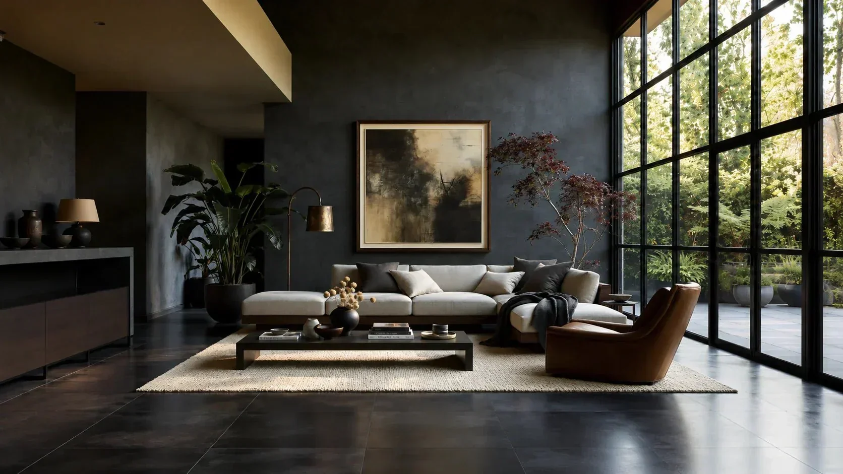

I grew up in a 1960s living room where the walnut practically glowed at dusk. That warm, honey-brown shine is exactly what made me fall for mid-century modern in the first place. Years later, in my own 1958 ranch, I learned the hard way that paint can either make walnut and teak look rich and expensive or strangely orange, muddy, or flat.
The good news is that you do not need a designer’s eye to get this right. You just need to understand undertones, light, and a few color families that consistently play nice with warm vintage woods.
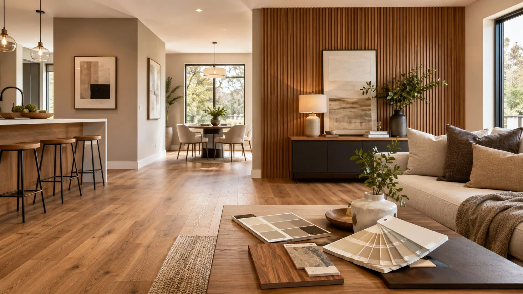
Walnut vs. teak: why they react differently
People lump these woods together because both read “warm,” but they behave differently next to paint.
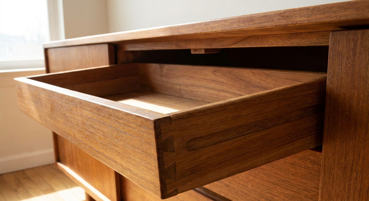
- Walnut often has deeper chocolate and coffee tones with cooler brown shadows, especially in American black walnut pieces. It can look elegant with cooler neutrals, but it can also go dull if the wall color is too heavy or too yellow.
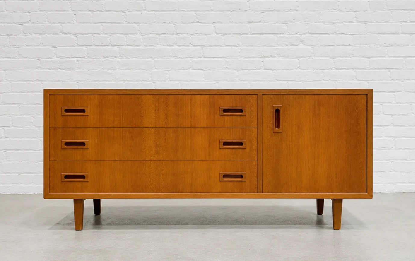
- Teak usually leans golden with an oily, sunlit warmth. It can go orange next to the wrong beige, or look a bit greenish if paired with certain cool grays.
If your room mixes both (very common), aim for wall colors that are neutral-leaning with controlled undertones. That is the sweet spot where both woods feel intentional.
Start with undertones, not color names
“White,” “beige,” and “gray” are not really colors. They are undertone delivery systems. When the undertone fights your wood, your furniture loses that warm vintage magic.
Quick undertone check you can do in five minutes
- Look at the wood in daylight: does it read more golden (teak) or more brown and smoky (walnut)?
- Hold a sheet of bright white printer paper next to the wood. If the wood suddenly looks very orange, your room probably needs less yellow in the wall paint.
- Check your fixed finishes (floors, tile, counters). Paint must bridge wood plus whatever you cannot change.
If you want a deeper dive on balancing saturated tones, my thoughts on warm vs. bold palettes are over in Earth Tones vs. Jewel Tones in Mid-Century Style.
The most flattering wall color families for walnut and teak
These are the families I reach for again and again when I want vintage wood to look warm, not loud.
1) Soft creamy whites (not bright, not icy)
A creamy white makes walnut look deeper and teak look sun-kissed. The key is choosing a white with gentle warmth, not a heavy yellow cast.
- Best for: Smaller rooms, low ceilings, rooms with lots of wood furniture
- Avoid if: Your teak already looks orange in your lighting. In that case, use an off-white that is more neutral than buttery.
2) Greige and mushroom neutrals
This is my “everything looks intentional” category. Mushroom and greige tones calm teak’s gold and keep walnut from feeling too dark.
- Best for: Open concept spaces and homes mixing vintage and modern pieces
- Pro tip: If your room has warm bulbs at night, pick a greige that does not turn peach under lamplight.
3) Smoky blue-grays (the walnut best friend)
Walnut can look absolutely tailored against a muted blue-gray. It brings out walnut’s depth without making the room feel heavy.
- Best for: Offices, dining rooms, bedrooms
- Watch for: Very cool, steely blues can make teak look slightly green. Keep it smoky, not icy.
4) Sage, olive, and muted green
Green is a classic mid-century partner for warm woods because it feels natural and grounded. Muted greens also help brass and ceramics look amazing, which is a nice bonus.
- Best for: Living rooms, kitchens, entryways
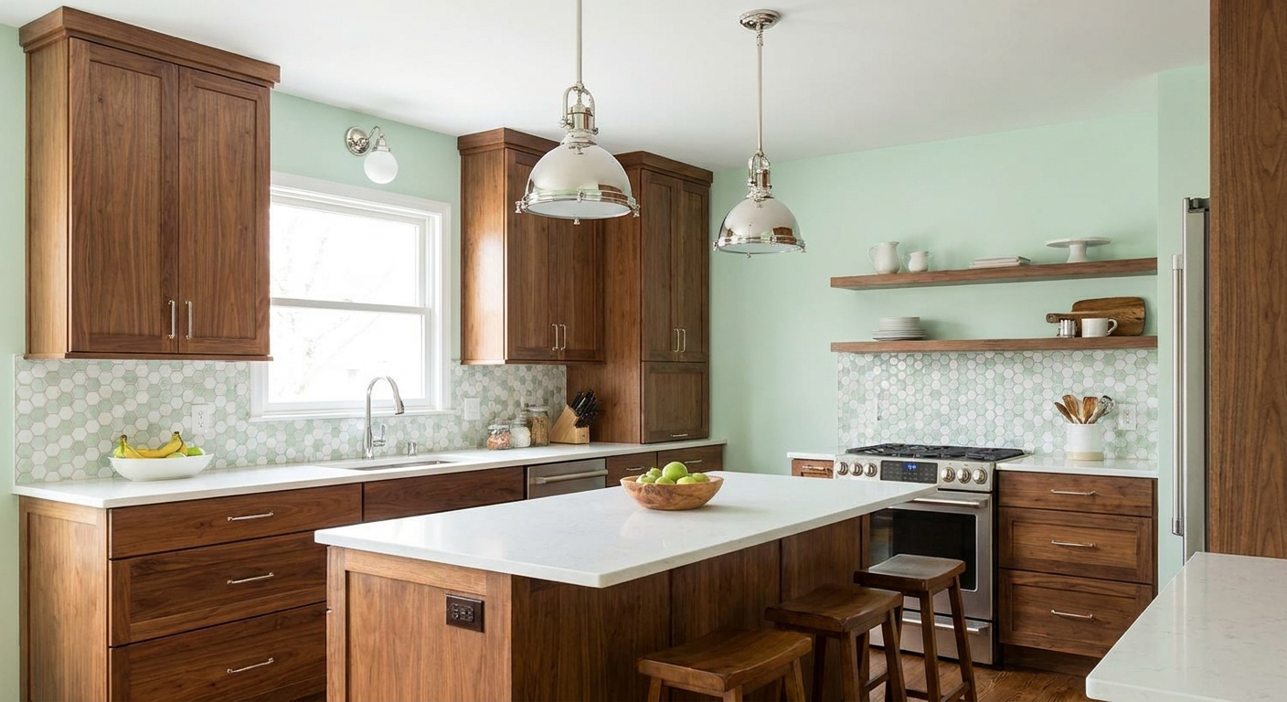
- Undertone note: Choose greens that feel a bit dusty or earthy. Very fresh “minty” greens can clash with teak’s warmth.
5) Warm clay, cinnamon, and soft terracotta
If you want a bolder MCM mood without going full orange-on-orange, clay tones can be gorgeous, especially with walnut. The trick is muted terracotta, not a bright pumpkin.
- Best for: Accent walls, dining rooms, retro dens
- Design move: Keep trim a softer off-white so the clay feels intentional, not overwhelming.
Colors that commonly clash (and what to do instead)
Problem: Yellow-beige walls make teak look orange
Swap to: a greige, mushroom, or a neutral off-white. These calm the orange reflex without cooling the room into “flipped house gray.”
Problem: Stark bright white makes walnut look flat
Swap to: a creamier white or a very light greige. Walnut needs a little warmth nearby to keep its richness.
Problem: Cool gray makes teak look greenish
Swap to: a warmer gray (greige) or a dusty blue-gray that has a touch of warmth built in.
Problem: Very saturated jewel tones feel too sharp
Swap to: “smoked” versions of the same color (smoky teal instead of bright teal, dusty navy instead of cobalt). You still get drama, but the wood stays the star.
My step-by-step method for picking the right paint
If you have ever painted a sample, loved it at noon, and hated it at 8 p.m., this is for you.
Step 1: Decide what you want the wood to do
- Make teak look calmer and less golden: go mushroom, greige, or muted green.
- Make walnut look richer and deeper: try smoky blue-gray, warm off-white, or soft clay.
- Make mixed woods feel cohesive: pick a neutral with balanced undertones (greige is your friend).
Step 2: Sample on poster board, not directly on the wall
I like large swatches on removable poster board so I can move them behind the actual furniture. That is the only “test” that matters.
Step 3: Check the color in three lighting moments
- Morning daylight
- Late afternoon (warmest natural light)
- Evening with your lamps on
Step 4: Don’t forget the trim and ceiling
Trim color can make a wall look cleaner, warmer, or oddly pink. If your home has warm wood, a soft white trim often looks more harmonious than a super bright, bluish white.
Room-by-room suggestions that work with vintage wood
Living room
If your living room has a walnut wall unit, teak credenza, or a mix of both, start with greige or a muted green. Then layer in texture so the wood does not feel like the only warm element. (Vintage ceramics and art glass help so much here, and I talk about what to look for in Thrifting Mid-Century Ceramics and Art Glass.)
Bedroom
Walnut nightstands look beautiful against smoky blue-grays and soft creams. Teak dressers like calm, slightly warm neutrals that do not turn yellow.
If you are working with tight square footage, wall color has extra power. I share layout tips in Arranging Mid-Century Bedroom Furniture in Small Spaces.
Dining room
This is where you can go moodier if you want. Walnut dining sets can handle deeper paint, especially dusty navy, olive, or clay tones. Just keep the finish consistent: warm bulbs, brass accents, and a statement light that fits the scale. If a Sputnik is on your wish list, see How to Size and Hang a Sputnik Chandelier.
Hallways and entryways
If your entry has a teak console or walnut bench, a muted green or greige reads welcoming and hides scuffs better than bright white. If you lean bold at the front door, coordinating that with your interior neutrals keeps things cohesive. There are great retro options in Best Mid-Century Modern Front Door Colors.
Cheat sheet: pairing ideas by wood tone
| Wood tone | Wall colors that flatter it | Wall colors to be cautious with |
|---|---|---|
| Golden teak | Greige, mushroom, muted sage, neutral off-white | Yellow-beige, icy cool gray |
| Medium walnut | Smoky blue-gray, warm off-white, muted olive | Stark bright white, very dark brown walls |
| Dark walnut | Creamy white, soft greige, dusty blue | Overly warm tan that makes the room feel heavy |
| Mixed teak and walnut | Balanced greige, soft mushroom, dusty green-gray | Strong pink-beige, super cool blue-gray |
Frequently asked paint questions (mid-century edition)
Should I match the wall color to the wood?
I usually avoid trying to “match” wood with paint. It tends to make the room feel monotone, and if the undertone is slightly off, the furniture looks accidental. Aim to support the wood with a complementary undertone instead.
Can I use pure white walls with teak and walnut?
You can, but pure bright white is high-contrast and can make vintage wood feel harsher. If you love that crisp look, soften it with warm textiles, natural fibers, and lighting that leans warm, not blue.
What if my teak has aged darker or looks uneven?
A lot of teak darkens or shifts over decades, especially if it sat in sun. Before you repaint a whole room, it is worth checking whether the piece needs a gentle refresh. If you are dealing with a larger teak piece like a sideboard, my process is in Restore a Vintage Teak Sideboard Finish.
How do I avoid that orange cast at night?
Two fixes: choose a wall paint with less yellow undertone and pay attention to bulbs. Very warm bulbs can make neutral paint skew peach. I like warm lighting, but I keep it consistent room-to-room so the paint does not look like it changes personalities.
A final rule I swear by
If you are stuck between two paint colors, pick the one that makes your walnut and teak look like themselves. Not redder. Not yellower. Just quietly rich. When the walls behave, the wood becomes the “color,” and that is where mid-century rooms feel timeless.
And if you are still in the collecting phase, it helps to know what you are looking at before you build a palette around it. I put my most practical tells in How to Spot Authentic Mid-Century Modern Wood Furniture.