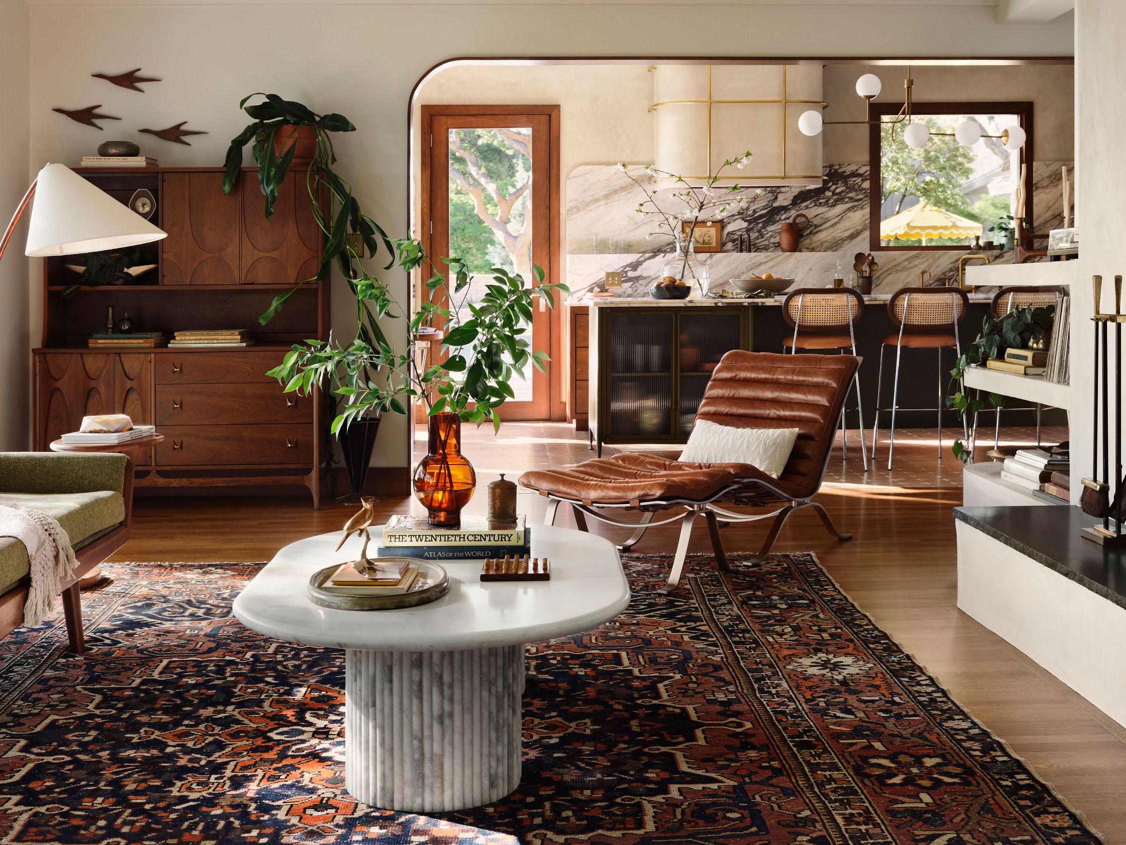

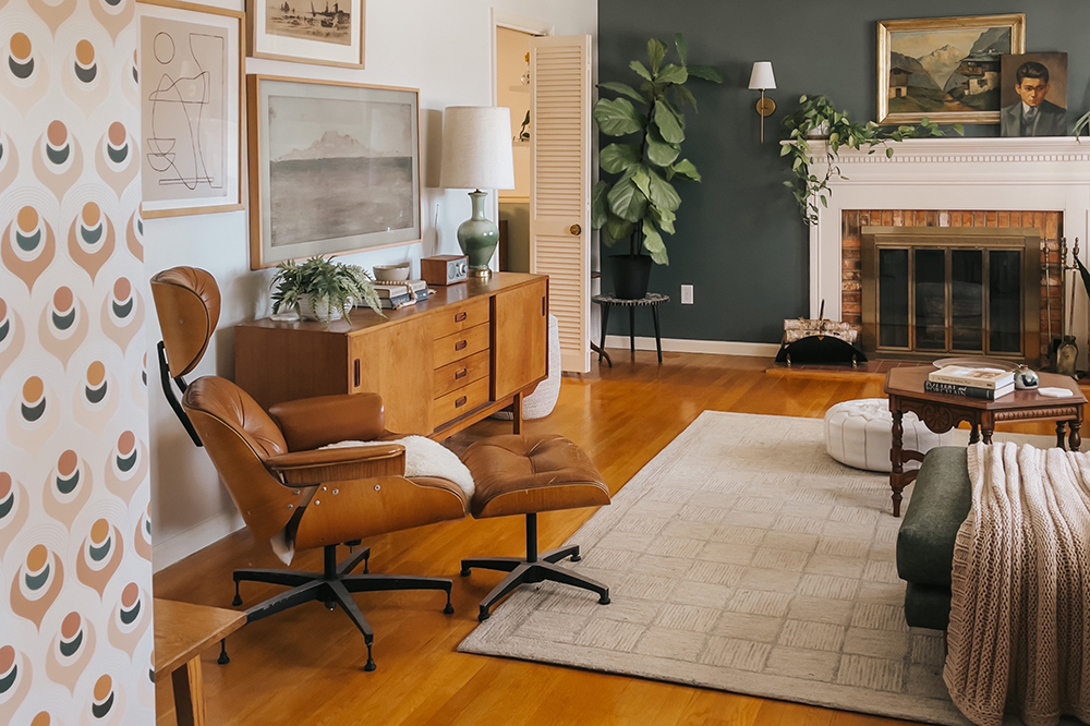
My love for mid-century color started in my grandparents’ 1960s living room, where the walls were a soft, spicy neutral that made their walnut furniture look even richer. Years later, working on my own 1958 ranch, I learned something that still surprises people: some of the most “authentic-feeling” MCM rooms are not all white. They are warm. They are confident. And they make your wood tones, metals, and upholstery feel intentional.
Below are 10 mid-century modern living room paint colors that feel historically grounded, plus easy modern matches you can ask for at the paint counter. Think of these as backbone shades you can build around with vintage art glass, a patterned rug, and one good lamp.
Before you pick a color, it helps to decide which side of the era you love most: early-60s organic warmth or late-60s to 70s high-contrast boldness. If you’re torn, my rule is simple: start with a warmed-up neutral, then add one “period” color in textiles or an accent wall.
How to keep it mid-century
- Choose warmth over starkness. Even when a color reads “neutral,” mid-century palettes often lean creamy, sandy, or smoky rather than icy.
- Let wood be the hero. Walnut, teak, and oak look best against colors with depth, not flat bright primaries.
- Mind the sheen. For a classic MCM look, I like matte or eggshell on walls with a satin or semi-gloss on trim. Historically, sheen choices varied by decade, brand, and what was available, so think of this as a reliable way to get the vibe.
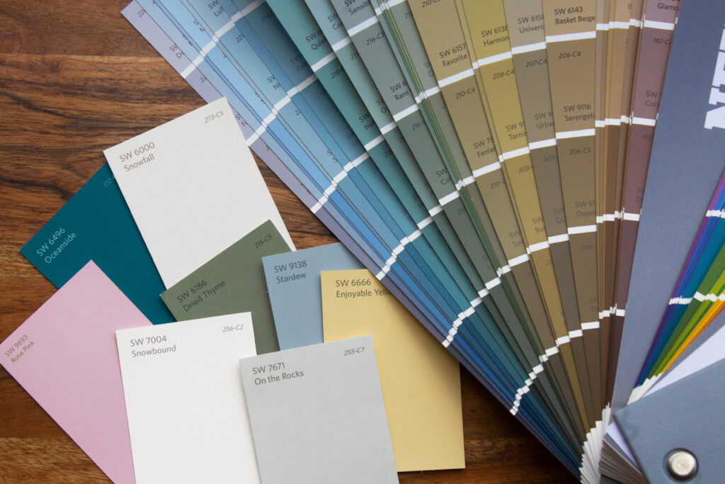
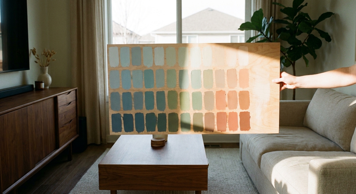
- Test at the right times. These colors can shift wildly from morning to evening. Paint two large swatches and live with them for a full day.
Quick wood-tone cheat sheet: Teak (golden) usually loves celadon, warm off-whites, and soft clay tones. Walnut (deeper and richer) can handle mustard, tobacco, dusty rose, and inky shades. Red oak (pink-orange) looks best next to warmed-up greiges, creamy whites, and greens that are more olive than mint.
If you want a deeper dive into era-appropriate combinations, I also break down the mood differences in earth tones vs. jewel tones in mid-century style.
10 authentic MCM paint colors
Paint names from the 1950s to 70s varied by region and manufacturer, so I’m focusing on “true-to-era” color families and pairing them with widely available modern matches. Always grab a sample first. Colors can look different by finish, by brand formula, and (annoyingly) on your screen versus your wall.
1) Mustard ochre
This is the quintessential sunny mid-century wall color, especially in rooms with a lot of walnut. It reads optimistic, but still grounded.
- Best with: Walnut furniture, black accents, woven textures, smoked glass
- Modern matches: Benjamin Moore Golden Vista, Sherwin-Williams Nugget (a clearer mustard direction), Farrow & Ball India Yellow
- Clara tip: If mustard feels like “a lot,” paint it on the wall behind your credenza and keep the rest a warm off-white.
2) Avocado green
Avocado gets teased, but done right it is lush and deeply mid-century, especially when you lean into natural fibers and warm metals.
- Best with: Teak, cane, brass, cream upholstery, terracotta decor
- Modern matches: Sherwin-Williams Avocado, Benjamin Moore Tate Olive (a classic olive-leaning option that lands closer to the avocado family), Farrow & Ball Bancha
- Clara tip: Avocado loves contrast. If your room is reading too “murky,” add a creamy trim and one crisp black line somewhere (a frame, a lamp, or a table base).
3) Smoky teal blue
Teal shows up frequently in authentic vintage textiles, tile, and glassware. On walls, a muted teal feels sophisticated, not theme-y.
- Best with: White oak, walnut, chrome, crisp (but warm) white trim
- Modern matches: Sherwin-Williams Riverway, Benjamin Moore Aegean Teal (often reads greener in low light), Farrow & Ball Inchyra Blue (deeper, blue-leaning option)
4) Burnt orange clay
This is late-60s and 70s warmth in paint form. This shade makes a living room feel instantly cozy and pairs beautifully with ceramics and textured upholstery.
- Best with: Rust, camel leather, brass, woven wall hangings
- Modern matches: Sherwin-Williams Cavern Clay, Benjamin Moore Potters Clay, Farrow & Ball Red Earth
5) Warm greige (the right kind)
Not every mid-century room was bold. Plenty were quiet, creamy, and wood-forward. The trick is choosing a greige with a tan or beige base, not a cool gray.
- Best with: Statement lighting, bold art, walnut casegoods
- Modern matches: Benjamin Moore Edgecomb Gray, Sherwin-Williams Accessible Beige
- Clara tip: This is my favorite “starter” color if you are building a collection slowly through thrifting.
6) Dusty rose (not baby pink)
Mid-century pinks are usually muted and earthy. Dusty rose looks especially authentic with darker woods and black accents.
- Best with: Walnut, matte black frames, smoked glass, cream bouclé
- Modern matches: Farrow & Ball Setting Plaster, Benjamin Moore First Light (lighter, airy option)
7) Tobacco brown
This is the unsung hero for mid-century drama. A tobacco wall behind open shelving makes vintage ceramics and art glass look curated.
- Best with: Brass, amber glass, off-white upholstery, woven shades
- Modern matches: Sherwin-Williams Turkish Coffee, Benjamin Moore Carob Bean
8) Soft celadon (pale green-gray)
If you love the calm, airy side of mid-century design, celadon gives you color without shouting. It feels especially right in ranch homes with lots of daylight.
- Best with: Teak, natural linen, light rugs, warm white trim
- Modern matches: Benjamin Moore Saybrook Sage, Sherwin-Williams Sea Salt (lighter, more gray-green)
- Clara tip: Celadon is an undertone chameleon. Tape your sample right next to your sofa fabric before you commit, because it can swing green, gray, or even slightly blue depending on what is in the room.
9) Inky charcoal
Charcoal is a modern favorite, but it can still read mid-century when you keep it soft and pair it with warm woods and vintage brass.
- Best with: Walnut, brass, graphic textiles, oversized art
- Modern matches: Benjamin Moore Kendall Charcoal, Sherwin-Williams Iron Ore
- Clara tip: Charcoal loves texture. Bouclé, nubby wool, and slubby linen keep it from feeling flat.
10) Creamy off-white
The most authentic “white” for mid-century homes is rarely pure. A creamy, slightly warm off-white keeps the room bright while still flattering wood tones and vintage finishes.
- Best with: Everything, especially teak and walnut
- Modern matches: Benjamin Moore Swiss Coffee, Sherwin-Williams Alabaster, Farrow & Ball School House White
Quick pairings
| Wall color family | Trim suggestion | Accent colors that feel period-correct |
|---|---|---|
| Mustard ochre | Creamy off-white (not bright white) | Teal, walnut brown, matte black, brass |
| Teal blue | Soft warm white | Mustard, camel, cognac leather, chrome |
| Avocado | Warm white or light greige | Terracotta, cream, brass, amber glass |
| Burnt orange clay | Creamy off-white | Olive, walnut, woven neutrals, smoked glass |
| Warm greige | Same color 20 to 30 percent lighter | Any single bold hue: teal, rust, mustard |
Ceilings and trim, the quick version: If you want the easiest mid-century read, keep the ceiling a soft white (not icy) and let the walls do the talking. If your home has a wood ceiling or beams, lean into it. Those warm tones are pure mid-century character.
If you’re also thinking about curb appeal, I have a separate roundup of mid-century modern front door colors that pair beautifully with these interior palettes.
My sampling routine
- Pick 3 finalists from the list above based on your wood tones and the amount of light you get.
- Sample on poster board and move it around the room. Corners and lamp light change everything.
- Check undertones next to your sofa and rug. A “green” can suddenly look gray. A “greige” can turn pink.
- Commit to one hero in the room. If walls are bold, keep the rug simpler. If the rug is wild, choose a calmer wall color.
Color is only half the story, of course. The glow matters too. If your living room still feels “off” after painting, it is often the lighting temperature and shade shape. I share favorites in mid-century floor lamps for cozy reading nooks.
FAQ
Were mid-century modern living rooms really colorful?
Often, yes, just in a grounded way. Even when walls were neutral, the era leaned into stronger upholstery, ceramics, and graphic art. Mustard, teal, avocado, and clay tones are common threads you will see across the decades.
Can I use a bold color if my room is small?
Yes. Deep teal, tobacco, and charcoal can make a small living room feel intentional and cozy, especially when your trim is a warm off-white and your lighting is layered.
What if my house is not mid-century?
You can still use these colors. The key is balancing them with mid-century shapes and materials. A clean-lined sofa, tapered legs, and warm woods make almost any home feel retro without looking like a set piece.
How do I avoid the theme-room look?
Limit yourself to one wall color statement and repeat it subtly. For example, teal walls plus one teal vase and a pillow, then let the rest stay warm and simple. For styling help, you may like Color Palettes & Styling.