
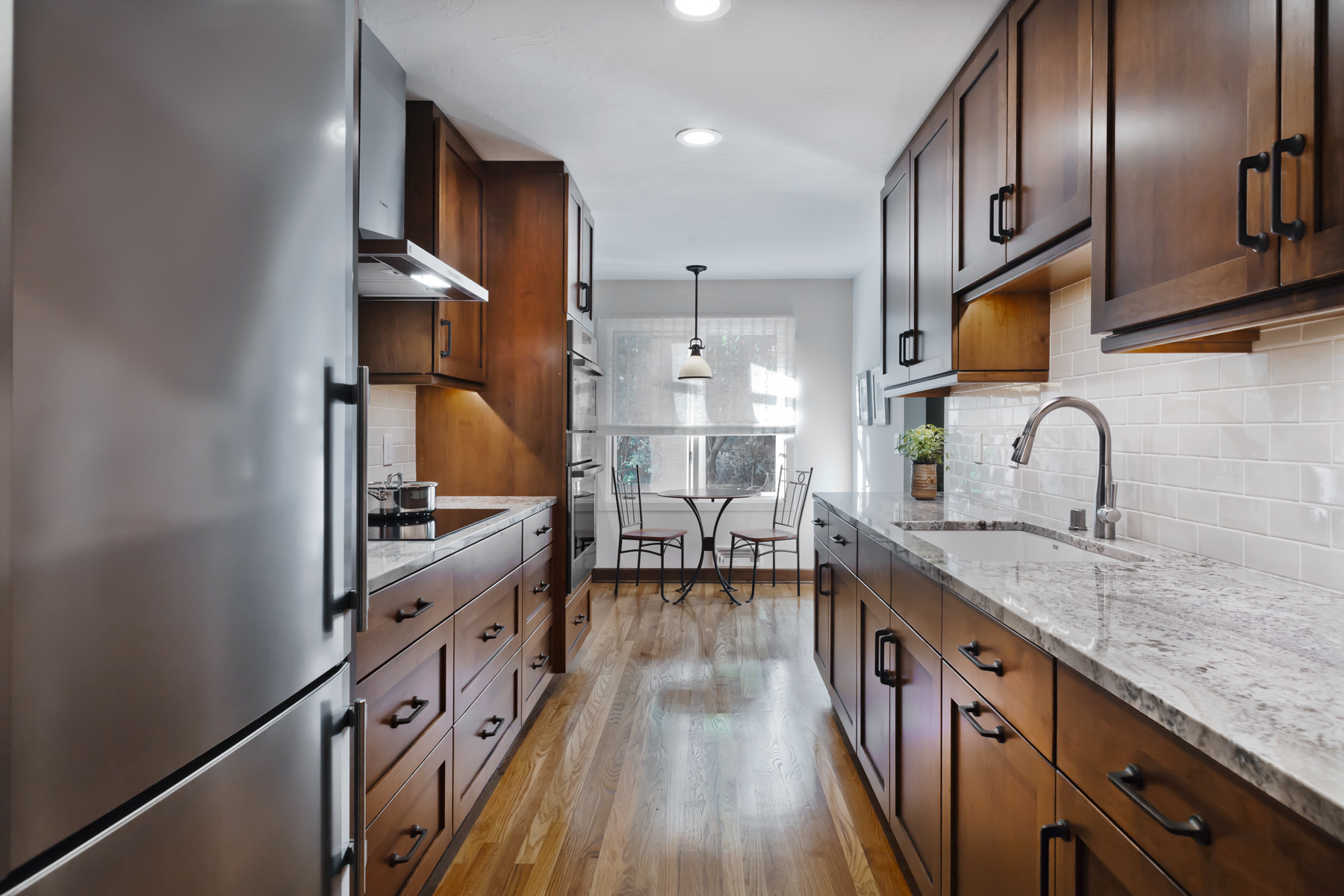
The first time I walked into this galley kitchen, it felt like the house was holding its breath. Two tight runs of cabinets. A narrow aisle. A lonely ceiling fixture that cast the kind of shadowy light that makes even a clean sink look guilty.
But I have a soft spot for galley kitchens. They are efficient by nature, like little vintage sailboats: narrow, purposeful, and surprisingly capable when you stop fighting the footprint and start designing for it. This remodel was about honoring that efficiency and giving it the mid-century warmth it always deserved.
The problems to solve
Before we touched a cabinet door, we wrote down the real pain points. Not the Pinterest problems, the everyday ones.
- No landing zones. You had nowhere to set groceries, a hot pan, or a coffee mug without doing a little side-step dance.
- Upper cabinets that felt like a tunnel. They ran long and unbroken on both sides, so the aisle felt tighter and darker than it actually was.
- Awkward work triangle. The fridge door clipped the traffic path, and the prep space lived in tiny fragments.
- Too much visual noise. Mixed finishes and fussy door profiles fought the clean lines the house wanted.
Mid-century modern design is at its best when it is calm and intentional. In a galley, that calm reads as spacious, even when the square footage says otherwise.
The layout that changed it
In a galley, layout is the whole story. We kept the basic two-wall galley plan, but refined it so the aisle felt open and the work zones finally made sense.
1) Make one side the work wall
We grouped the sink, dishwasher, and primary prep area on one run. That meant most tasks happened without crossing the aisle, which instantly made the kitchen feel less hectic.
2) Keep the aisle clear
We avoided deep overhang seating and bulky handles that snag clothing. A galley should feel like a glide path, not an obstacle course.
3) Give the fridge a real home
A retro-style fridge is adorable, but it still needs breathing room and a door swing that does not bully the walkway. We positioned it so the door opens toward the prep zone, not into passing traffic, and we double-checked the manufacturer’s clearance requirements before committing.
4) Watch the numbers
If you want a quick rule of thumb, an aisle around 42 inches tends to feel comfortable for one cook, and closer to 36 inches starts to feel tight fast. Door swings matter as much as the aisle width, especially with a fridge or dishwasher in the mix.
If you are planning a similar project, I always recommend doing a tape-on-the-floor mockup before finalizing cabinet depths and appliance sizes. A couple of inches can be the difference between cozy and claustrophobic.
Walnut cabinets
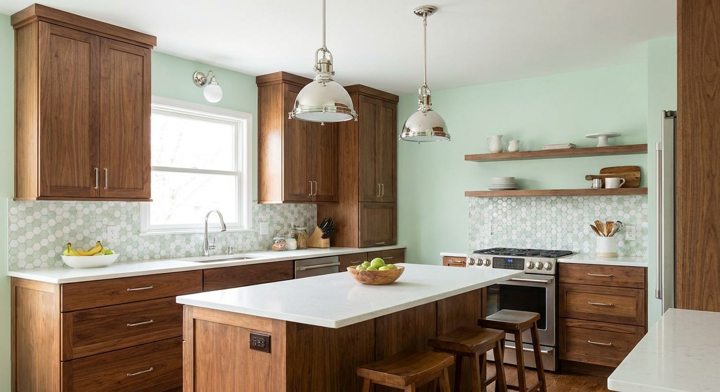
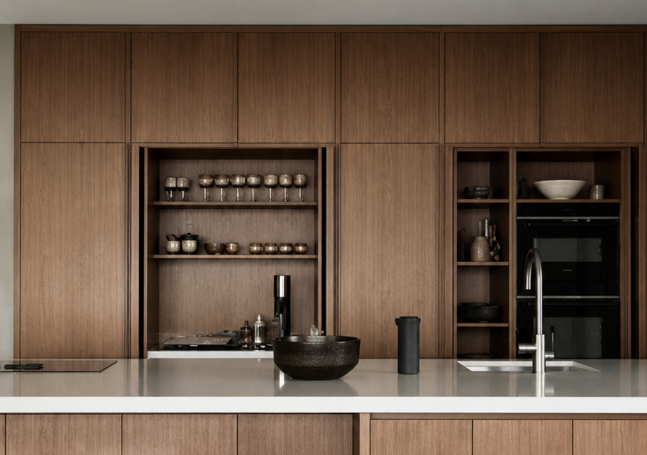
The moment the flat-panel walnut cabinetry went in, the kitchen finally felt like it belonged in the same house as the rest of the rooms. Walnut does that. It is warm without being loud, and it can make even brand-new cabinetry feel at home in a 1958 ranch.
What made it feel authentic
- Flat slab fronts. Clean, un-fussy planes read period-correct immediately.
- Consistent grain direction. Where possible, we kept the walnut grain running in a way that felt intentional, especially on larger door and drawer fronts.
- Simple hardware. Thin pulls in a warm metal finish, rather than ornate knobs. In a narrow space, quieter hardware also reduces visual clutter.
One practical note from experience: compared to high-gloss finishes, walnut with a low-sheen finish tends to be a little more forgiving when it comes to smudges and day-to-day fingerprints, especially in a galley where you are constantly brushing past cabinet fronts.
Retro appliances
Retro appliances can go two directions: charming and cohesive, or theme-park. The difference is restraint and proportion.
How we chose the retro details
- One standout piece. The refrigerator carried the vintage vibe with its rounded corners and color. Everything else stayed simple.
- Streamlined range profile. We aimed for clean lines and minimal visual bulk, so the cooking wall felt tidy.
- A low-profile or integrated hood. The more the ventilation blends in, the taller and calmer a galley feels.
Ventilation is one of those places where style cannot be the only decision. Ducting, make-up air needs, and even the right hood size can depend on your range and your local code, so we treated the hood choice as a design decision and a professional install decision.
When you are mixing eras, I like to keep the big shapes mid-century and let the small tools be modern. A sleek toaster and a simple kettle will not fight the fridge the way a pile of novelty appliances will.
Counters and backsplash
In a narrow kitchen, too much pattern can make the walls feel like they are closing in. We kept surfaces crisp and simple on purpose.
Countertop approach
A light, clean countertop helped bounce light through the aisle and kept the walnut from feeling heavy. For this look, think along the lines of a quiet white quartz, a simple solid-surface, or even a high-quality laminate in a soft, clean tone. The goal was bright backdrop, not statement stone.
Backsplash approach
We leaned into a backsplash that felt classic and unfussy: a straightforward grid like 4x4 tile or a simple stacked rectangle, with grout that does not scream for attention. Mid-century kitchens loved clean geometry and honest materials.
If you want to play with bolder color, I am a big believer in putting it on walls, textiles, or accessories first. For kitchen-specific palette ideas, I keep a running list in Retro Color Palettes for a Mid-Century Modern Kitchen.
Lighting that widens
Bad lighting can flatten a kitchen into a hallway. Good lighting gives it depth.
The three-layer fix
- Ambient. A warm, flush or semi-flush ceiling fixture that spreads light evenly.
- Task. Under-cabinet lighting to erase shadows on the counters.
- Accent. A small vintage-inspired pendant or globe near the sink or at the end of the run, if ceiling height allows.
Mid-century light is all about glow. Not spotlight glare. Not blue-white LEDs. A warmer temperature makes walnut sing and keeps the whole room feeling inviting.
Under-cabinet lighting is also the part that is easiest to underestimate. We made sure the electrical plan could support it cleanly and safely, and if you are unsure, this is another spot where a licensed pro is worth it.
If you are collecting vintage fixtures, I talk more about what to look for and how to think about proportions over in Furniture & Lighting.
Storage that works
Galley kitchens do not forgive countertop clutter. The fastest way to make one feel small is to park everything on the counter because there is nowhere else to put it.
What worked in this remodel
- Deep drawers for daily tools. Spatulas, knives, cutting boards, and pans belong in drawers, not stacked in base cabinets where they become a leaning tower of frustration.
- A narrow pull-out. Perfect for oils, spices, and baking sheets without stealing aisle space.
- Upper cabinets used strategically. We did not cram uppers wall-to-wall. A little breathing room kept the kitchen from feeling like a tunnel.
- Wall-mounted rail or hooks. A small run for a towel, a favorite pan, or a set of measuring cups adds function without bulk.
My personal rule: if you use it every day, it should live between hip and eye level. If you only use it on holidays, it can earn its place up high.
Finishes that fit
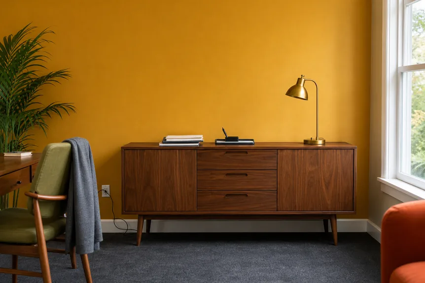
Mid-century kitchens often mix metals and materials, but it is a controlled mix. In this galley, we kept it to a simple recipe: walnut, a light counter, one warm metal, and one accent color.
If you are balancing chrome, brass, and other finishes, it helps to choose a lead singer and let the other metals harmonize. I break down that approach in Mixing Brass, Copper, and Chrome in Mid-Century Modern Style.
The result
After the remodel, the kitchen stopped feeling like a cramped add-on and started feeling like the heart of a mid-century home.
- The flat-panel walnut cabinetry brought instant warmth and that clean-lined look the house wanted.
- The refined layout made cooking feel smooth, not cramped.
- The retro fridge added personality without tipping into kitsch.
- Layered lighting erased shadows and made the space feel wider.
The best compliment a mid-century makeover can get is that it looks like it was always there. Not brand new, not artificially aged. Just right.
If you are planning yours
Here are the questions I ask before I buy anything, especially in a narrow footprint.
- Where will the clutter go? Plan drawers and pull-outs first, then plan styling last.
- What is the one mid-century hero? Walnut cabinets, a retro fridge, or a period light fixture. Choose your moment and build around it.
- Can you create a real prep zone? As a rule of thumb, even 24 to 36 inches of uninterrupted counter can change daily life, because it gives you one dependable place to chop, unload, and plate without playing musical chairs with appliances.
- Are you making it brighter or darker? Galley kitchens need help reflecting light. Use walnut as warmth, not as a cave.
- What is the best impact per dollar? If you cannot do everything, lighting, hardware, and a calm paint color tend to deliver the biggest day-to-day difference without a full cabinet replacement.
And if your project includes any vintage pieces, I am always careful about structural stability and safe transport. These two guides can save you a lot of headaches: 5 Structural Red Flags to Avoid When Thrifting Mid-Century Wooden Furniture and How to Safely Move Thrifted Mid-Century Modern Furniture.